If you happen to be in Dublin today (we sure wish we were), be sure to check out the screening of 'Kelsey,' along with other LGBTQ web series, as part of the In With the New Out Panel we've been touring with, at the GAZE International LGBT Film Festival.
kelsey the webseries
Christina on 'Make Art Make Money' Live Radio
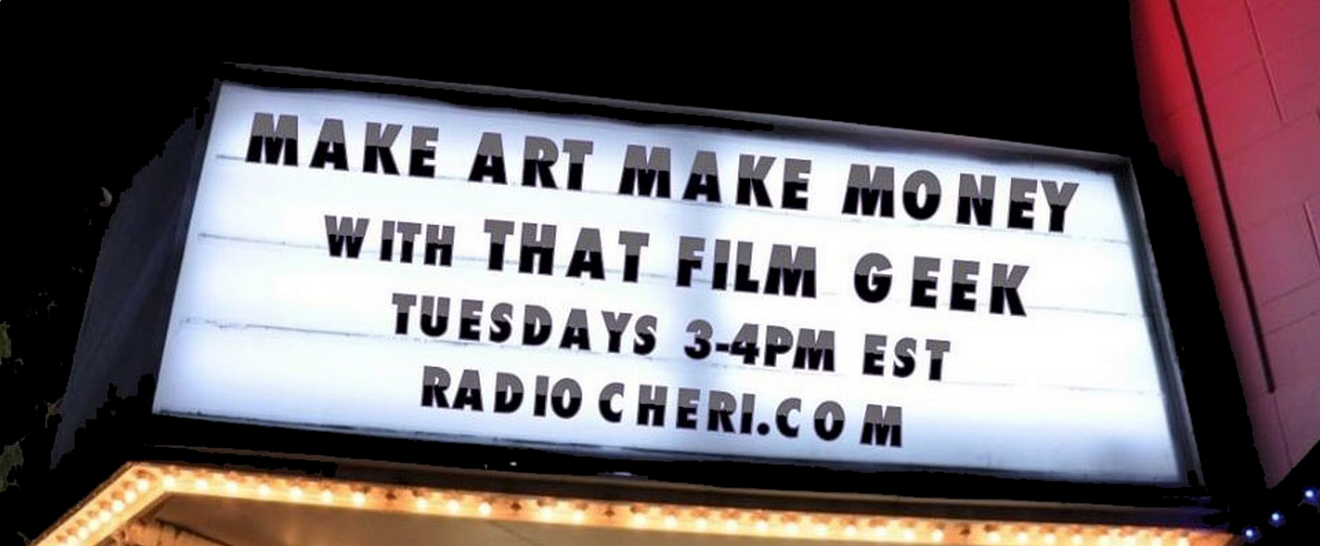
Listen live tomorrow at 2pm for Christina as the special guest on the new radio show 'Make Art Make Money.' She'll be talking about 'Kelsey' & how we got as much attention for it as we did. Streaming link coming soon.
Directing 'Kelsey' - Episodes 9 & 10
Christina here, back with the final post for my 'Directing Kelsey' blog series. Sorry this is a week late, I was super busy last week preparing for our IndieWorks: Best of Fest. But without further ado, here I go...
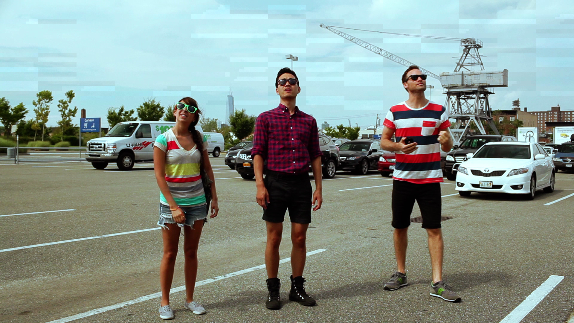
Episode 9 (Drive Through) is another one of my favorite episodes. Since episode 8 officially established them as a group, we were allowed to have a lot of subtext-heavy fun with their dynamics together; and we got to throw Joanne into the mix to make it more interesting.
One thing that makes this episode stand out is that they're not at any of their usual hangouts. They're also not drinking, which allowed for a change of pace in terms of our usual comedic go-to's. A lot of the comedy in this episode comes from tension between characters.
This episode is also special because it's our first/only completely linear episode. It's all one timeline with no flashbacks. It's meant to allude to what Kelsey Rauber & I planned for the next season, with Kelsey not living in the past quite as much. (Similarly, episode 10 only flashes back to the post-sex OMG's, the rest is linear). Additionally it , again, played into our plans to take the series in a more ensemble direction with Kelsey still as the central character but maybe not such an overt focal point.
Also the only episode where we have a true establishing shot. Something that never had a place in other episodes with the narrative always jumping around. Felt necessary in this case though.
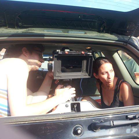
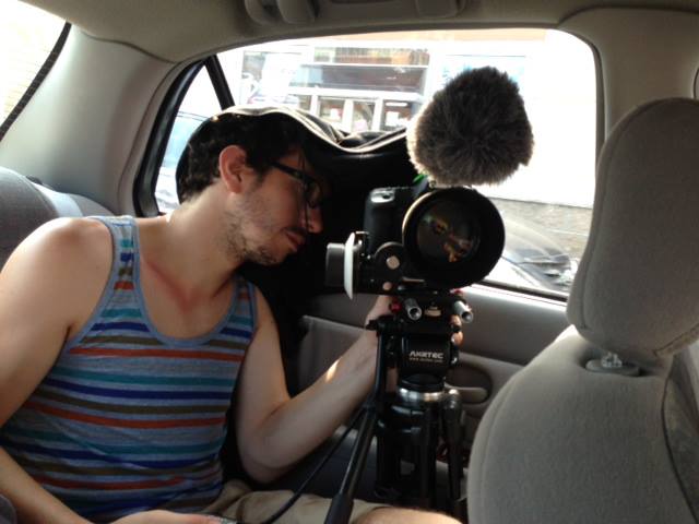
Something else interesting about this episode is how we pulled it off. As you can imagine, we did not have permission from Dunkin Donuts to shoot there. So, like episode 4, we guerilla-styled it. When getting the Wide shot of them actually going through the drive-thru, Peter & I were in the car in front of them, and actually ordered drinks from the drive-thru so as to not draw too much attention to ourselves.
Alternatively, when we got the interiors of them deciding what to order & Tyrone speaking into the microphone, since we needed the car to be moving and had to shoot that scene on each character at least once, we drove in circles next to the drive-thru lane, not actually in it; and the 85mm lens worked in our favor by condensing the space between Daniel & the actual drive-thru menu.
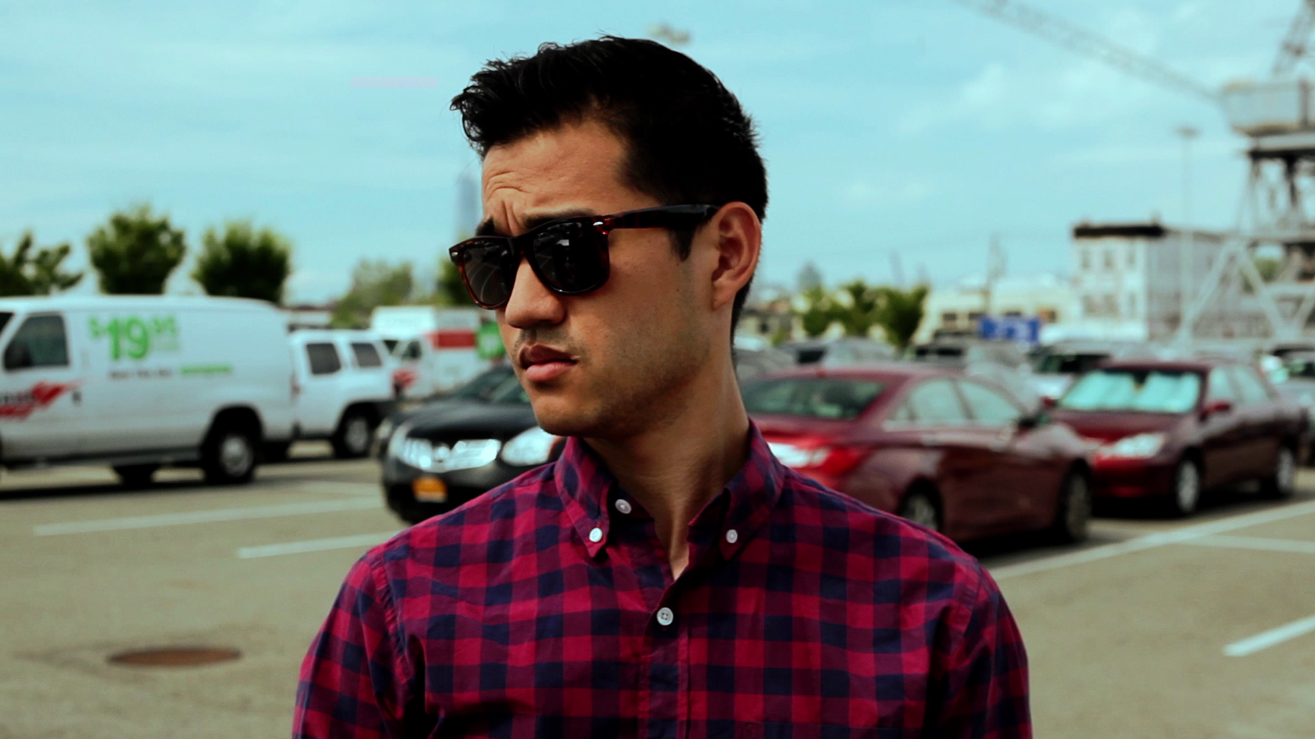
As far as the look of the episode, we were on an 85mm lens almost the entire time, with occasional 50mm usage. Since we had already established the intimacy of the group with the shots in episode 8, we had less pressure to have dirty shots and chose to concentrate more on tight singles, at least at first, and the various ways we could play with them in angles.
However, as the interactions between the characters became more tension-fueled, we brought in Overs.
Working with the confines of the car, we were able to emphasize the close quarters when we did use Overs, which visually represented that they were all maybe a little too close for comfort in this episode.
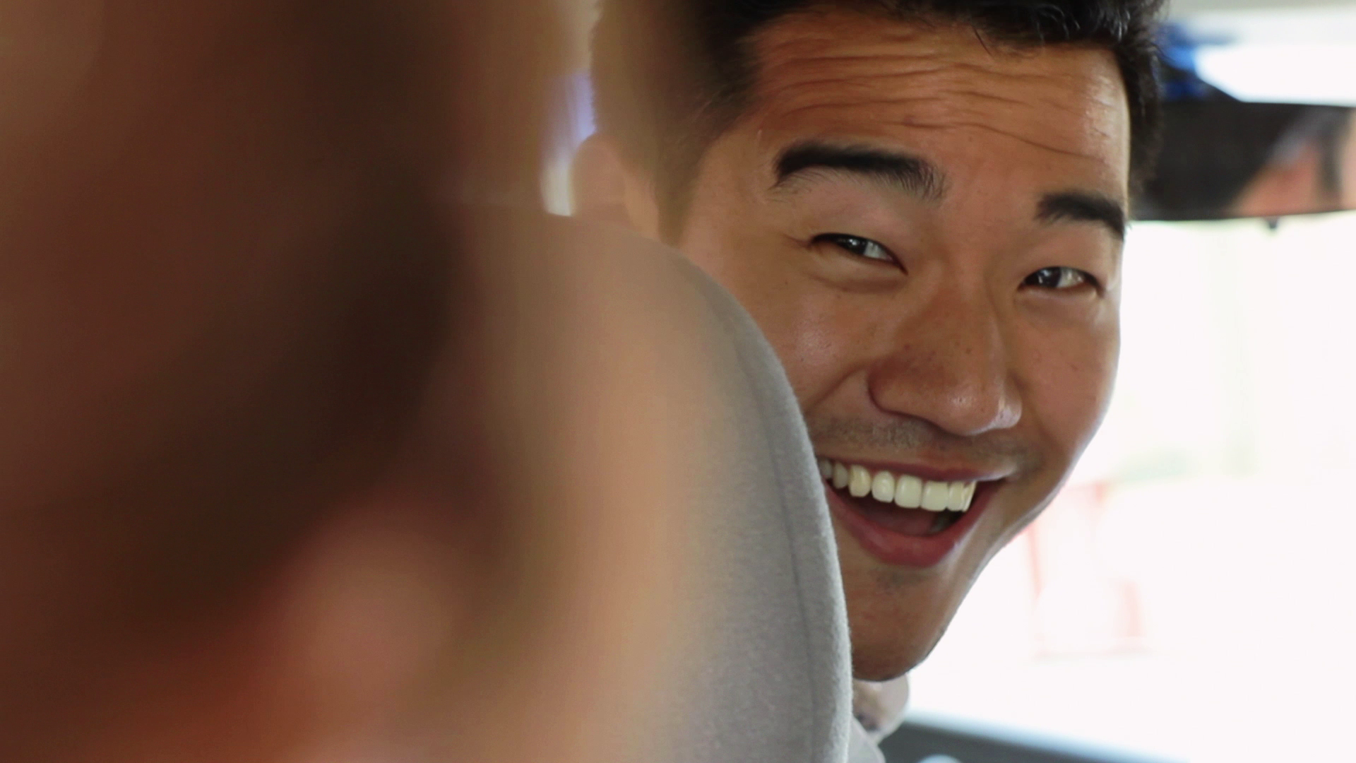
We were also able to have fun with more stylistic shots like the mirror angles (also tension-fueled).
One of my favorite aspects of the episode, and I'd say Kelsey Rauber's writing in general, are the reveals and how they're established. It's never overtly stated that they initially thought they were going somewhere nice to celebrate Tyrone's new car when instead he takes them to a Dunkin Donuts drive-thru; it's merely alluded to, which left a lot of room for more directing choices. For instance, this is emphasized when Sam gets out of the car in her outfit.
A bigger reveal is that the Dunkin Donuts is just around the corner from Kelsey & Sam's apartment; again not something stated overtly, which made for fun when planning shots. This shot actually continues with them walking all the way to the door, but it didn't work for pacing. I think it still translates though, especially when we later imply Tyrone goes into their apartment to use the bathroom.
Fun Fact, Kelsey Rauber really did live on that block right around the corner from that Dunkin Donuts. I can tell you this because she recently moved. Sorry stalkers.
To wrap this up, I think it's a really fun & punchy episode that was easy in some ways but hard in a lot of other ways to pull off; and I'm really proud of my production team for making it work. Peter did a great job with limited angle options, as did Jordan (editor) with putting it all together & hitting the beats.
If I'm going to mention one thing that didn't work quite as well as the episode as whole, it's the scene building up to the kiss between Kelsey & Joanne. We never quite got a perfect take. I really wanted the entire interaction between the two to happen in a continuous intimate two-shot, no cuts. But it started to rain before we could get one take that didn't have any line blunders. So we had to cut from one sort of two-shot to the main two-shot, which was a little jarring and detracted a bit from the natural chemistry and flow of the scene. However, I still think it works despite the rocky beginning.
Something similarly unexpected that happened in post is that the scene between Sam & Rowan stayed as one continuous two-shot when I had originally planned to cut to Singles between them. Originally, the two-shot was just for coverage while the whole scene was meant to contrast the two-shot of Kelsey & Joanne by playing out with isolated Singles, implying their sexual relationship was ending while Kelsey & Joanne's was just beginning. However, Jordan brought it to my attention that it just didn't flow as well when he cut it with Singles. The scene worked so well as one shot because they played off each other incredibly well and had such great chemistry when they'd do full run-throughs, particularly in this take. I agreed with Jordan and we chose to leave it as one shot. I think the contrast still works because their two-shot is clearly less intimate & they’re at unequal planes.
Lastly, again alluding to the ensemble progression, like episode 8, this episode doesn't quite end on Kelsey, but on one last punchline for Tyrone.
As discussed in my first post, Episode 10 (Making Things Work) is pretty much the culmination of what the entire season had been building up to, not just narratively but aesthetically as well.
The opening mirrors the opening of the pilot but on the much more flattering 85mm lens, which we were on for the majority of the episode, with, again, only occasional changes to the 50 for wider, establishing shots.
Since we were now at the point where we weren't focused on and restricted to following patterns that were meant to develop over the season, we could simply get the coverage we wanted. So we had very tight frames within the group, establishing the tight-knit feel the audience would now have with them.
This being the season finale, we had to wrap up storylines but introduce new ones as well, like the introduction of Kate.
I have to give Peter lots of props here because at this point in production, we had no gaffer (Sayo got a paying gig on a feature film and we happily excused her from her commitment to the show) and Peter was doing lighting all on his own. He managed to compliment everyone’s diverse skin tones with the lighting in one 5-person shot while still maintaining the intimate, lower key feel, and all with very limited lighting equipment. Not an easy feat, as any Director of Photography, I'm sure, knows.
The bedroom scenes with Kelsey & Joanne, I wanted to feel unlike any other times we had seen Kelsey in her bedroom.
Like their scenes in episode 7, we have very dirty, intimately framed Overs. I loved Peter's soft lighting, which was a big difference compared to the colder feel to her room in previous scenes (episode 1 & 6).
Kelsey’s happy. She's comfortable and confident in a way she hasn’t been in a long time, and the framing and lighting were mean to reflect & compliment that.
Initially, I felt like there was no point in hiding that it's Shane at the door. We're not very ambiguous about it, so were going to get a shot of her at the door. However, we couldn’t get Charlotte on the day we were shooting that scene, so I opted to just put her voice in, in Post.
But I think this ended up being for the best for that scene because I absolutely love Lauren’s dropped expression and wouldn’t want to cut away from it even if I had the Shane footage as an option. Her subtle transition from post-sex euphoria/ready-for-food excitement to surprise, which quickly becomes annoyance, and then worry for the future of her relationship is all so perfect, both in delivery and timing. I wouldn't want to shift the focus away from her to show Shane, so I'm really happy it worked out how it did in the end.
Lastly, unlike the past 2 episodes, the last shot is of Kelsey because, as the theme song says, it is still all about her; ensemble or no ensemble, she’s who the audience is meant to identify, or at least empathize, with most. We're following her journey.
Similar framing to Joanne's reaction to Shane was very much intentional.
We felt leaving the season with this shot/moment would be a great way to leave the audience feeling satisfied for the season as a whole but definitely wanting to come back for more and know what happens next. Based on the fan reaction, it seems we were right! :)
That's it for this 'Directing Kelsey' series! Thanks so much for reading it. I hope it was interesting & enjoyable. And, as always, thank you so much for watching & supporting the series. Fingers crossed we'll be discovered by new audiences and continue reaching people with Kelsey & her friends. Only time will tell, but we'll be sure to keep you updated. Kelsey & I shot a video a few weeks back where we talk about the future of the series & what else we're collaborating on. We'll be releasing it in 3 weeks. Be sure to check back at this blog and on Facebook & Twitter for updates on that as well as Screening/Press news. We can't wait to start telling you about our future plans.
Be sure to stay in touch with me via Twitter. Thanks again for your support,
Christina
P.S. Kelsey & I recently spoke as Panelists at the New Haven International Film Festival, read about it Here.
Directing 'Kelsey' - Episodes 3 & 4
Christina here, continuing my Directing Kelsey series. I took a break last week to share our blooper reel but I'm back to talk about episode 3 (WWWdating?) and episode 4 (Shopping in Groups). I hope you've enjoyed my past 2 posts and getting to know a little about how each episode came to look and feel the way it did.
Starting with episode 3: This episode was in some ways about making Kelsey seem small in the frame (which wasn't tough considering Nichole's height compared to everyone else on the show) in order to reflect how small she felt finding out about Shane having a new girlfriend and the fact that all her friends have stayed somewhat in touch with her ex.
However, despite this small motif, for the most part this episode was visually about working towards a sense of normalcy compared to episode 2 because Kelsey was actually in a good mood at the start of the episode and, despite her excessive drinking and hangover, seems to be moving toward a better place by the end of it as she accepts the reality of her situation.
As I discussed in my first post, this episode was still pretty wide in terms of framing and lenses compared to where 'the look' would end up by the end of the series. But we definitely started working our way into over-the-shoulder's and medium shots more, and less use of full or wide shots (compare).
One of the things I'm most proud of in this episode is pulling off the slide behind the computer screen. Peter initially wanted to do reverse shots on them and the screen, since it was scripted that we'd see Shane & her new girlfriend. But I preferred leaving Shane and, especially, her new girlfriend (later learned to be named Suzie) a mystery because I felt like the audience should be isolated to identifying with how Kelsey felt about her and how seeing the new girlfriend made Kelsey feel rather than be able to form their own opinions. Also, it seemed pointless to cast someone we'd never see on the show (Suzie). Additionally, I wanted it to remain ambiguous whether or not Shane would make an appearance on the show. So the less we showed of her, the more it seemed like we just got a model for the Pilot photo and didn't cast an actual actress. And lastly, a more practical reason, I didn't want the hassle of having to create a Facebook profile for Shane nor deal with the potential repercussions of showing Facebook without proper permissions.
So anyway, Peter was totally on board for keeping the camera on them the whole time, and sliding behind the computer. He felt that it would be a tight squeeze but thankfully found a way to make it work precisely the way I wanted.
What's wonderful is that a lot of people relate to episode 3. Staying Facebook friends with your exes and/or your friends staying friends with them is such a reality for our generation. Your ex can randomly pop up in your face at any given moment with the refresh of your newsfeed. When this episode was scripted, I felt it was so timely and relevant but also timeless in a way because finding out your recent ex has moved on before you is something anyone, regardless of how they find out, can relate to. I was excited about bringing the whole episode together because it'd be a fun way to explore each of her friends' take on the situation and introduce the next episode's plot of online dating.
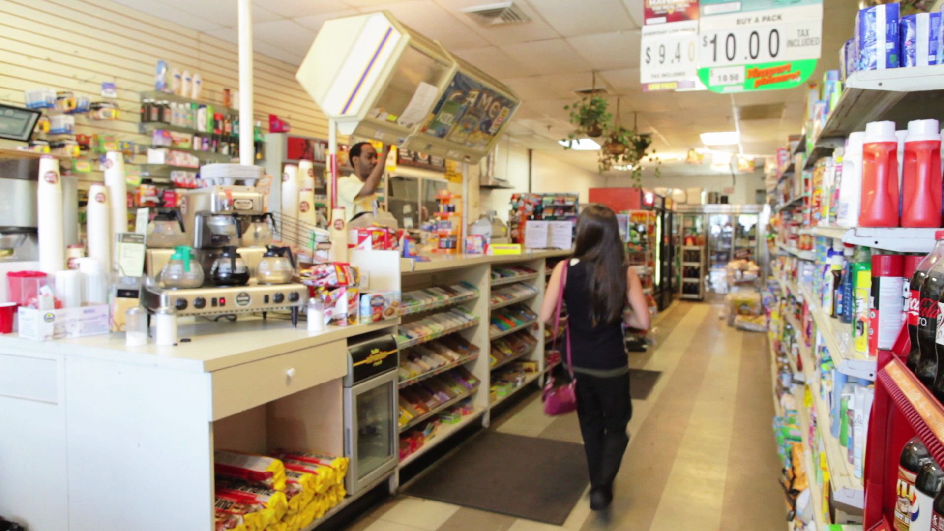
However, things didn't quite work out that way when we got down to the last few days of production and had to cut out one production date because Kelsey Rauber and I were about to go over budget & out of money. The exterior day that we planned to shoot episode 4 at Ikea got rained out early on in production, so we lost a date that it took almost all summer to try to coordinate and get back. Because of this, we had to sacrifice an alternate exterior date which was supposed to have scenes between Kelsey & Rowan in episode 3, and Rowan, Sam and Shane in episode 10 (will talk about that later). So two scenes out of episode 3 had to be cut. Here's a preview of the pages:
I felt that the episode could still work without the scenes, so found a way from a producing & directing standpoint to pull the episode off without making the loss evident to the audience. I ultimately do feel that the loss of the two scenes hurt the episode a little because it did not have as much cutting around as we originally envisioned since the entire episode is the past and only three scenes at the bodega are the present, which gave it less of the punchy feel that we like. However, because we had notice, we were able to make some adjustments to keep the momentum bouncy. We had already shot the office and bodega scene but not the bar scenes by the time we realized a day needed to be sacrificed. So we reworked the tone of those scenes a little to compensate for what was meant to go between them, and managed to bring it all together pretty tightly. Kelsey Rauber and I still feel what's lacking. But it seems that audiences enjoyed it regardless.
As you may have noticed from the preview above though, Joanne was meant to be in the episode. It was just supposed to be that appearance in the background so that we could further establish that she lives in the neighborhood and has met Rowan. Rowan would mention that he was double dating and, because Kelsey would spot her with the woman Rowan was presumably double dating with, this would add to Kelsey’s assumption that Joanne is straight in episode 4. We were, however, able to compensate for this loss in episode 4 because, luckily, we had not shot the Kelsey & Joanne scenes of the episode until after we realized the exterior shooting day would need to be cut.
Speaking of episode 4: This episode is one of my favorites for multiple reasons. It's where we first get to see Kelsey interact with Joanne, Kelsey is finally at a point where her world doesn't revolve around Shane, we establish Tyrone as more than just Kelsey's co-worker and actually part of the group of friends, and where I think Kelsey Rauber's dialogue writing really stands out. I loved the contrast of the rapid banter of the Ikea scenes versus Kelsey's oblivious rambling to Sam versus the more conversational (but still somewhat oblivious) moments with Joanne. I had a ton of fun taking Kelsey Rauber's excellent script and finding subtle ways to bring it to life and really hit the beats in this episode.
I'm not going to pick the episode apart too much. But I will say that I treated each of the locations' corresponding segments as almost little films of their own, where each had a slightly different look while still working as one cohesive episode. I did this because I felt that, although they each play off each other narratively, the three locations' scenes worked almost as episodes on their own, independent of the context of the story Kelsey was telling.
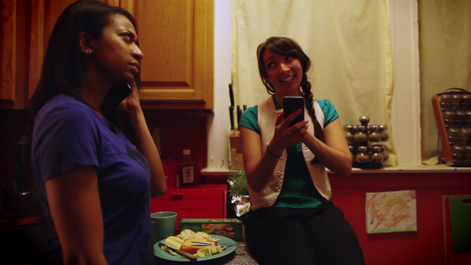
For the scenes with Sam, I chose to have kelsey sit on the counter, not just because it made framing easier, but also to show that she has gotten some of her confidence back (in spite of her playful self-deprecation throughout the episode and especially these scenes). It was to show a stark contrast to the last episode in terms of her self-esteem level. Also, their bodies get a little closer together in two-shots and the overs are a little tighter, at least in terms of depth between Kelsey & Sam, to create a sense of closeness now that the friendship is more established.
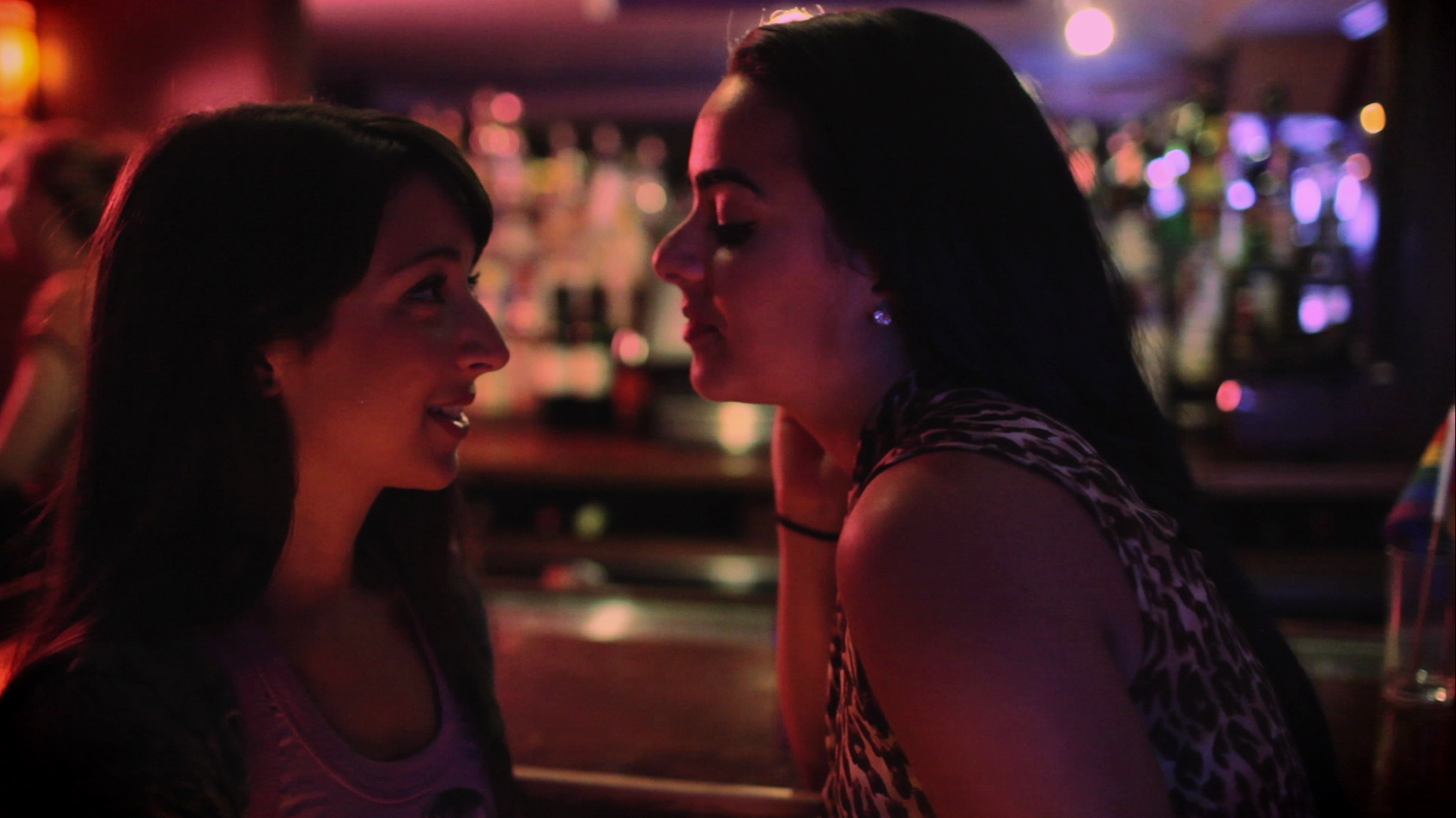
The scenes at the bar were very important because there was a lot of subtext going on and I wanted to emphasis both the chemistry as well as the tension between Kelsey and Joanne as much possible.
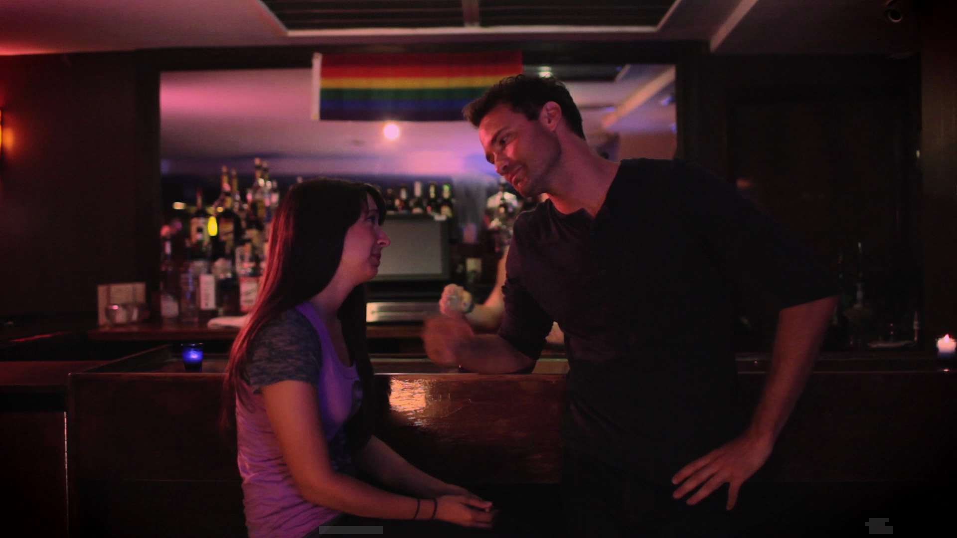
You probably didn't notice this but there's a very big difference between these scenes with Kelsey and Joanne versus the ones from episodes 1 & 3 with Kelsey & Sam at the bar. I wanted there to be a visual difference for when Kelsey would be at the bar with Joanne compared to her with Sam, in order to allude to there being more than friendship brewing between the former. Peter suggested we shoot Kelsey & Sam facing one way and Kelsey & Joanne the other way, with the bar as the dividing line. I loved this idea and we both agreed that not showing the bar or bartender, and narrowing our Overs so that there wasn't too much depth behind Kelsey & Joanne felt more intimate and, in a sense, romantic compared to facing the bar and seeing more of the space (as is the case with Kelsey & Sam). So this became a pattern we stuck to throughout the series.
Also, just to refer to what I spoke about in episode 3 regarding the absence of Rowan & Joanne. The bit about Joanne saying she knew Kelsey's name from Rowan, and then the awkwardness of Kelsey assuming Rowan had mentioned her and trying to hide that she was too self-involved to remember, and then Joanne appeasing her by explaining that she only knows him because he went home with her friend Sarah, was meant to compensate for the missed beats in episode 3, as well as set up the ongoing plot of Kelsey being completely oblivious to not only Joanne being a lesbian but also being attracted to Kelsey. It was also a way to quickly establish Rowan is definitely straight because Kelsey Rauber & I had feared the audience would assume he wasn't and be completely thrown by Kelsey's accusations later in the series. Episode 3 was meant to confirm this, so I added the throwaway line about "Sarah" to make up for what we lost.
Last thing I want to mention about these scenes is the use of music. I know, this isn't referring to the look, but definitely the feel. It's the first time music is heard at the bar. I tried to avoid using a score or any non-diegetic sound for the whole series in order to add to the realism, and highlight the acting & pacing. So anytime music is heard, it's coming from a source within the reality of the show. I made it a point to not have music playing at the bar except for, conveniently, when Kelsey is with Joanne. I felt that it would set the mood a little and allude to their future together. Additionally, I thought it'd be fun to use Kelsey Rauber's own music on the show (she of course was not a huge fan of this decision), so you will also notice that every time Kelsey & Joanne are at the bar alone, the music playing is in fact by the real Kelsey. That's the only time her music is heard on the show. Any other time, for instance in episode 5, it's other tracks by local musicians who were wonderful enough to allow us use of their work.
In terms of the Ikea scenes: When we were shooting, it was an incredibly sunny day out, and Peter did an excellent job bouncing the light and using what shade we could find. But there was too much of a glare on the monitors to tell whether or not we were catching crew member reflections in the actors' sunglasses. Peter assured me that he didn't think we were but once we got into post, we realized we had. I found it very distracting once the cut was put together and really pushed to find a solution. Peter eventually came up with the idea in color grading to lower the saturation and give more of a bleach bypass look, which significantly darkened the reflections in their glasses. It unfortunately led to less of a sun-kissed look for the cast but definitely hid the recognizability of the figures reflected in the lenses.
I opted for the alternate look, despite it not being as flattering, because it didn't immediately pull me out of the scene the way seeing actual faces in their lenses did with the first color pass. Overall, the day just ended up looking a little more cloudy than it actual was, and everyone slightly less tan than they actual were. But I'm happy with it how it turned out in the end.
In this episode, we tried to be on Kelsey's eye-level at all times to, as stated in episode 3, get to the point of normalcy, allowing her (and in effect the audience) to feel grounded visually because she was finally at a space of feeling ready to move on and more comfortable with the idea of not being part of a couple anymore.
These scenes are also where I most used my director trademark of sorts, building up to close-ups, something I spoke about in the first post. I chose to start wide but abruptly isolate the three of them in singles, rather than overs, to emphasize them being in conflict rather than actually working together.
And of course the singles get progressively tighter as the tension builds between them.
Luckily, the bleached look didn't remove some of our planned reflections, like Rowan taking off & putting on his glasses seen in Tyrone's lenses.
As tension subsided and the situation resolved itself, we pulled back out.
And ended the scene on the skyline shot that Peter & I were very excited about. (See the reverse of it here.) I wanted to show that the series is true indie, on-location production and, although that comes with a million headaches, it has the perks of having the realness you can't get in a studio.
Also, regarding true indie production, as a fun fact to share, the shots facing the actors and the shots facing Ikea are actually on completely opposite sides of the building. We had to run & gun the shots in the front of Ikea to avoid getting caught, and then we were able to take our time with a little more ease at the back of the parking lot for the majority of the shots, which were facing the characters. Just a little low-budget movie magic.
That's it for episode 4. Hopefully my ramblings are interesting and give you some useful insight into the episodes upon rewatch. If you ever have questions or want to chat with me about the series, always feel free to tweet at me. And I hope you’ll be back next week for episodes 5 & 6. The view count is now at 144,395. So close to 150,000! Thanks for watching & reading.
-Christina
Directing 'Kelsey'
Hello to all our wonderful "Kelsey" fans,
Christina here. Some of the more cinephile-type fans of the series have asked questions about the look of the show over the past couple months. So I thought it’d be fun to write a blog series about some of the artistic choices behind "Kelsey". This is the first of what will be 5-10 posts discussing each episode; I may combine a couple episodes depending on how much I decide to say. This one will be the longest, though, because I'm setting up the series as a whole before diving into a specific episode. So here it goes, starting with episode 1 (Palette Cleaner).
If you don’t know the story of how “Kelsey” came to be, read it in Kelsey Rauber’s words HERE. It was back in July of 2012 that we had that dinner and the idea to turn her hilariously bizarre but incredibly relatable story into a web series first occurred to me. I told her that what I found so compelling about her story was the way in which she told it to me. Her hindsight commentary was a big part of what made the story so entertaining. When she said that she would start writing immediately, I told her that she should try to retain her comedic storytelling style as a character in the writing of the series itself. So, we initially came up with the idea that Kelsey, the character, could be retelling the story of this event in the form of a video blog and part of it would be portrayed through flashbacks, while the other part her commentary. However, talking to the camera has become such common practice in comedy now that I’m so glad that that idea was eventually nixed. Kelsey wrote her first draft and it was funny but not nearly as funny as it later became when the new non-linear motif was tested in her second draft in February of 2013. Kelsey had come up with the idea that the character of Kelsey would be telling the same story to her friends separately and the audience would be able to follow it partially through flashbacks and partially through the non-linear moments of interaction with her friends throughout the episodes. I thought this was absolutely brilliant and unlike anything currently happening in comedy right now.
So we decided to roll with this structure and, after we brainstormed on where we wanted the series to go as a whole, Kelsey began writing future episodes and I brought on our DP Peter Westervelt; then we began casting. This is where I’m going to stop telling background to how the show came together. I just wanted to set up the narrative structure of the series as a way to get into the aesthetic choices behind it.
The prospect of the series including flashbacks and a general non-linear structure made the series more exciting for me from a directing standpoint and allowed me to have some interesting brainstorming sessions with Peter (as mentioned, the series Cinematographer) on how we could create a visual distinction between past and present. I initially proposed the idea that we commit to shooting the flashbacks on a specific lens, which we would never use in the present, in order to create a subtle but intentionally different look between the two time periods of each episode. This is something I had seen done in Blue Valentine, one of my favorite films. But Peter, rightfully, brought up the fact that that would be very limiting for the visual storytelling, especially with tight locations to contend with. Peter then suggested that we have some sort of camera movement for every time we introduce the past in an episode. I loved this idea, so we decided that the main way we'd differentiate the past from the present would be to slide into the past and cut out to the present. This is a rule, I’m proud to say, we maintained throughout the whole series. This is a part of why I think it’s so necessary to plan and ideally shoot a season of your web series as one whole entity because, even if you are thinking of each episode as standalone, you can make artistic choices that go a long way. (From a producing standpoint, as well, it’s just incredibly naïve not to shoot your whole season together before launching your pilot in regards to time efficiency, cost effectiveness and consistent distribution. But I’m not talking producing here. This is the director side of me writing this post.)
Another motif for the series that I wanted to convey was the idea of building up to close-ups. This is something I generally incorporate into all my work, especially if tension building is a big aspect for the film as a whole, even in comedies ("S.K.A."). It was definitely an integral aspect of the cinematography for my feature film Summit, and I was actually producing "Kelsey" right off the heels of shooting Summit. I suppose I wanted to find a way to use that motif very specifically again because it worked so well in the film. The way I worked it into "Kelsey" was by using wides early on as a way to introduce you to Kelsey’s world in relation to her.
But as the relationships became closer and they became more of a tight-knit group of friends, and as Kelsey became less self-centered, our shots got tighter and dirtier over the season. I’ll elaborate on this further for each episode from a tone/feeling standpoint. But here's an example compared to above:
I wont touch on lenses and that kind of stuff; it’s Peter’s realm. But for you real tech fans, we generally never went above a 50mm lens for the first 3 episodes, and never went below it for the last 3.
It was Peter’s idea to open the series coming into focus on Kelsey. I thought that was really cool because I had made it a point with the pilot to just kind of drop you into her life, and the focus shift felt, to me, like it was you coming into Kelsey’s world.
The kitchen was an incredibly tight space to work with. We basically just tried to be as wide as possible while getting as much coverage as possible. Peter was really amazing at utilizing the limited shooting area, and our editor, Jordan Roberts, did an excellent job of taking all the shots and making the scene feel cohesive and smooth.
We toyed with making the photo of Kelsey & Shane on the fridge more in your face with a very intentional close-up. But I felt that was kind of tacky, and decided to just put it in the foreground a few times and let the audience find it upon rewatch after Samantha references "her stuff" or Kelsey pulls it off at the end of the episode.
I’m generally not a fan of inserts as a way to draw the audience’s attention to something and tell them it’s important. I rather be subtle about it and let the scene play out more realistically, as if you're in that space with them. You’ll probably notice that there are few, if any, inserts during the series.
But for the fans who’d like to see that photo more closely, here's a shot we never used:
You'll notice wider frames and lenses are generally all over the place. It's in both bars (something that was always a bit of a challenge to pull off with our limited budget & lack of extras). The look of the lesbian bar was made different from the local bar mostly through Peter's idea to put colored gels on all the lights. It added to the rainbow theme of the space.
There’s a lot of fun we had with art direction in Kelsey & Tyrone’s office. We established Tyrone’s infatuation with Ryan Gosling (which would play into episode 2) and Kelsey’s love for Kermit (true story, Kelsey Rauber really does love Kermit).
Okay, I’m not going to pick apart each scene or shot in the episode, don’t worry. I just wanted to touch on a bit of what makes each episode different while also talking about the general look of the whole series. I'll stop doing that now.
Moving on, a stand out aspect of this episode is the use of close-ups on somewhat wide lenses as character's POVs. A choice mostly used to be slightly jarring and add to the comedy, but also to pull you into the story like you're the one being spoken to, like you're one of Kelsey's friends now.
This is not something we do in any other episode. I normally think it's a bad idea to do something in the first episode of a series because the audience may come to expect it from the whole show. But I also felt that, since it's a pilot, we could get away with it as long as we didn't repeat it at all in episode two, and that, since the pilot is so standalone as is, it'd be an okay choice to make. This is the episode where we flashback more than any other; it's also the most story-oriented, where little happens in the present and the story she's telling dominates the episode. I felt that having character POVs would be a great way to show how intently the other characters were listening to Kelsey but also how they were reacting to her and her story in a different way from how she perceived it (which would go on to be a running theme). Again, like starting the series out mostly wide, it was a way to introduce you to the supporting characters specifically in relation to Kelsey and her world.
Peter was totally on board for this isolated episode motif and pulled it off very well. We made it a point to shoot Kelsey's interactions with each character on the same lens and from the same angle and distance as much as was possible for each part of the story she was in while talking to them. We figured that, not only would it feel more polished to do so, it'd help audiences subconsciously place themselves chronologically in the non-linear story.
It was completely Peter's creative idea to shoot the shot where Kelsey & Jen do all the shots in one take.
I liked it a lot, especially the slight awkwardness of it happening in real time rather than convenient jump cuts. Getting drunk and hooking up with some random at a bar is inherently awkward, and I generally like to make you feel a little awkward visually if the characters feel that way (more on this in episode 2).
I specifically wanted to jump the line for the kiss in order to signify that what was about to happen was what this whole episode had been building up to and that it'd be slightly jarring the way jumping the 180 line is jarring.
The final scene of the episode is one of my favorites of the whole series. First of all, the color tone of the end product is actually quite different from the original. In Post-Production, Peter gave me a choice and I chose the colder look because it was much more in line with the tone of the scene. Just a taste of the beauty of color correction and Peter's overall skill.
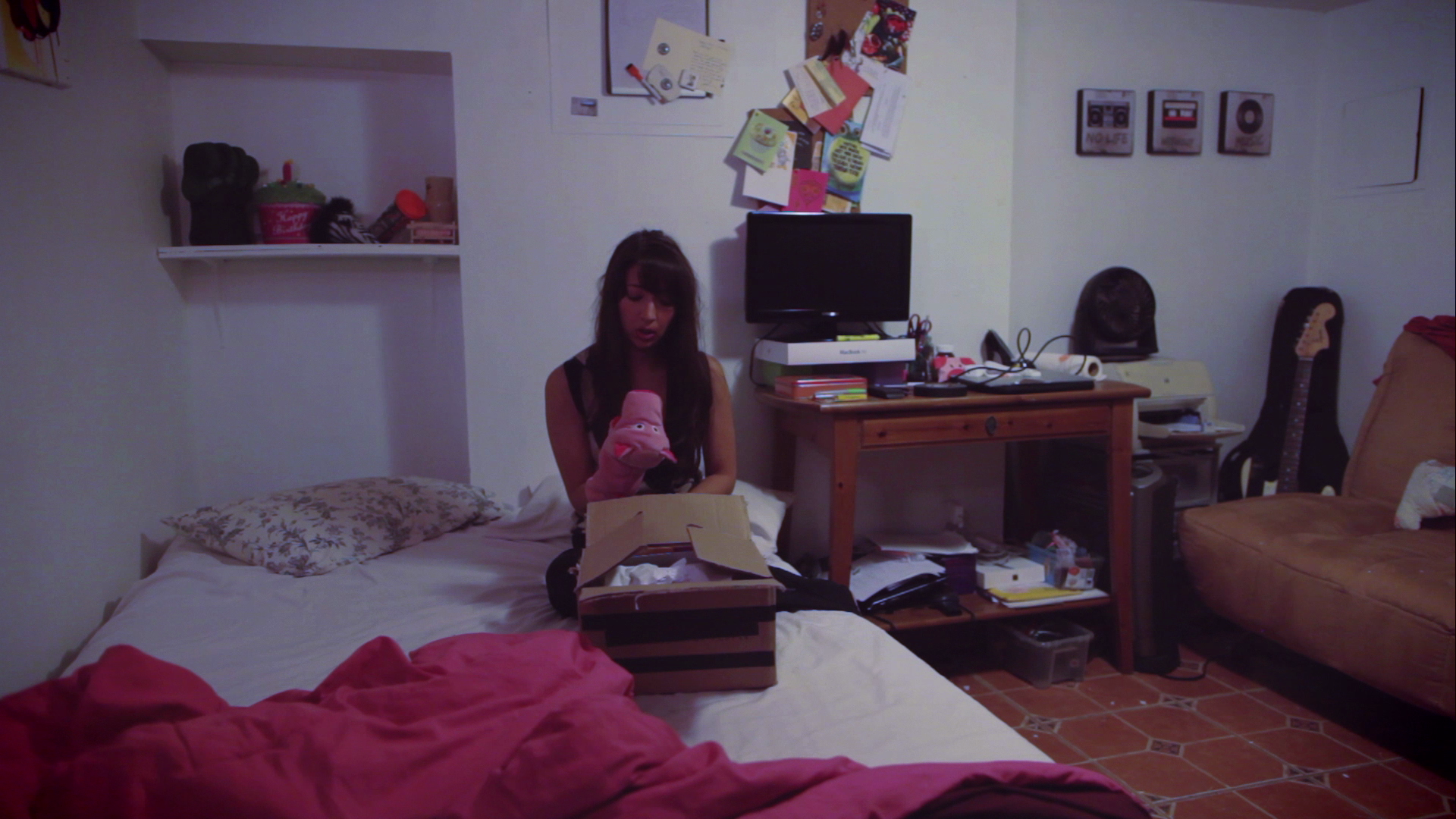
We only had one version of the poster on the wall so Nichole had one take to nail crumbling it up. I was also deadset on it being all in one wide shot, no cuts to close-up. I liked the idea of conveying the intimacy of that scene by not being intimate with the camera, but actually making you, the audience, feel somewhat like a voyeur as you watched her in this incredibly vulnerable moment. So Nichole had quite the challenge on her hands, as did the whole production team because nothing could go wrong in this take.
The part with the pig puppet was not scripted; it was originally scripted that Kelsey takes down Shane-related stuff off her wall and puts it, along with the photo that was on the fridge, in a box and tucks it away under her bed feeling slightly hesitant but ready to move on. I found the pig puppet in Kelsey Rauber's bedroom and thought it was cute so told Nichole to pretend that it was a gift from Shane and that she had to say goodbye to it as she packed it and the rest of Shane's stuff away. I also wanted to take a slightly more somber approach to the ending in conveying that the realization that she was actually ready to move on was maybe the saddest and scariest part for her. Nichole totally rolled with that and didn't want to rehearse what she would say to the pig; she just wanted to let it come naturally. So I was banking on liking whatever she chose to improvise, as well as everything on a technical level going well because, again, we literally had one take to pull this off. Her choice to actually have the puppet speak to her was brilliant, humor in such a sad moment; and the way she kissed it goodbye and put it in the box was heartbreaking. I loved it. She nailed the scene in one take.
For the final moment, I chose to just let it linger on her, lying in bed after she finally decided to put the box of Shane’s stuff away. I wanted to make it clear that, although the show was a comedy, we’d be touching on some real stuff in it. When Kelsey Rauber saw the footage, she was on the same page. I was proud to have captured what she had emotionally put on paper.
I think we truly nailed it with those final moments because it's one of the most referenced scenes in interviews, including what led to a discussion, in one of my favorite interviews that Kelsey Rauber & I were invited to do, with Fetch & Femme about Kelsey(the character)'s uncomfortableness with being alone and how the show is really meant to be the journey of Kelsey getting to the point where she's okay with who she is regardless of who she's with.
That's it for episode one. If you enjoyed reading this, go ahead and rewatch the episode to see what I was talking about. And definitely check back in a week for the exploration of episode 2. I promise it wont be as long as this post. Also, as of right now, the series has a total of 136,667 views! Thanks for watching (and reading)!
Christina


