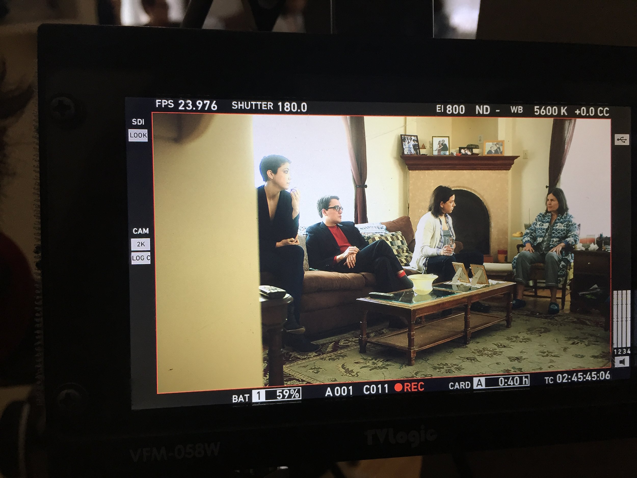
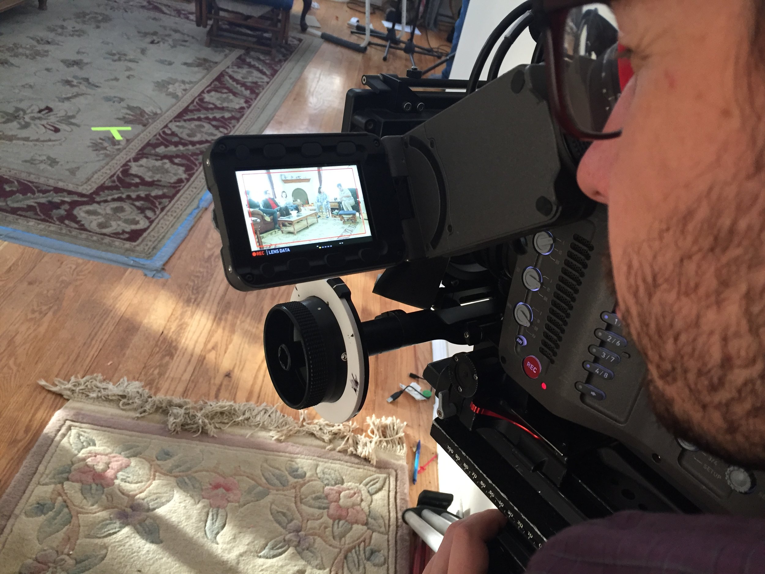
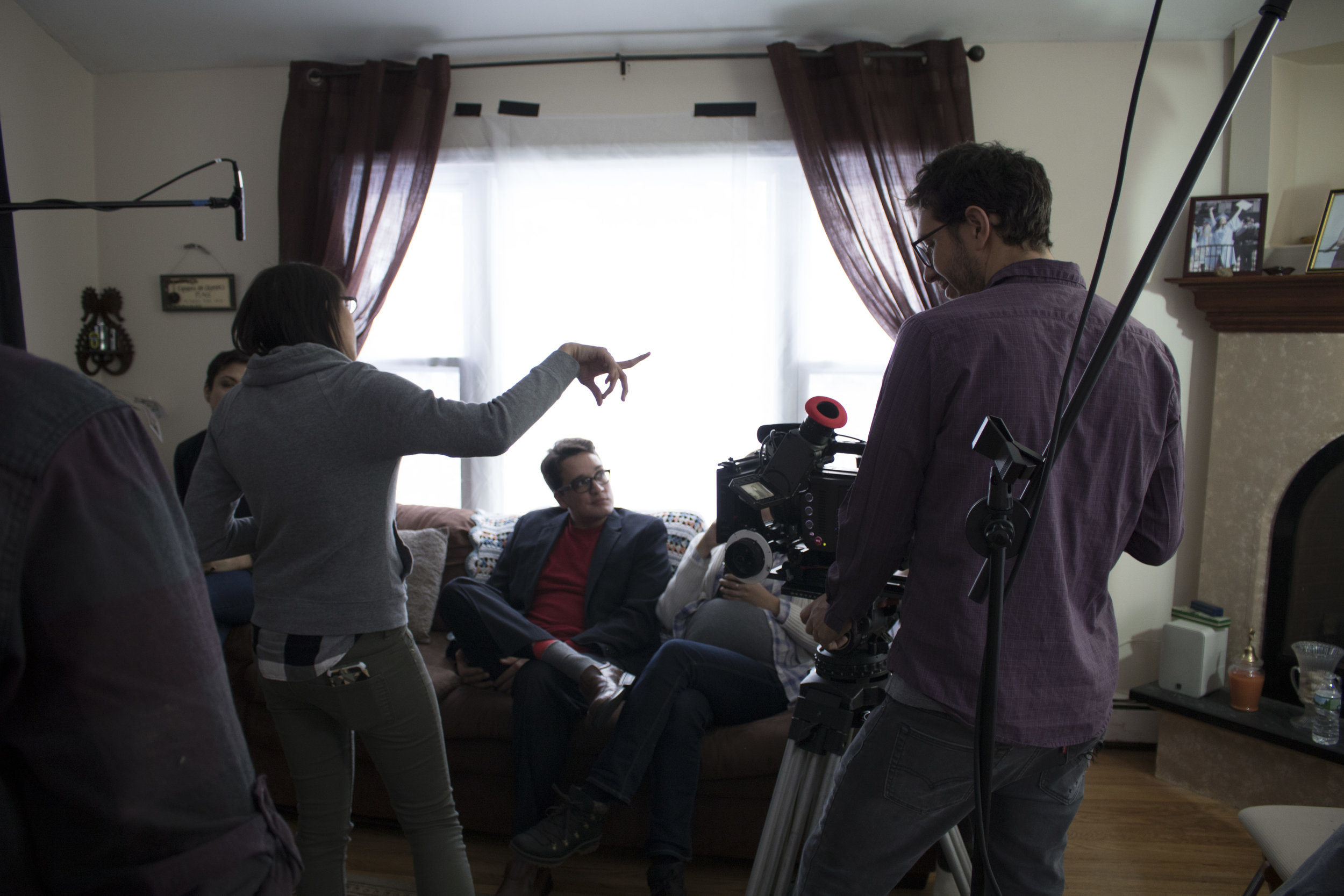
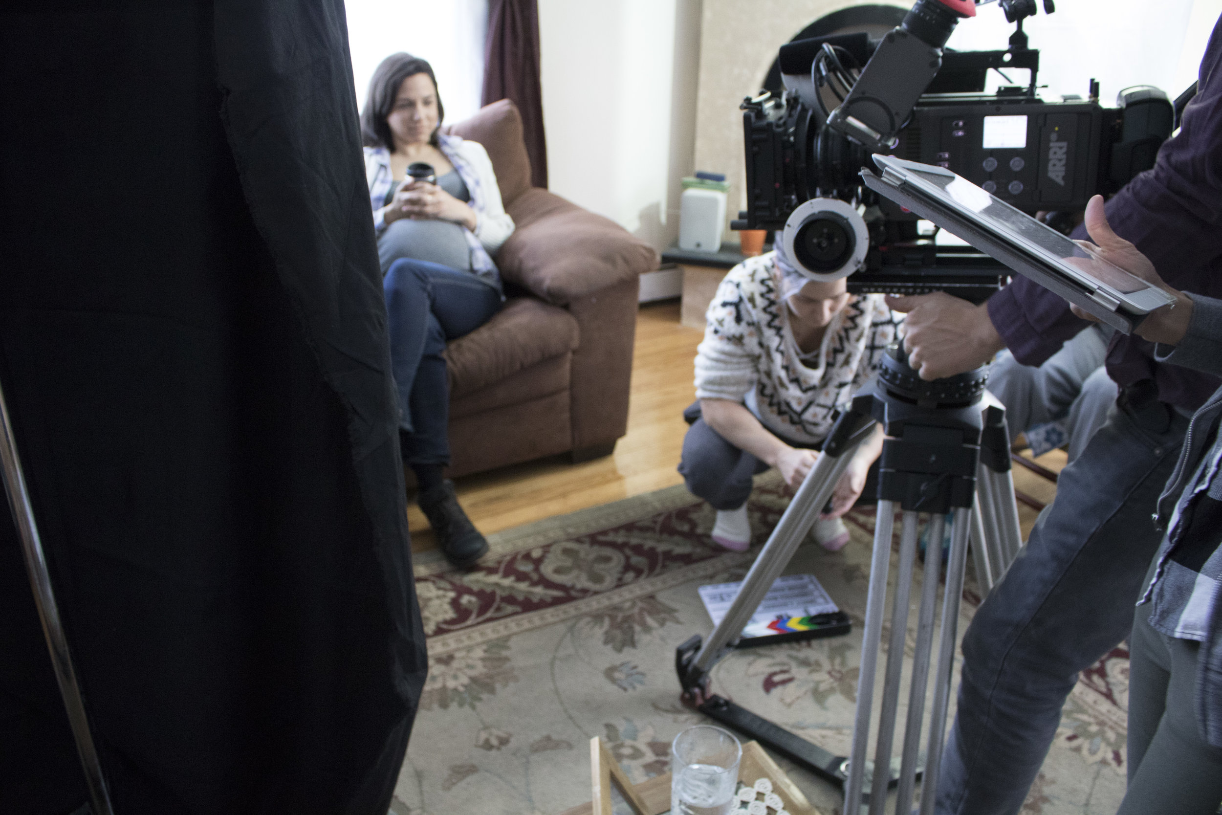
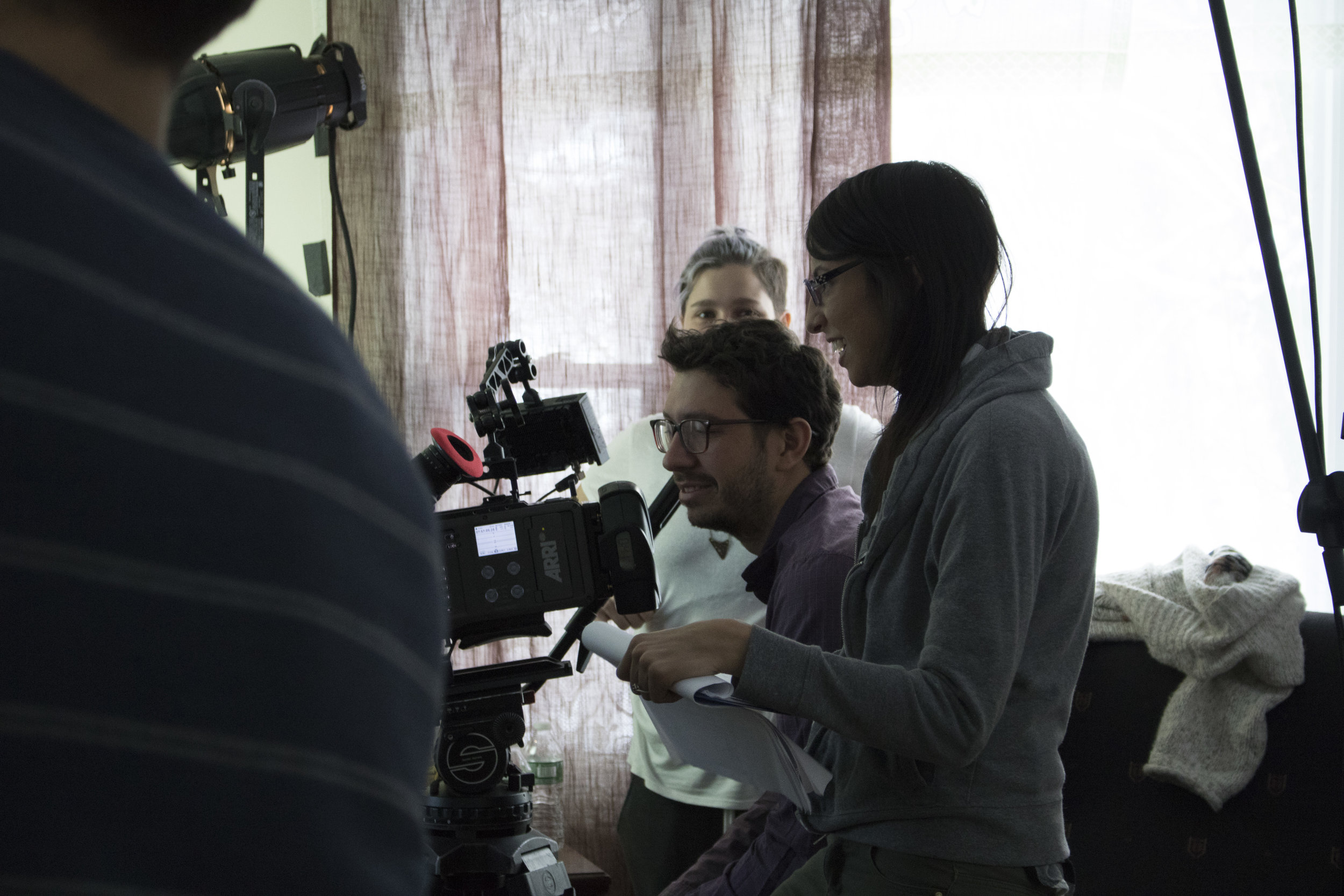
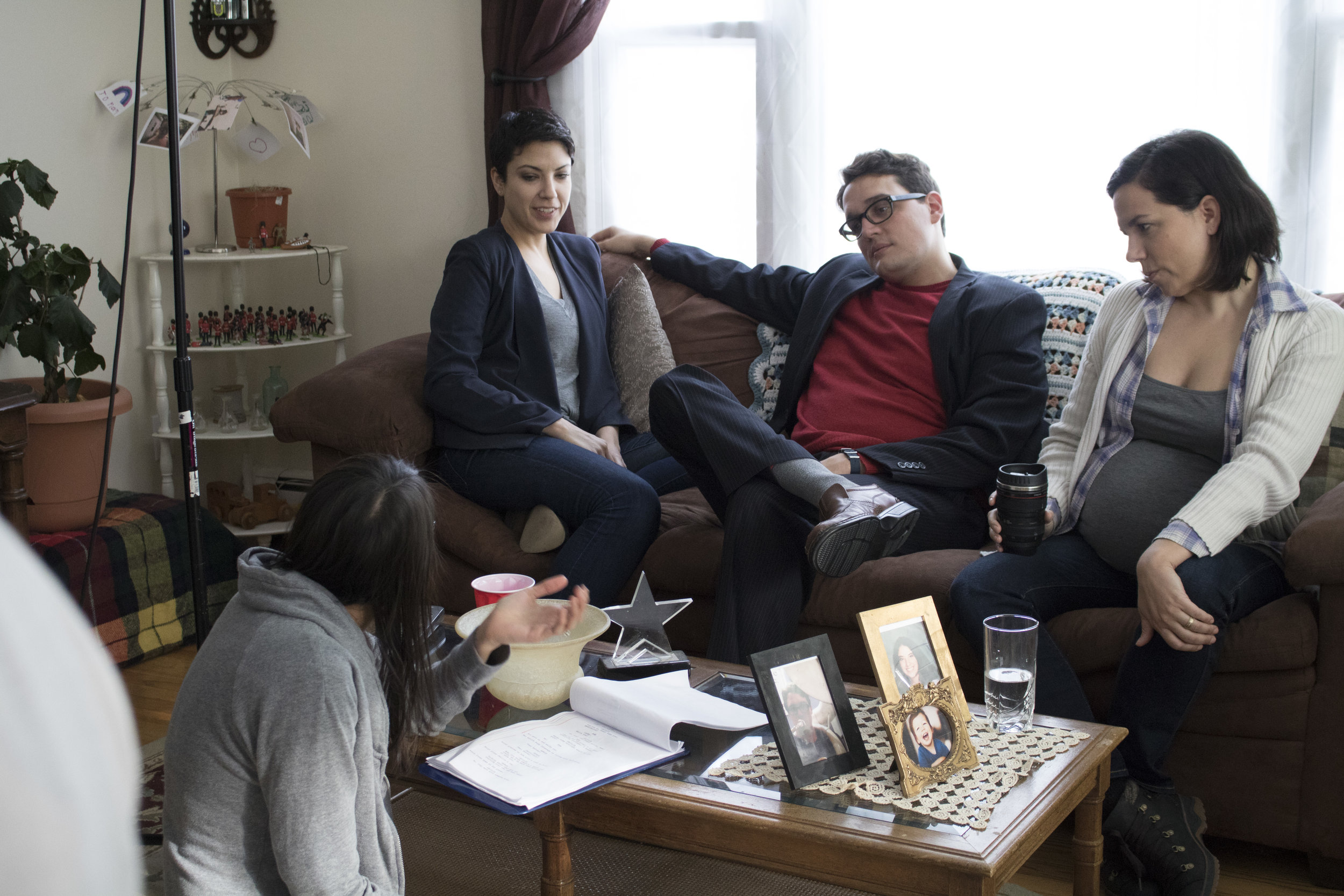
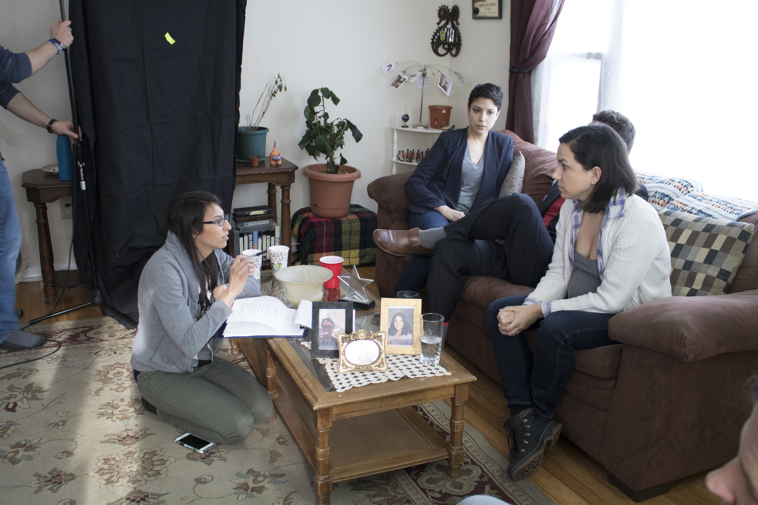
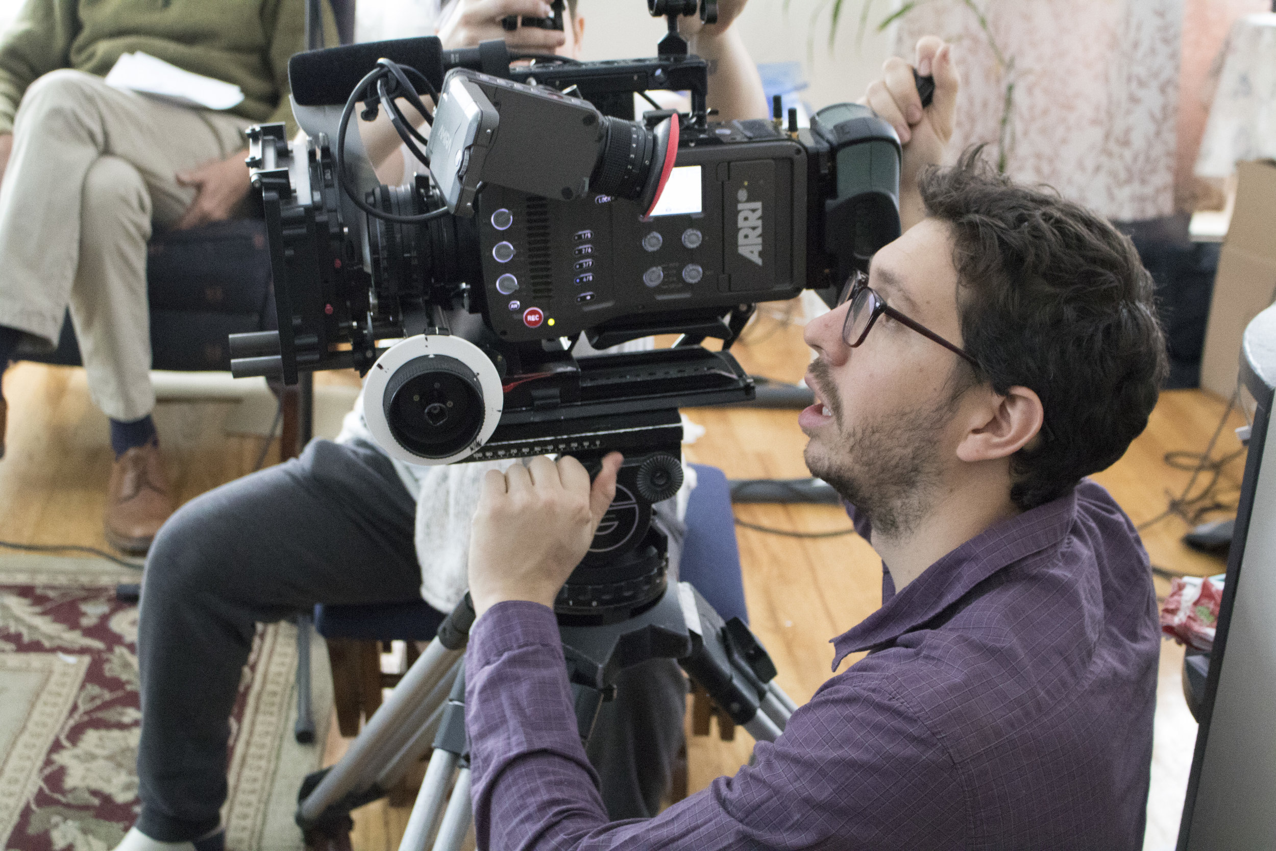
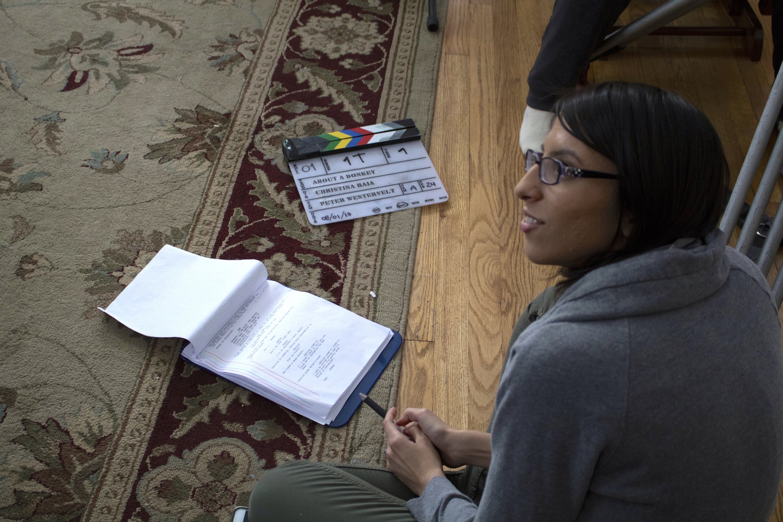
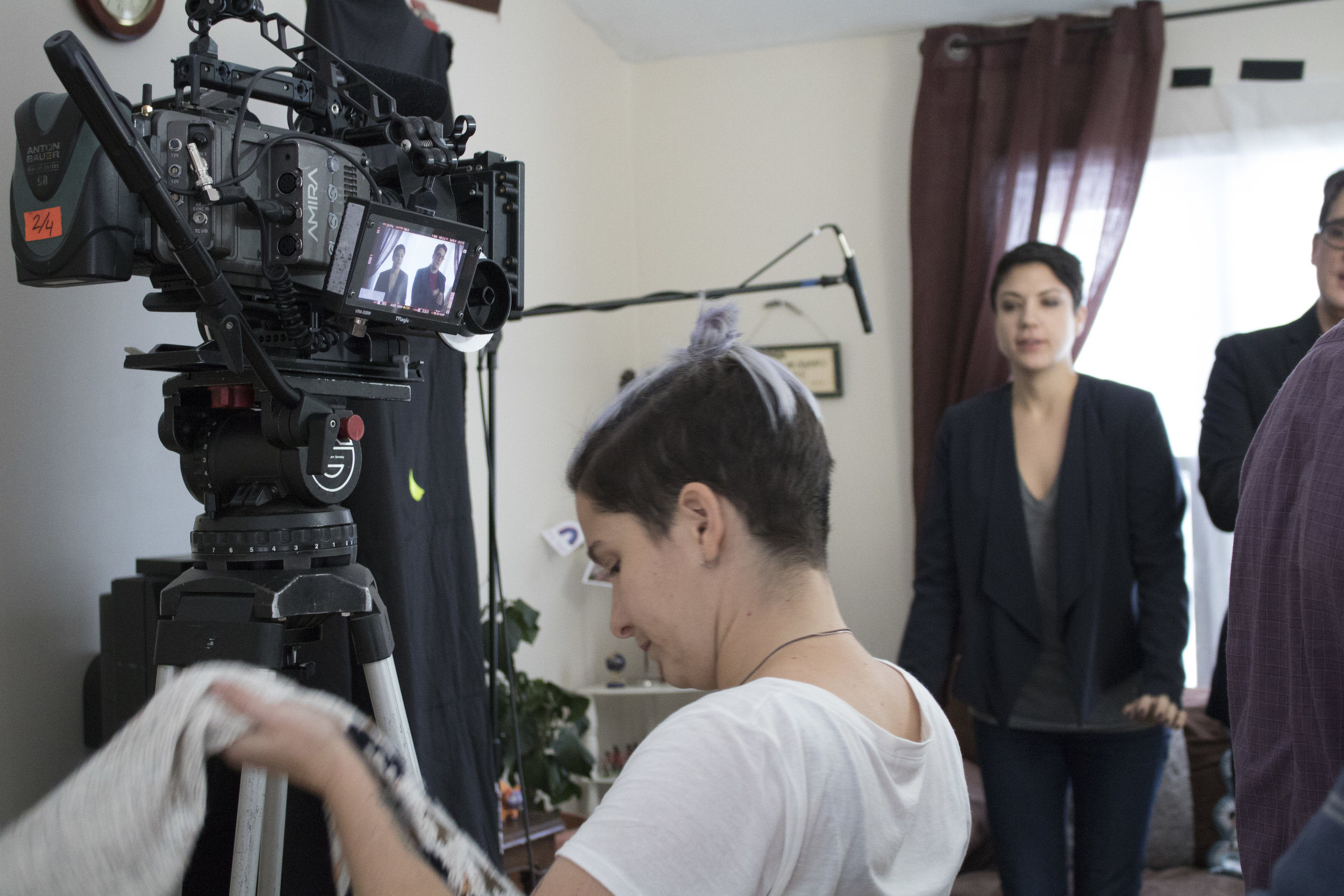
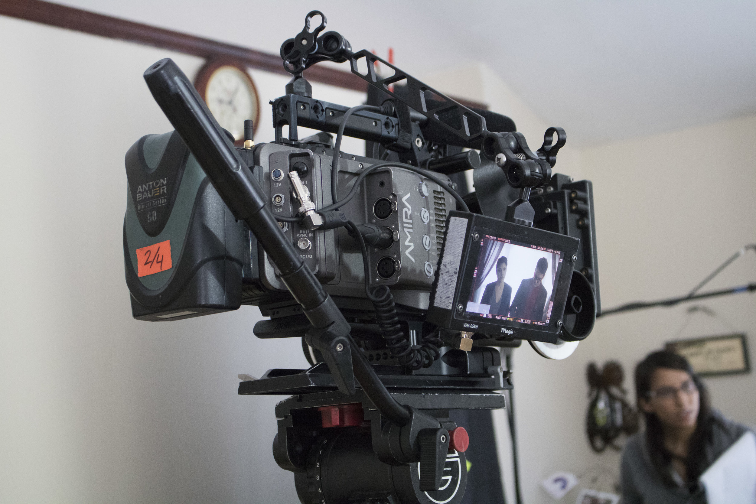
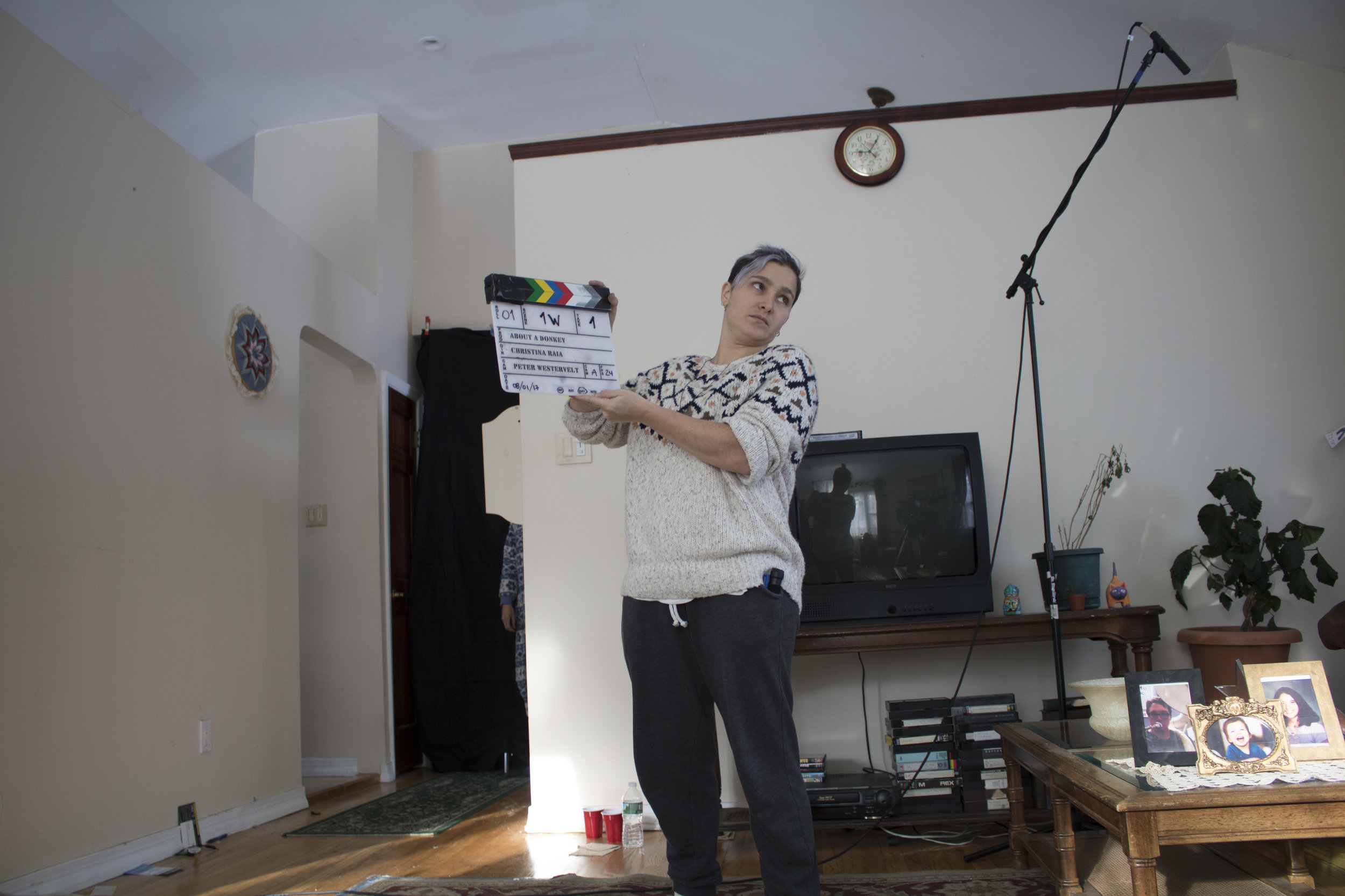
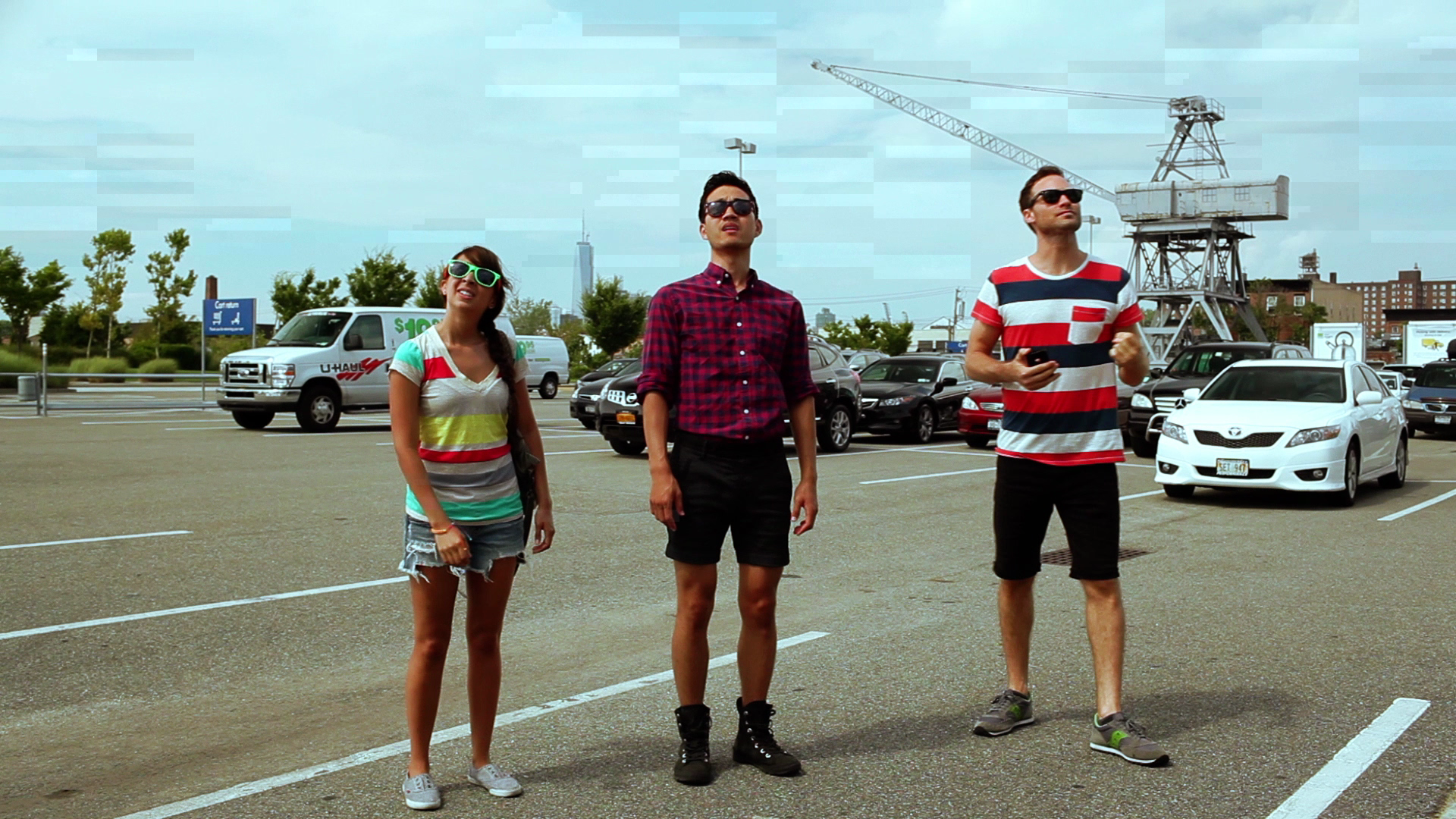
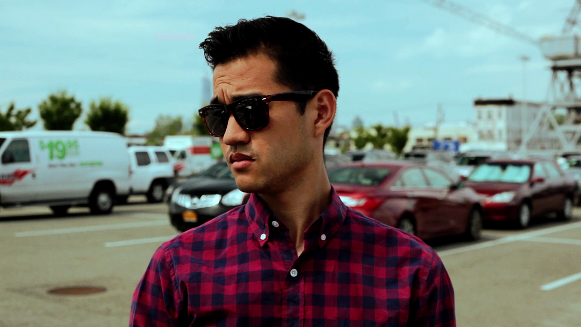
directing

A Case for Test Screenings

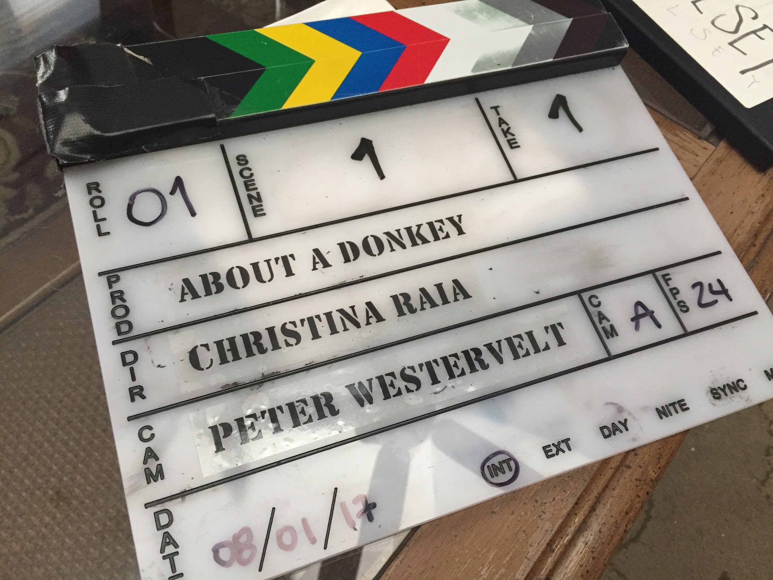
As I'm in post-production for my second feature (About a Donkey), I've been reflecting on post-production for my first (Summit). There are a lot of differences between then and now, largely related to my skill and experience as a filmmaker and the unique conditions under which each film was made. (Though there are similarities too, like who my collaborating editor is and the (lack of) budget for both projects.) But the biggest difference I've noticed is my strong desire to share the rough cut of the film with a broad audience before locking picture. 

Four years ago, I honestly didn't see the point of test screenings. I understood why people do them from an objective standpoint. But, to me, it kind of felt like pandering or like it would just result in a bunch annoying comments about what was yet to be finished with the film. I did show it to a few people, of course -- those who worked on the project or very few other filmmakers whose opinions I trusted. But I felt that getting audience opinions wouldn't mean anything because I had a vision (and a limited budget that left limited options) and I didn't need outward input clouding my perspective. But I later realized that my aversion to showing it to a wider audience was more rooted in insecurity than practicality. Part of my desire to keep objective eyes off the film was because I knew a lot didn't go as planned in production, and I wanted to maintain a bit of a bubble around it so that I would feel compelled to finish it and deliver on what I had promised people. I suppose I feared that getting enough potentially lukewarm reactions would be discouraging in a way that would rob me of my motivation. (It's important to note that due to budget constraints, we had only 3 people working on the film in post-production (one person even did everything in terms of sound, including the score), around full-time jobs. The film was in post for a year and a half.)

That decision not to share (through not only picture lock but also through color grading and sound mixing) was a mistake, though. After my experience of screening Summit for an audience, I slowly started to see the value of test screenings. I may have been keeping it under wraps because of the big things I couldn't change. But when I screened it for an audience, I would cringe realizing there were little things I could've changed if I had just shared it and seen how they were interpreted. (I'm including a list of some of those things at the bottom of this post, if you're interested.)

As a director, it's definitely important to have a vision and follow your gut, but we're making films for an audience because we want to share a story that presumably is meant to say or affect something. So, while it's just as important to make choices and feel confident in those choices, I believe you should also make sure that what you're trying to say translates to your audience. I find it interesting that we workshop our screenplays like crazy, but there's this kind of auteur arrogance about the final directed product. Since I started running IndieWorks (which I started after I made Summit), I've realized this more and more. I often see films that are so obviously too long or contain shots or moments that are independently beautiful but don't serve, and sometimes even detract from, the story. And I often say to my programming colleagues, if only someone had told them before they locked picture -- or maybe, if only they had asked and been open to that kind of feedback. Sometimes films are so personal or the choices made all the way back in the screenwriting process have been with you for so long, that you simply need someone to help you see through fresh eyes. And from my own experience and what I see daily screening submissions, I wish more directors were as collaborative in the post process as they are building up to it. (Side note, test screenings and cultivating a broader, more informed perspective on your work before you lock it are especially pertinent if you are not an individual of a marginalized group of people but are (rightfully) choosing to be inclusive in your work. You'll want to run your depiction and choices by individuals who do identify with your portrayal to make sure you're capturing authenticity and empowering voices rather than perpetuating stereotypes.)

In my more recent work, I've been much more open to feedback during post-production. I believe I've always been a collaborative director, both in pre-production and on set. But I feel I would often go into the edit married to what I originally wanted it to be rather than letting it become something new. Even when working with other editors (which I mostly do), I was still fairly tied to the script or the modifications made to it on set.

However, my last two shorts, I edited myself. And ironically, I've always said I prefer not editing my own stuff so that I could have a fresh perspective on performances and pacing; but it was through editing my own work, specifically my latest short "Enough," that I realized I really needed to deviate from my own script. After playing around with options and feeling like some things weren't translating when all assembled together, I eagerly started showing rough cuts to people -- people I trust but still people outside my usual small circle and more in my target audience. I checked my ego and actually relished in hearing interpretations, even when they weren't my intention. Though I didn't end up following every piece of advice, I took it all in and allowed it to affect the way I see the film. I earned a stronger perspective on what I wanted the end product to be. In fact, hearing from a diverse grouping of people confirmed some things I had been feeling; I gained the confidence to throw out an entire sequence from the script that we had shot. Originally, the film was meant to cross cut between three characters before they are brought together. Instead, I had it cross cut between two before shifting the narrative to the third. The substance and purpose are still there, but the execution has changed for the better.

Between this latest experience and the rewatching of some older work with an audience recently, I've grown to fully accept that, generally speaking, the film that was on the page simply will not be the film that is edited, which will also likely differ from the film that was shot. Even when it's a writer/director, or in my case, writer/director/producer/editor, the vision and execution will and should change along the way. I now embrace this process and appreciate how the viewer's experience informs the work. This shift in perspective and willingness to be more vulnerable and less precious has been beneficial and helped me grow as a filmmaker -- which for me is the goal, to always be growing and becoming a better, more effective visual storyteller. 

We're only in the very beginning of post-production for About a Donkey, but I'm already looking forward to and planning our first test screening. In this first rough pass, I'm making the choices I feel are right to convey and elicit what I'm going for. But I'm also keeping flexibility in mind. I'm looking forward to asking an audience if any given joke lands or if a line or moment feels too longwinded or abrupt for the subtext underneath. I really just can't wait to consume diverse experiences of the film to make sure it's as strong as possible while accomplishing what my collaborators and I want it to. I'll, of course, keep my vision and preferences in mind, but I'll also listen and be open to finding creative ways that could possibly better execute that vision.

-Christina 


Some of my observations after releasing Summit, many of which I could've realized from test screenings before release:

I'm gonna spoil my film a bit here, so skip this whole section if you have any intention of watching.

  • A moment that pains me every time I watch the film (which is lately never unless I have to for some deliverable reason or if it's screening and I need to attend), is one in which a character is insanely searching the house for someone or some evidence of someone after the death of one of the characters. His character insists someone is in the house and then storms off ripping the place apart. The last thing he checks is a dresser, pulling out all the drawers before slamming his fists on it in frustration. There were lines scripted immediately after that, that referred to there being no one and no clues in the house. The actor dropped the section of the line about clues (this was a particularly stressful production day for everyone and we all struggled and had to make creative sacrifices). In post, I was so concerned with the technical things wrong with the scene and also certain aspects I felt were lacking performance-wise which I was trying to fix in nuanced ways, that I overlooked a very logical flaw. I assumed (really hoped) people would infer that he was mad with grief and just searching for any minuscule sign of someone hiding in the house. But when the film first screened in front of an audience, many people in the audience laughed when he was looking through the drawers. (A viewer from a later screening specifically tweeted about my movie and mocked "stupid characters in a horror movie searching for people in tiny dresser drawers.") In hindsight, yeah, if you're not onboard with his crazy erratic behavior, if you're not going along with his grief, if you're a skeptical viewer, or even just a super logical one, it is pretty silly that he says he believes a killer is hiding in the house and then searches in spots only mice could fit. A test screening would have allowed me to see the way it was perceived and found a way to cut it or cut around it. I was too married to the intention and didn't have the distance to have an objective perspective on the execution.

  • There are two POVs in my film, one when a character goes to pee in the woods and gets spooked by hearing cracking branches around her, and one when two characters have sex and are being watched by someone unseen. I was definitely playing with the POV trope as alluding to the killer in horror films. The first POV scene was, in hindsight for the viewer, meant to be symbolic of said character cracking in her own mind -- like her need to consume & kill was coming back even though she was trying to suppress it. But, after screening it for an audience, I realized that literally no one got that symbolism. I was trying to ground it in reality with a certain hint of surrealism. But it blended too much with reality for anyone to read into it. It apparently just read as a weird (possibly poorly directed) moment, not as a clue. I wish I had known that while there was still time to heighten it. And then the second POV, very few people interpreted it as a POV at all. There was no heavy breathing, maybe the camera wasn't shaky enough, maybe the audience just wasn't expecting for the film to go in that direction. I don't know because I didn't get a sampling of feelings. It's very possible I would have kept it as ambiguous even if I got feedback that stated it wasn't translating as a POV, but I still would've loved to know how that moment was being interpreted just for the context of the choice I was making before I locked that choice.

  • There are lines in the film that directly reference obscure horror movies and pretty much tell you who the killer is while still making sense in the context of the conversation. Only hardcore horror fans ever picked up on those. I was definitely playing with a lot of references in the film, trying to achieve the duality of being enjoyable for horror fans and non-horror fans alike. But I never did see how the film played and was interpreted differently by those different targets until it was done and out there. In post, I was always unsure of whether or not the clues to what the film was really about were too subtle or not subtle enough. I was making a lot of choices while attempting to look at the film as if I didn't know what the twist was to see if I was treading the line effectively. But I could've answered my questions if I had been less precious about protecting the twists and my choices and, ultimately, my ego.

  • And beyond the horror clues, a unifying factor of viewing the film was definitely supposed to be the commentary. There's stuff embedded in it regarding gender and race tropes in horror films as a reflection of gender and race expectations in real life. I was also going for a bunch of subtle commentary on how people use each other in relationships (romantic and platonic) to validate or appease ourselves. I found that while some other filmmakers and a more analytical subset of my audience got the the general commentary, most viewers did not. I had to accept that most people won't think deeply about the intention behind something when it's alluded to but not overtly stated; and while I may not necessarily care whether or not those people get it, I do want my vision to be effectively communicated and consumed. Along our festival run, I had to contemplate whether or not the film and the story worked independent from the commentary enough to encourage rewatch from people who wouldn't immediately pick up on the subtext. But this reflection of mine was long after the fact when the film was done and when there could be no revisiting of the execution. In hindsight, I feel I could have balanced it better with all that in mind. That said, there are people who enjoy it as just a slow-paced, character-driven, horrific story with no sense of the intended commentary. Some others enjoy it largely with the commentary in mind. Some just hate it, and it varies whether or not that's in spite of, in ignorance of, or because of the commentary. Some are just bored and confused by the film and wouldn't even watch long enough to notice the commentary. I accept and appreciate all those things now. But the point is, I feel I could've made stronger decisions if I had allowed them to be more informed decisions.

"About a Donkey" Second Week of Production Recap

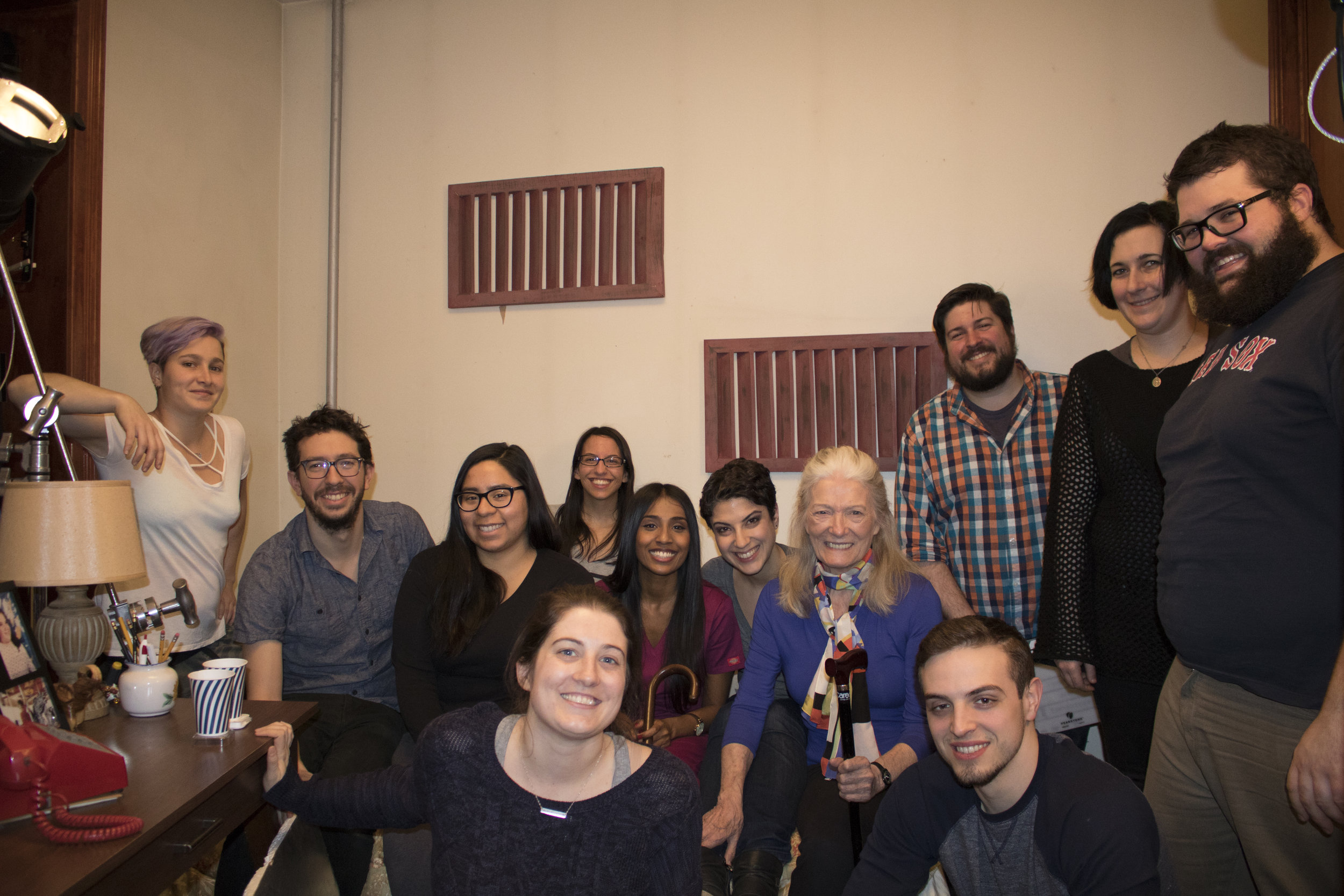
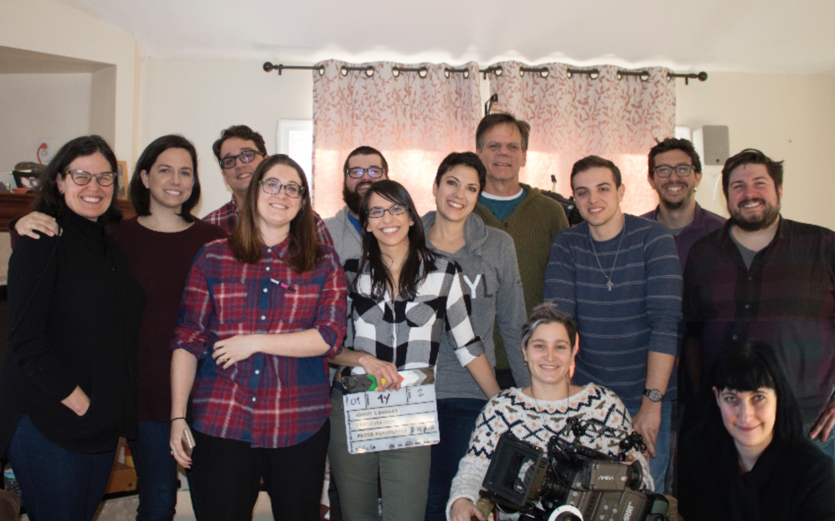
This past weekend we completed days 5 and 6 on the set of About a Donkey. We skipped Sunday because we had a film festival screening for a past project (more on that in a future update). We're so proud of and excited about what we accomplished thanks to our hardworking team!

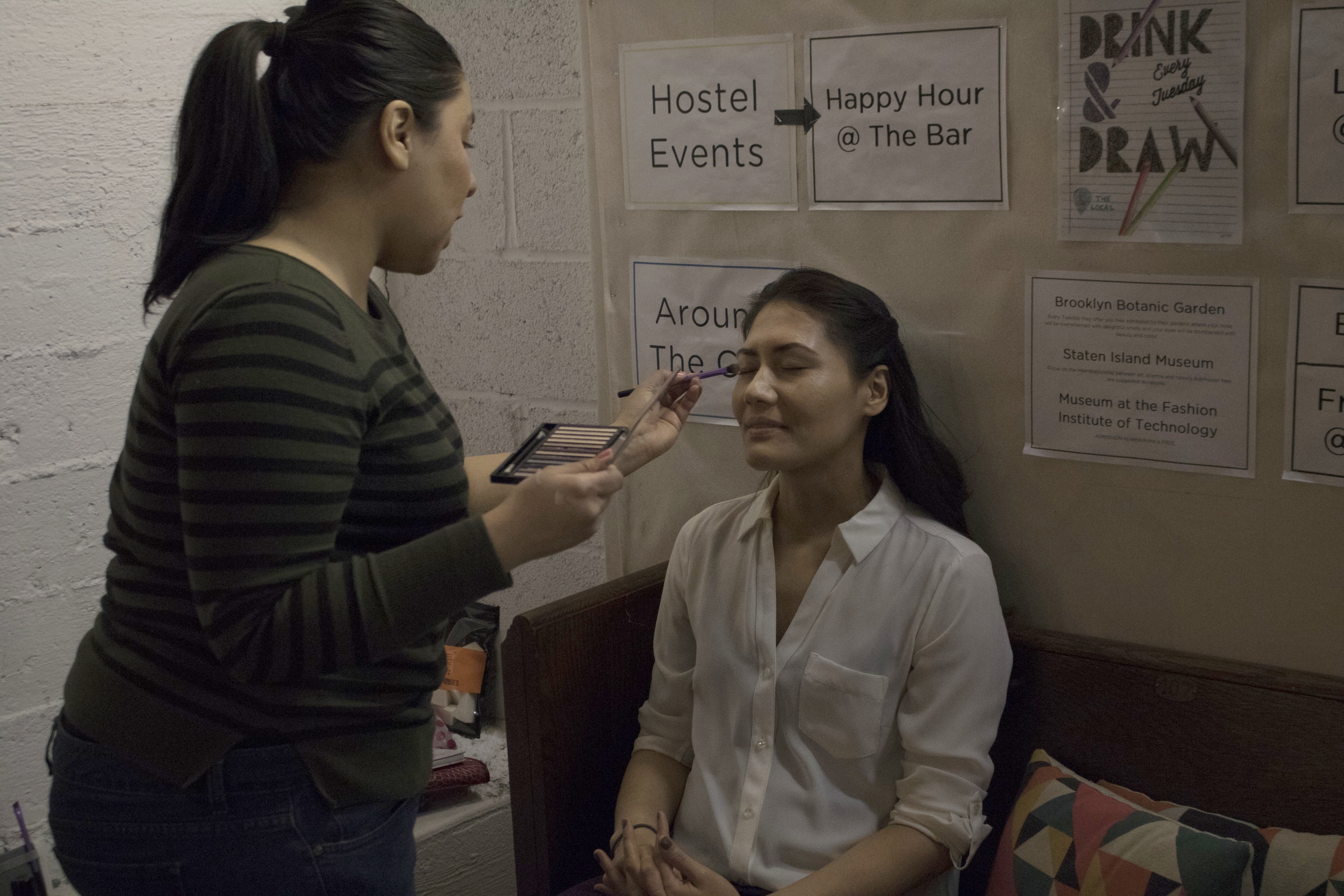
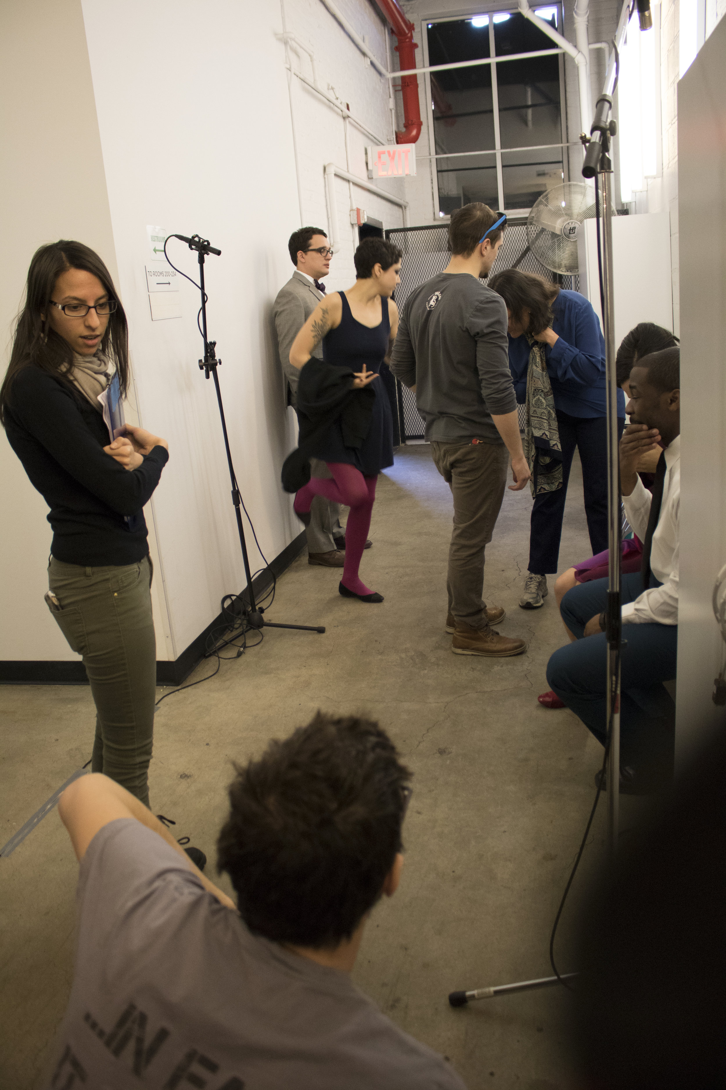
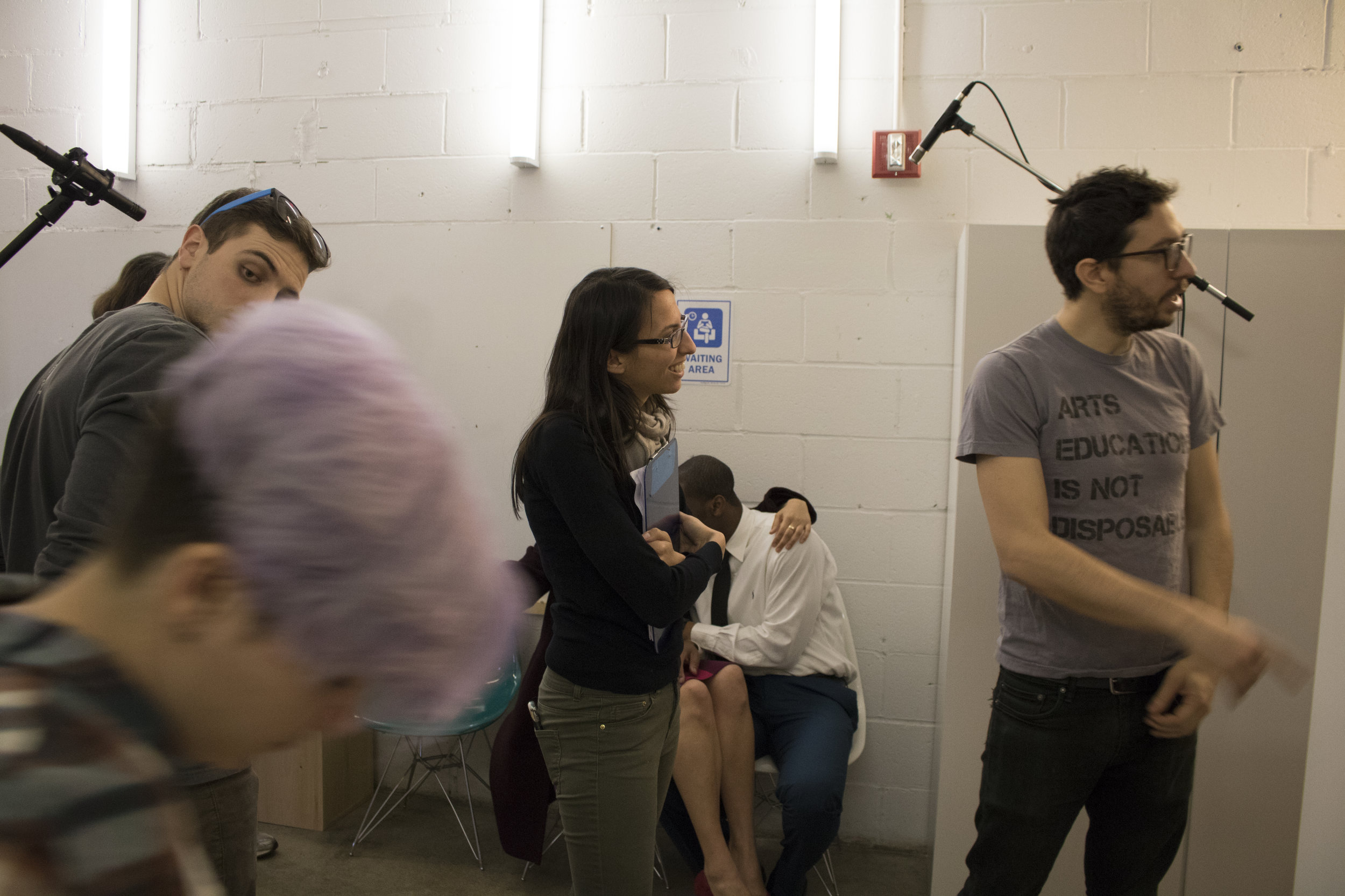
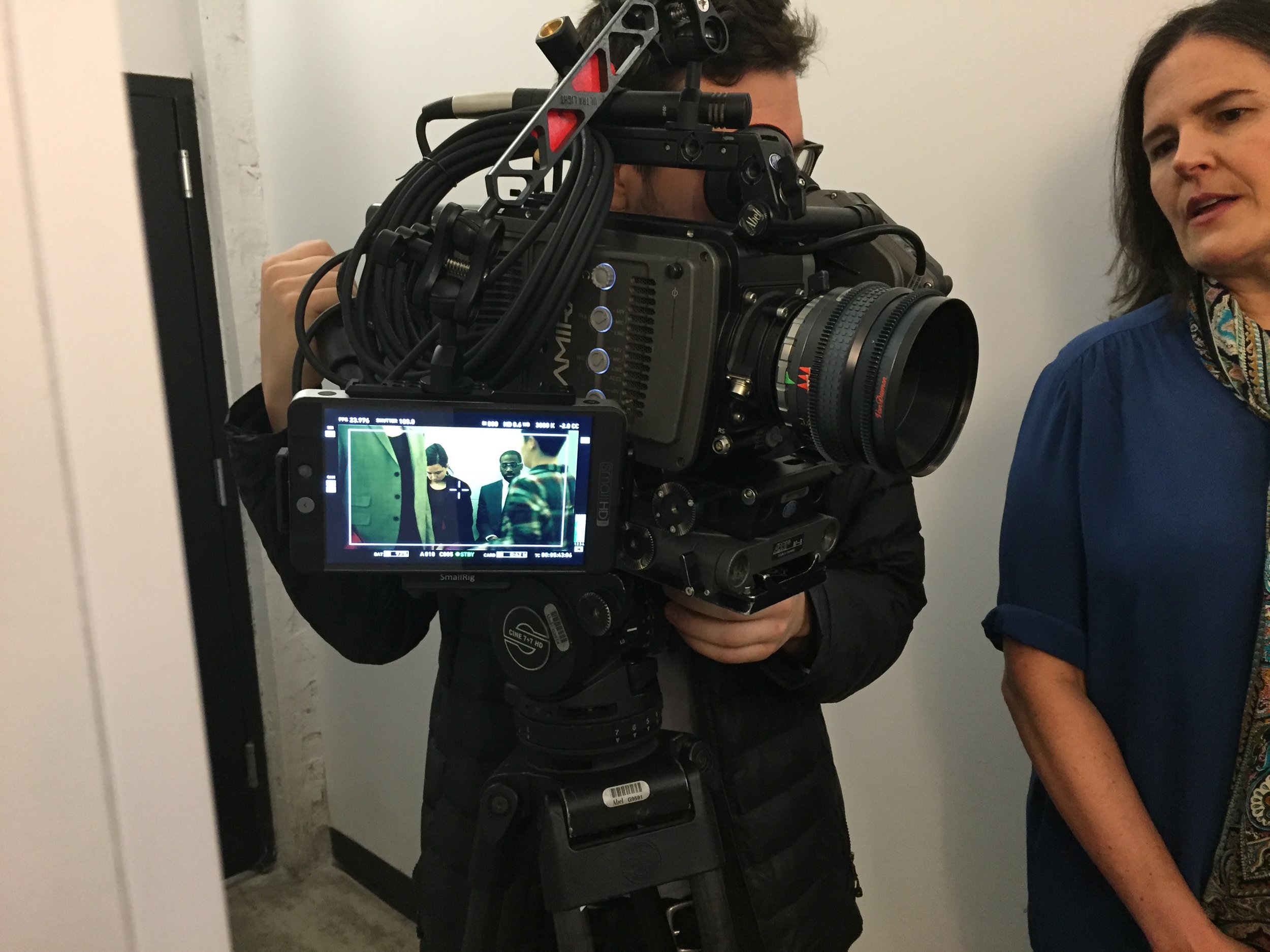
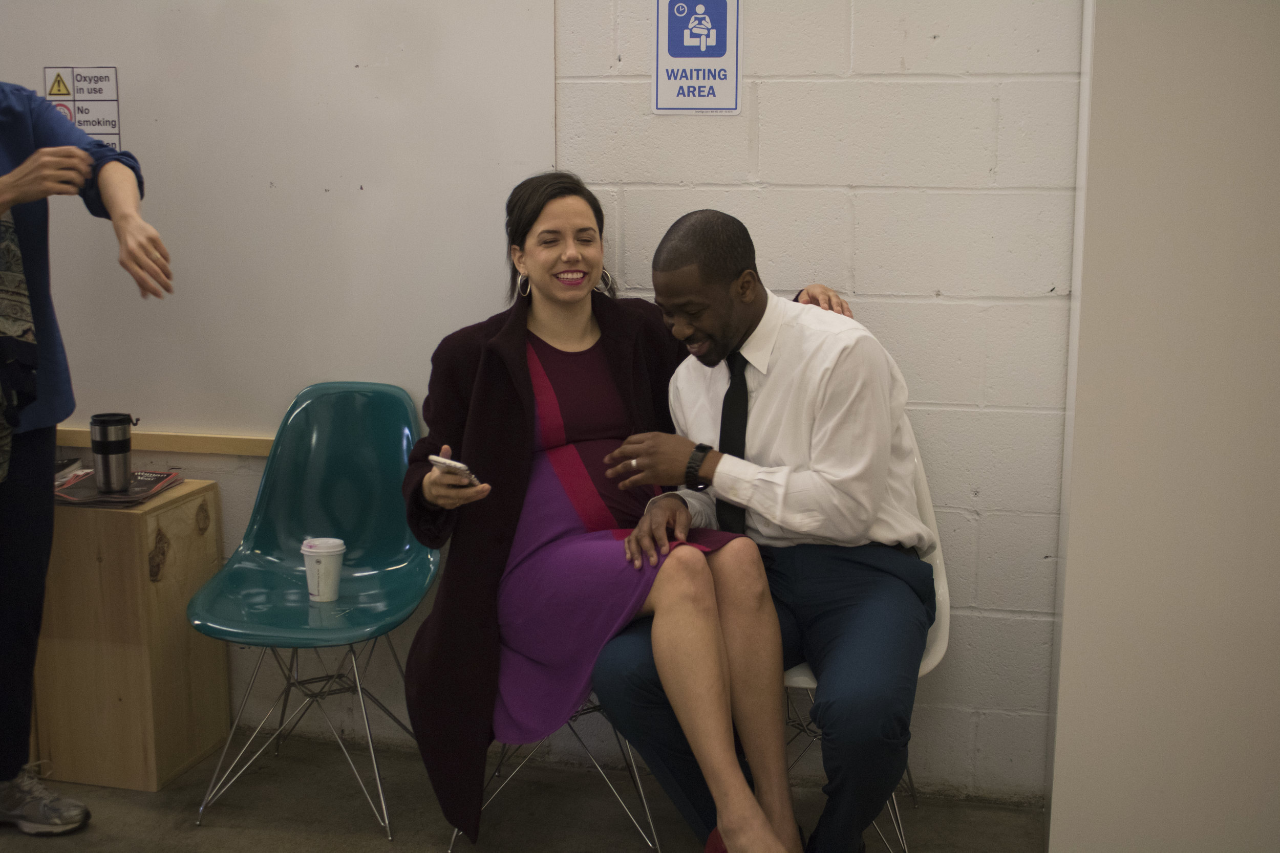
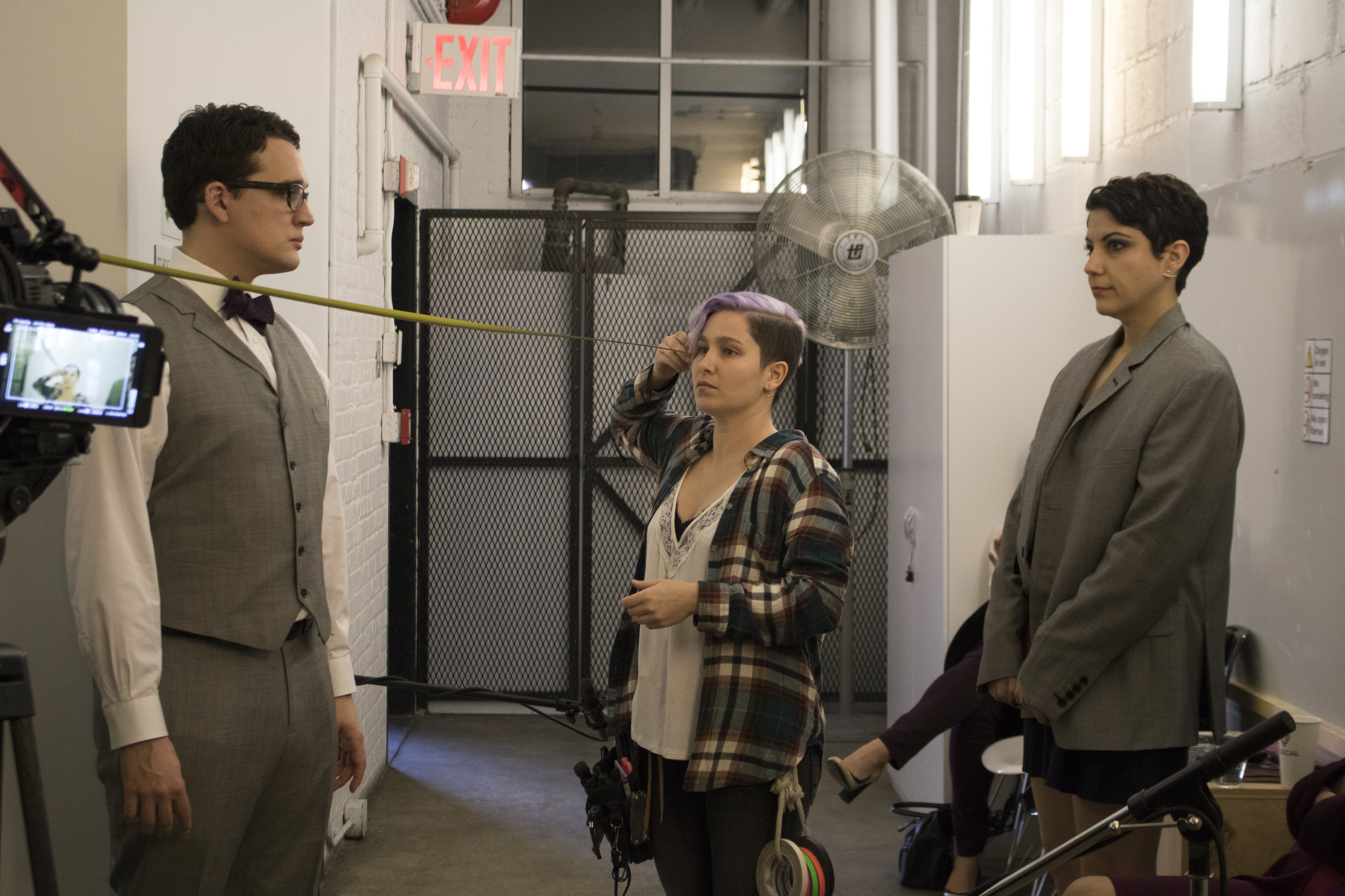
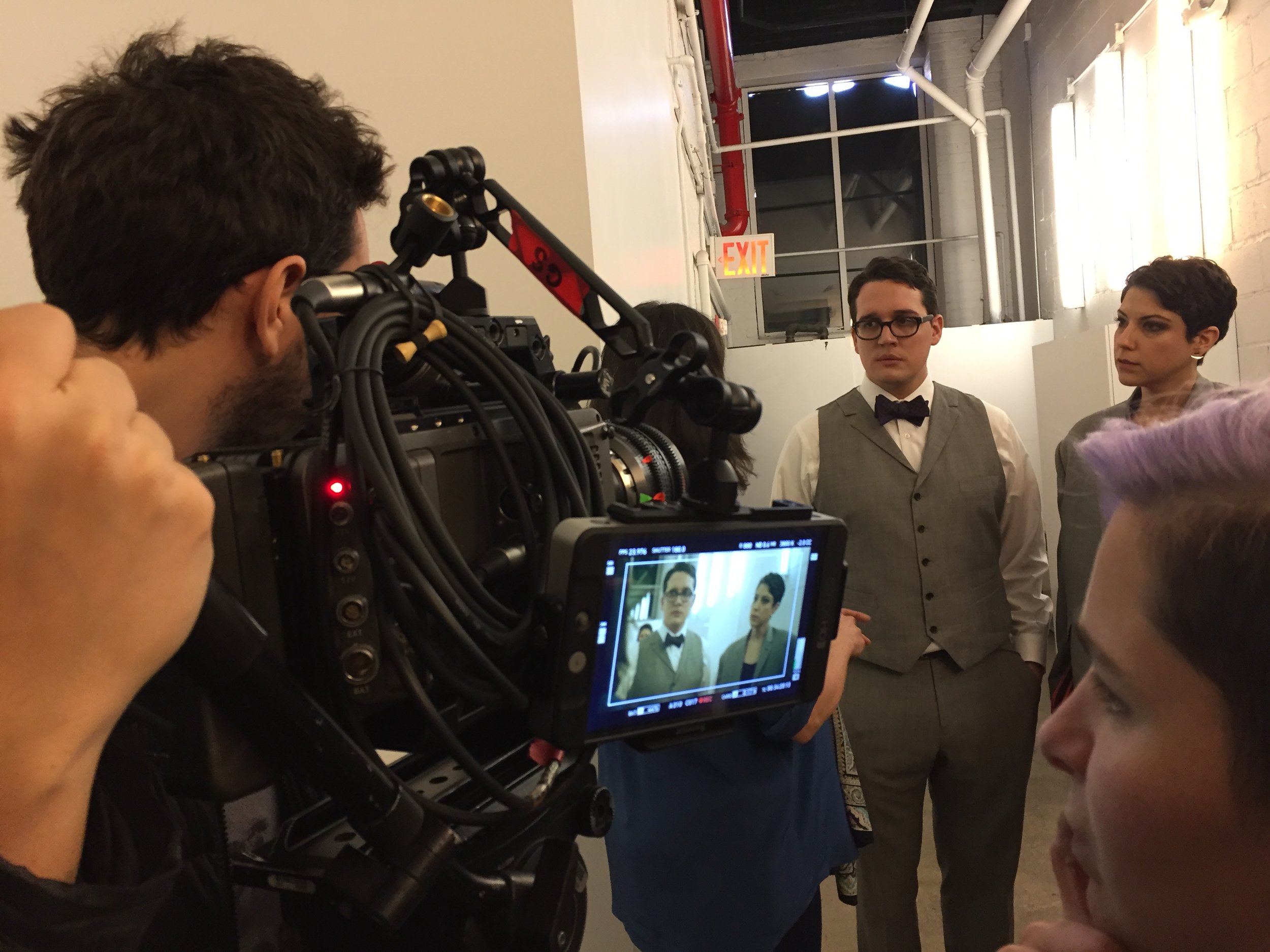
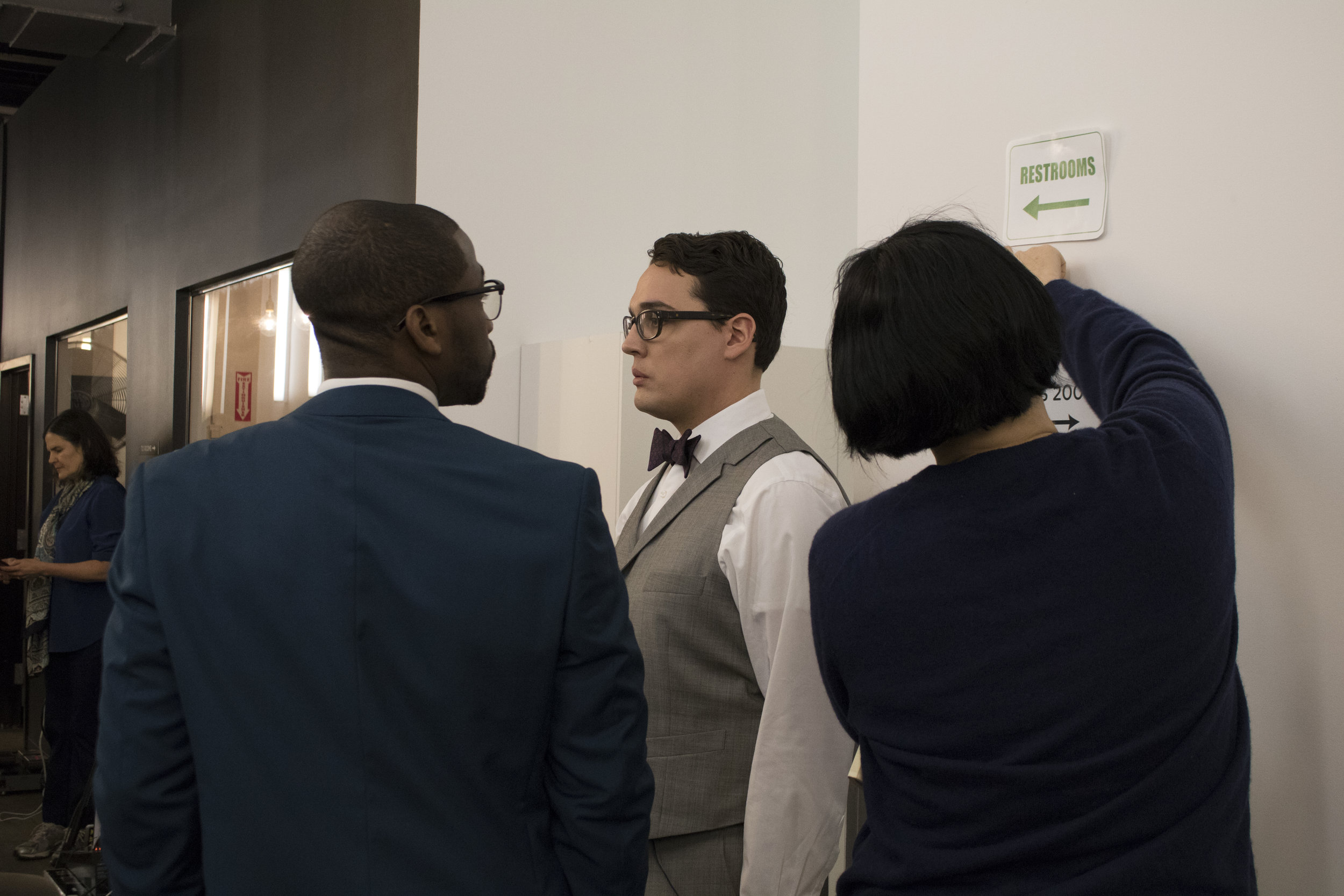
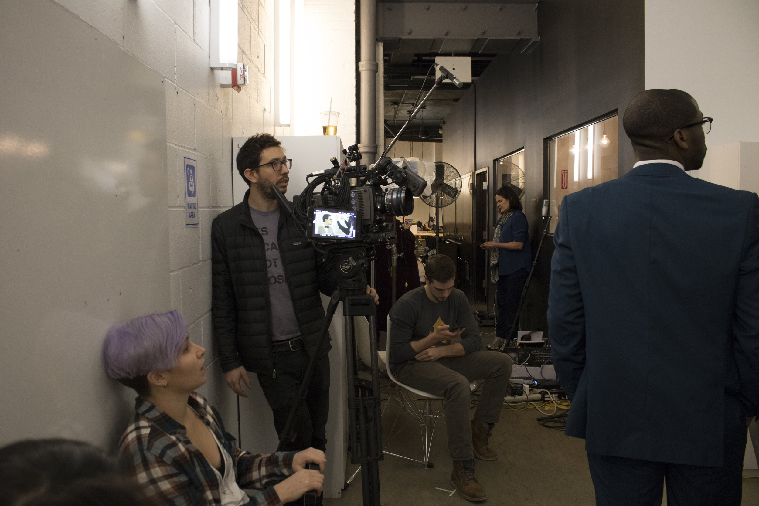
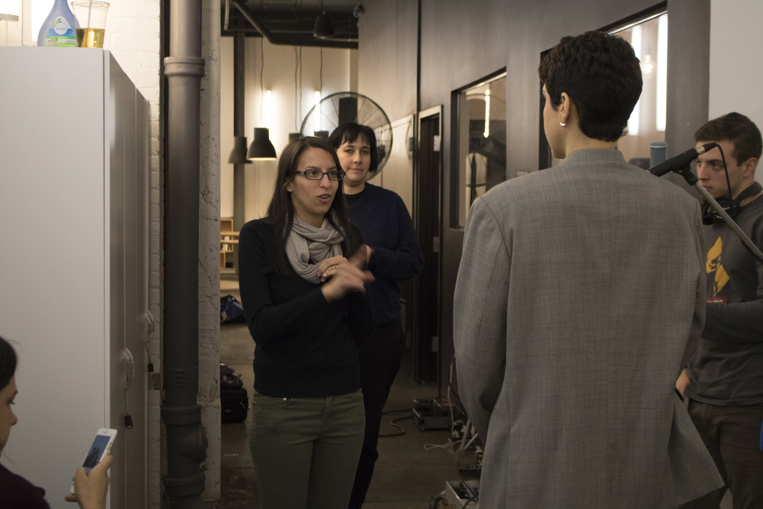
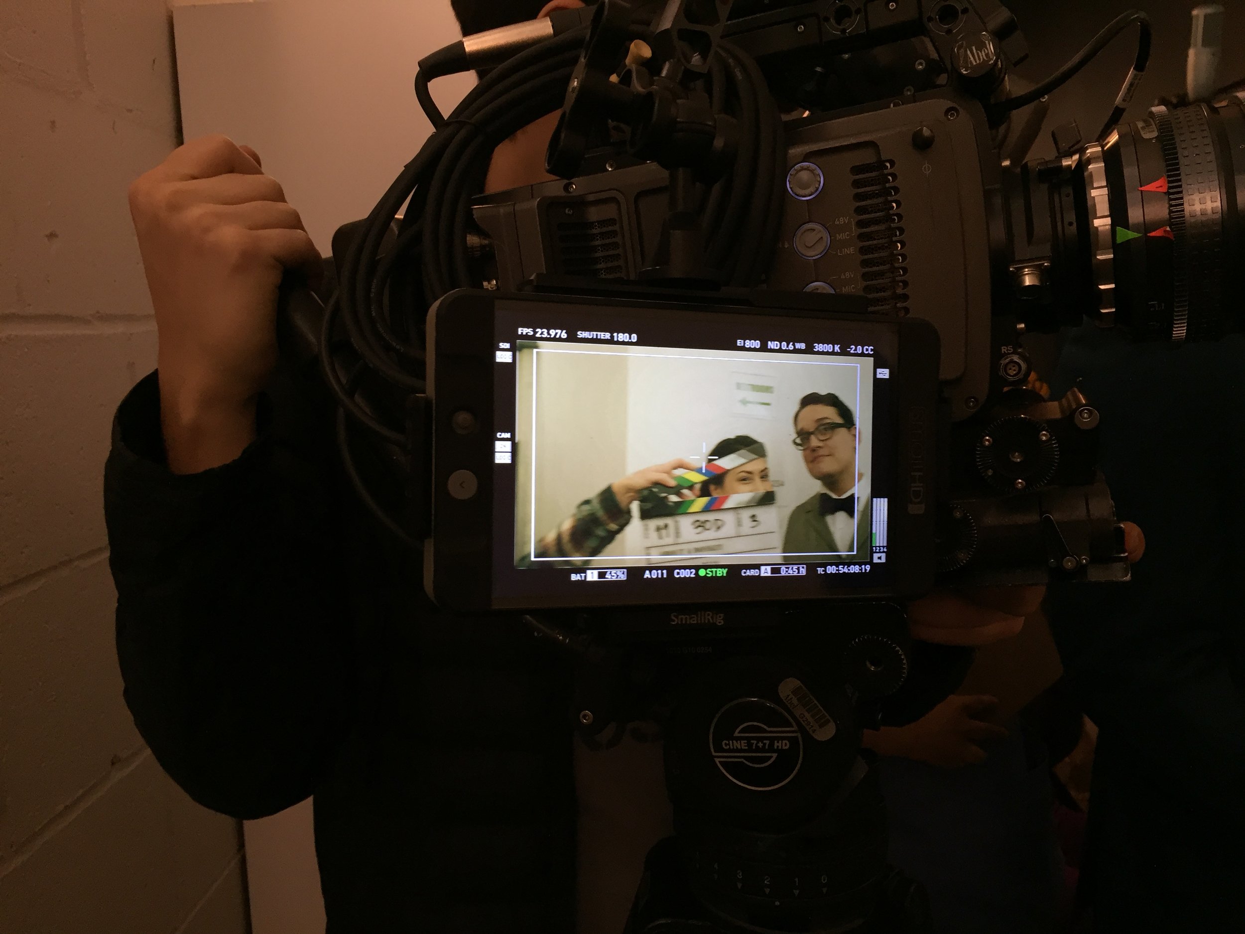
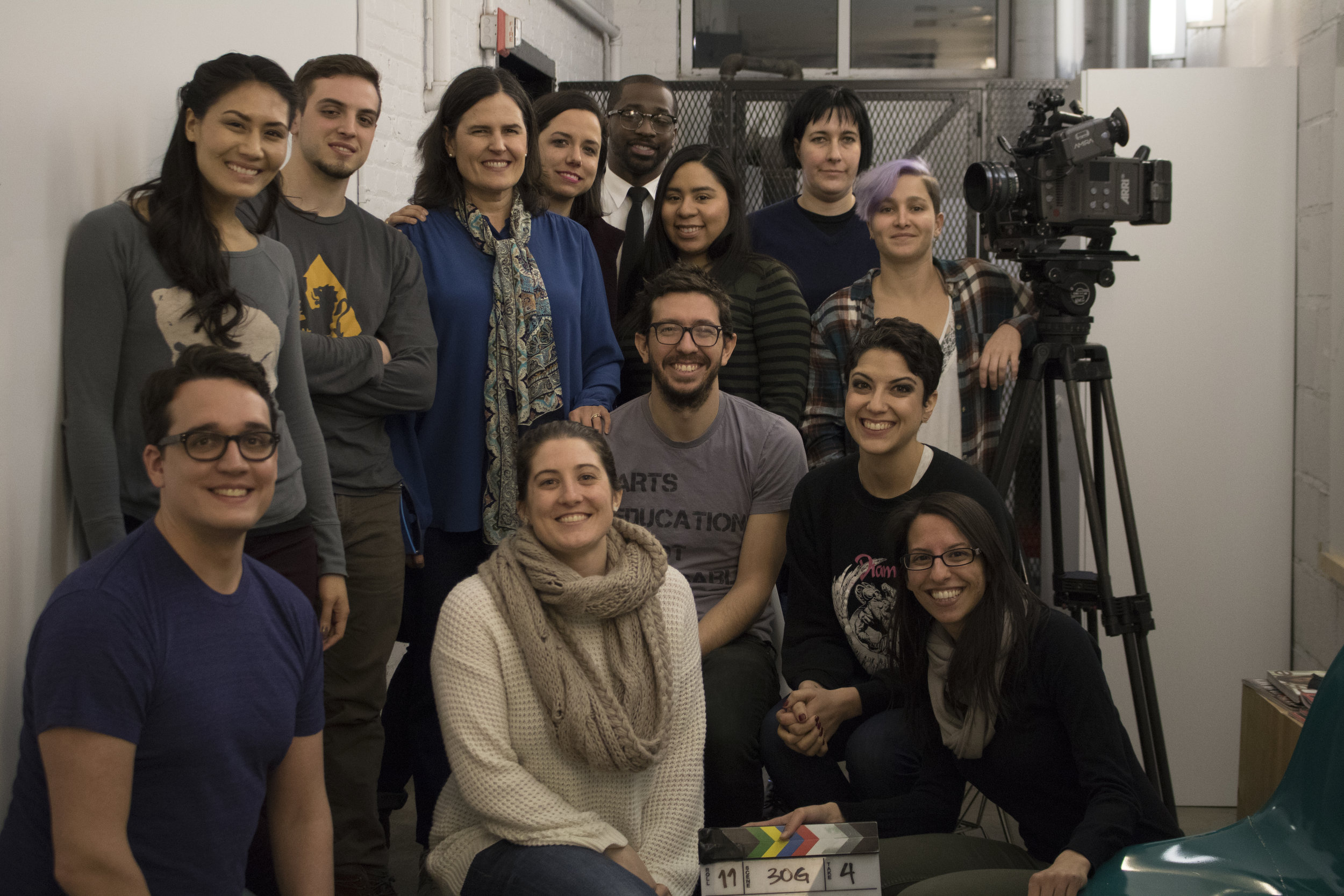
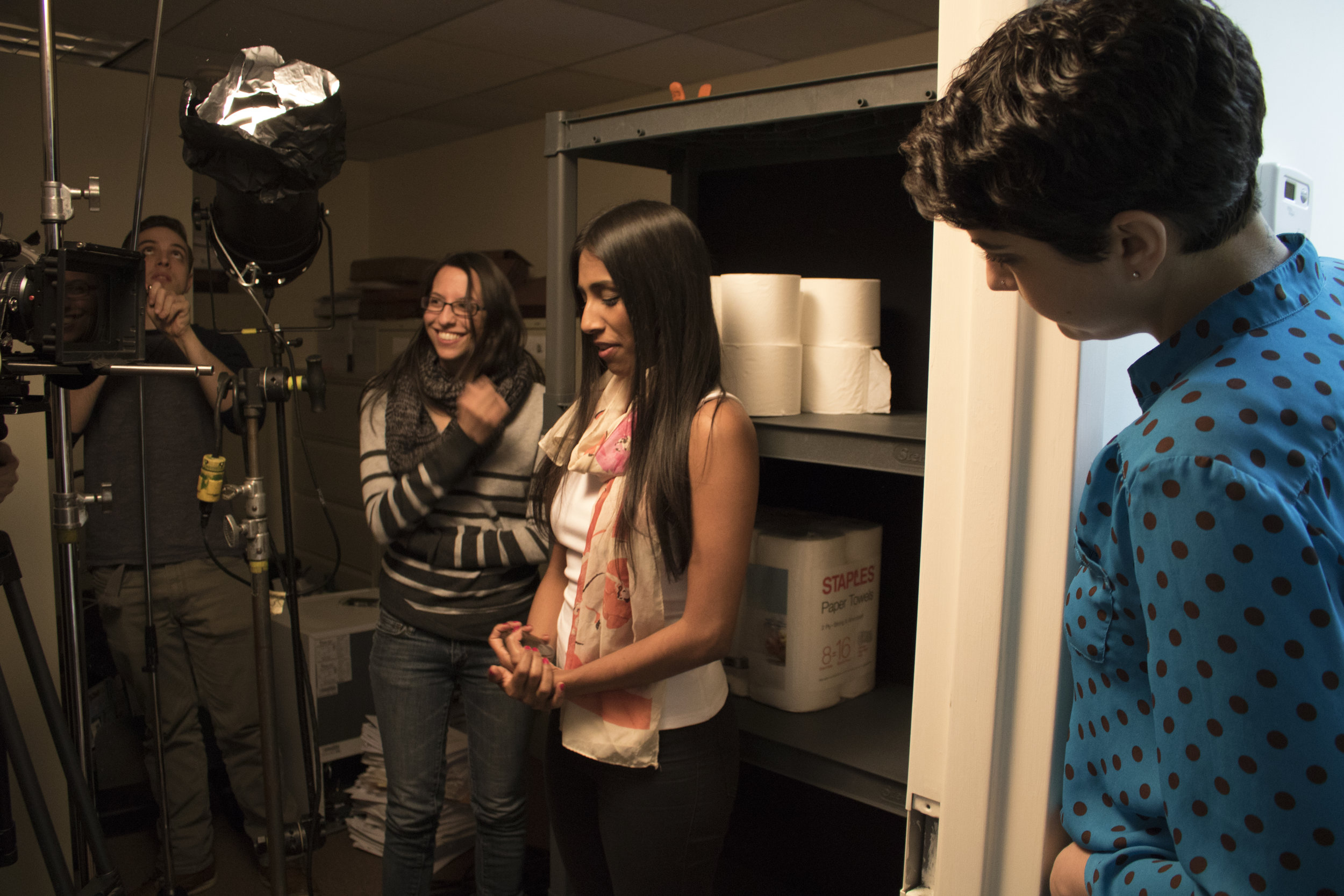
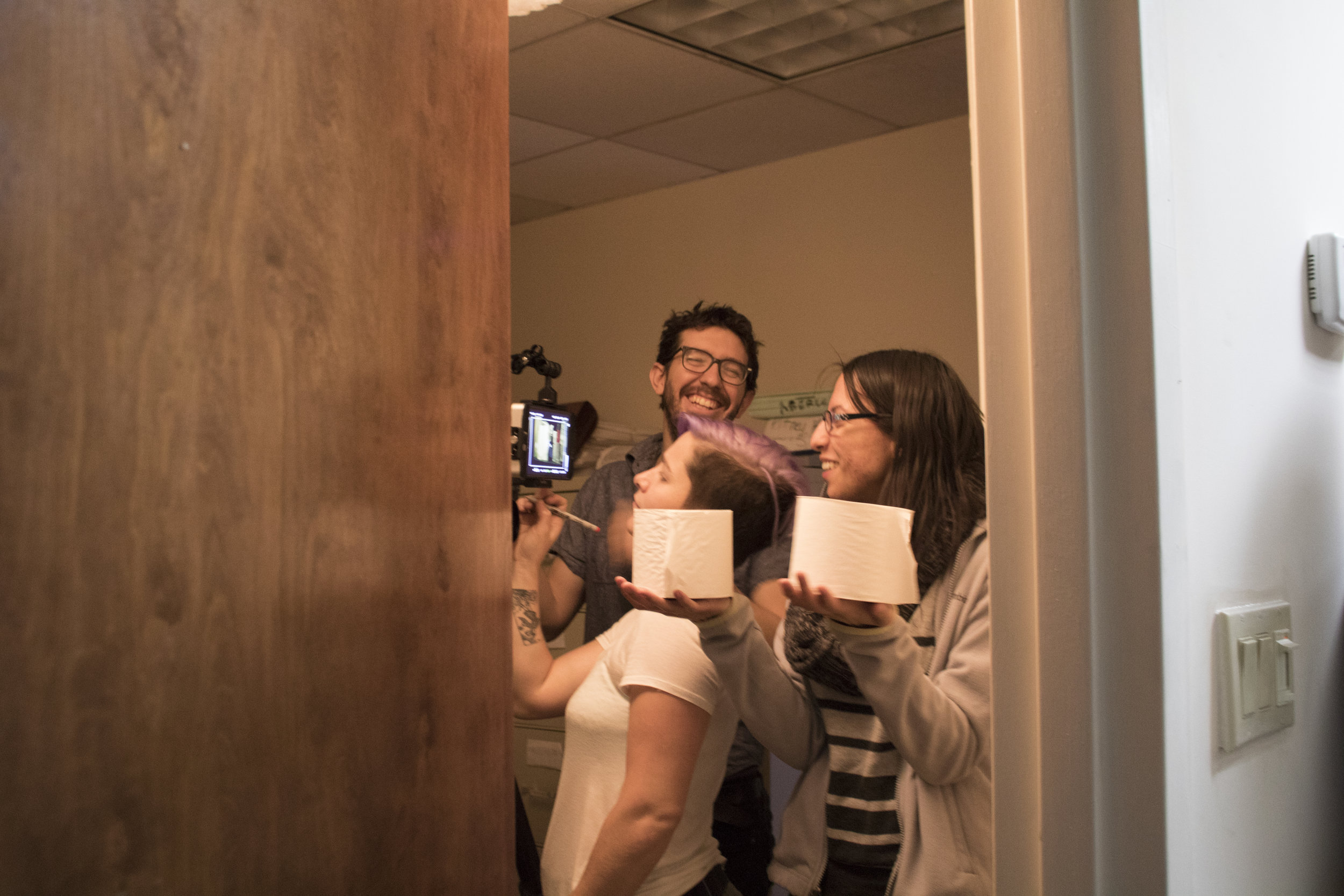
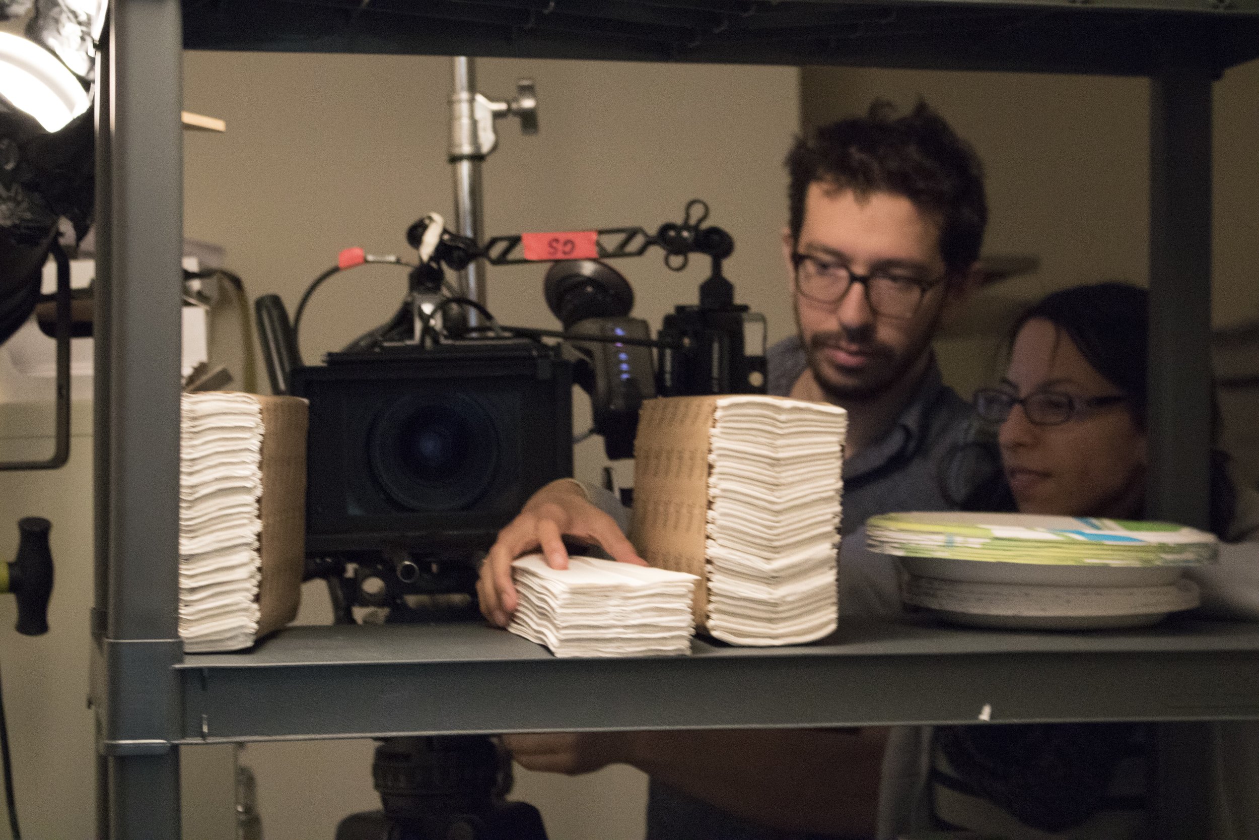
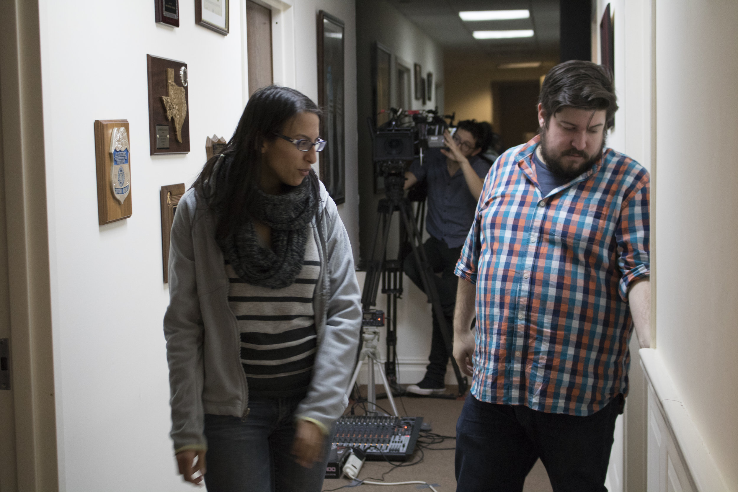
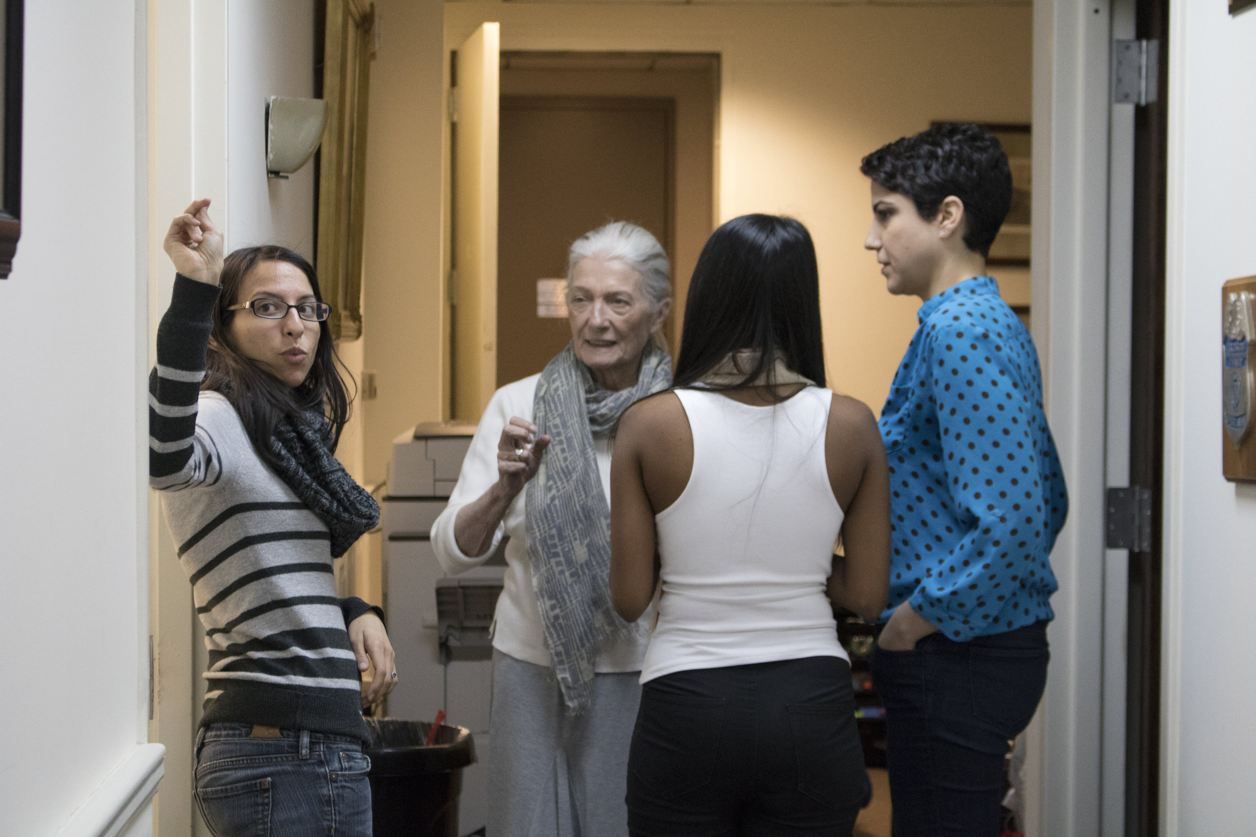
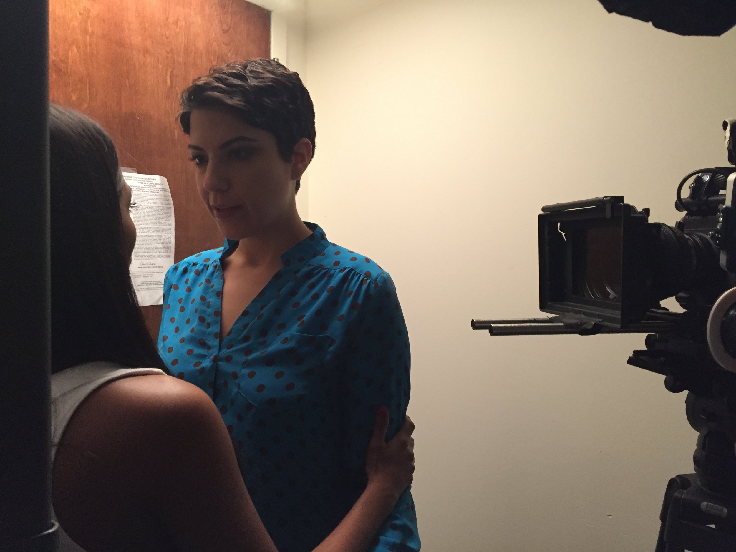
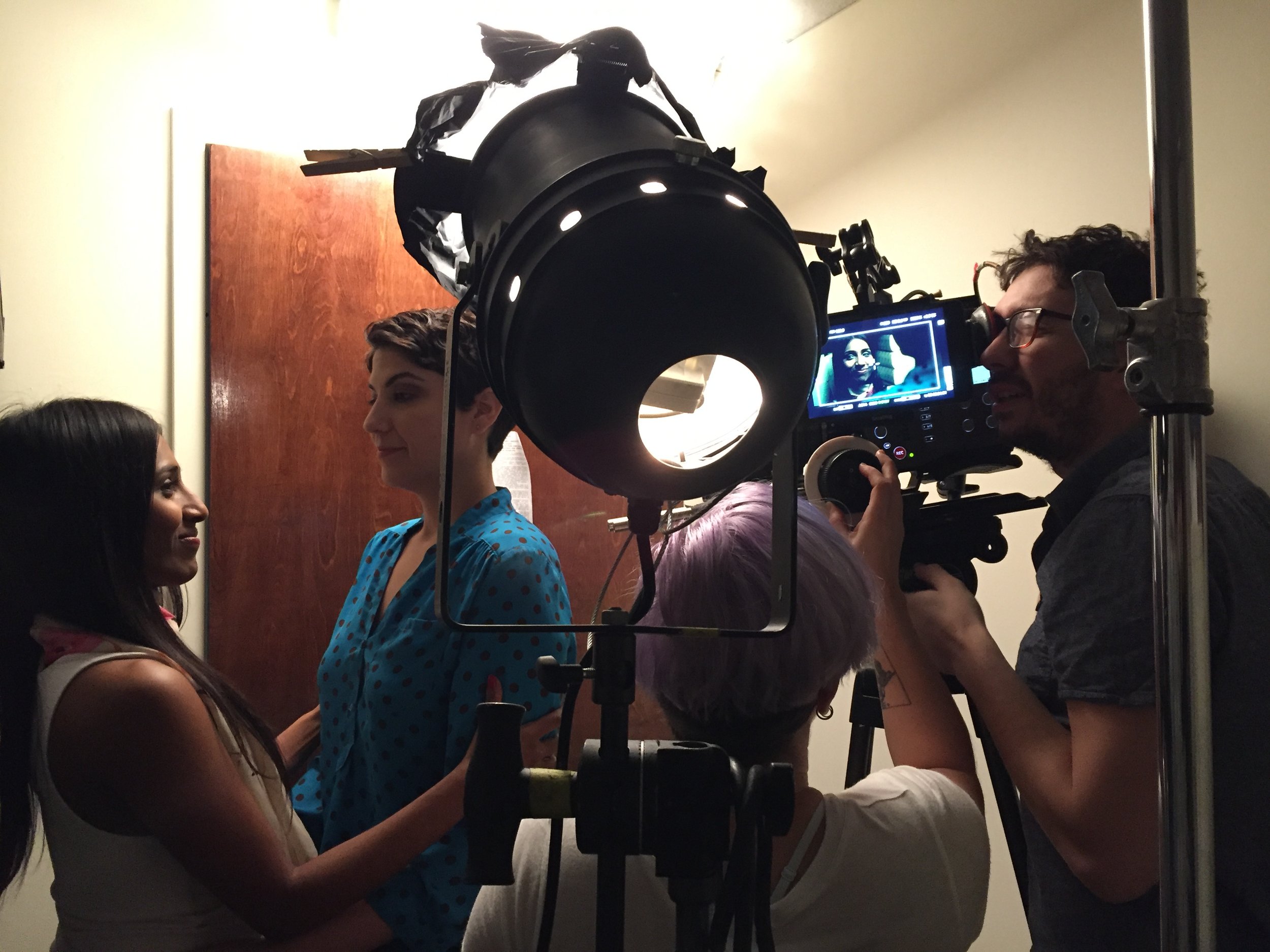
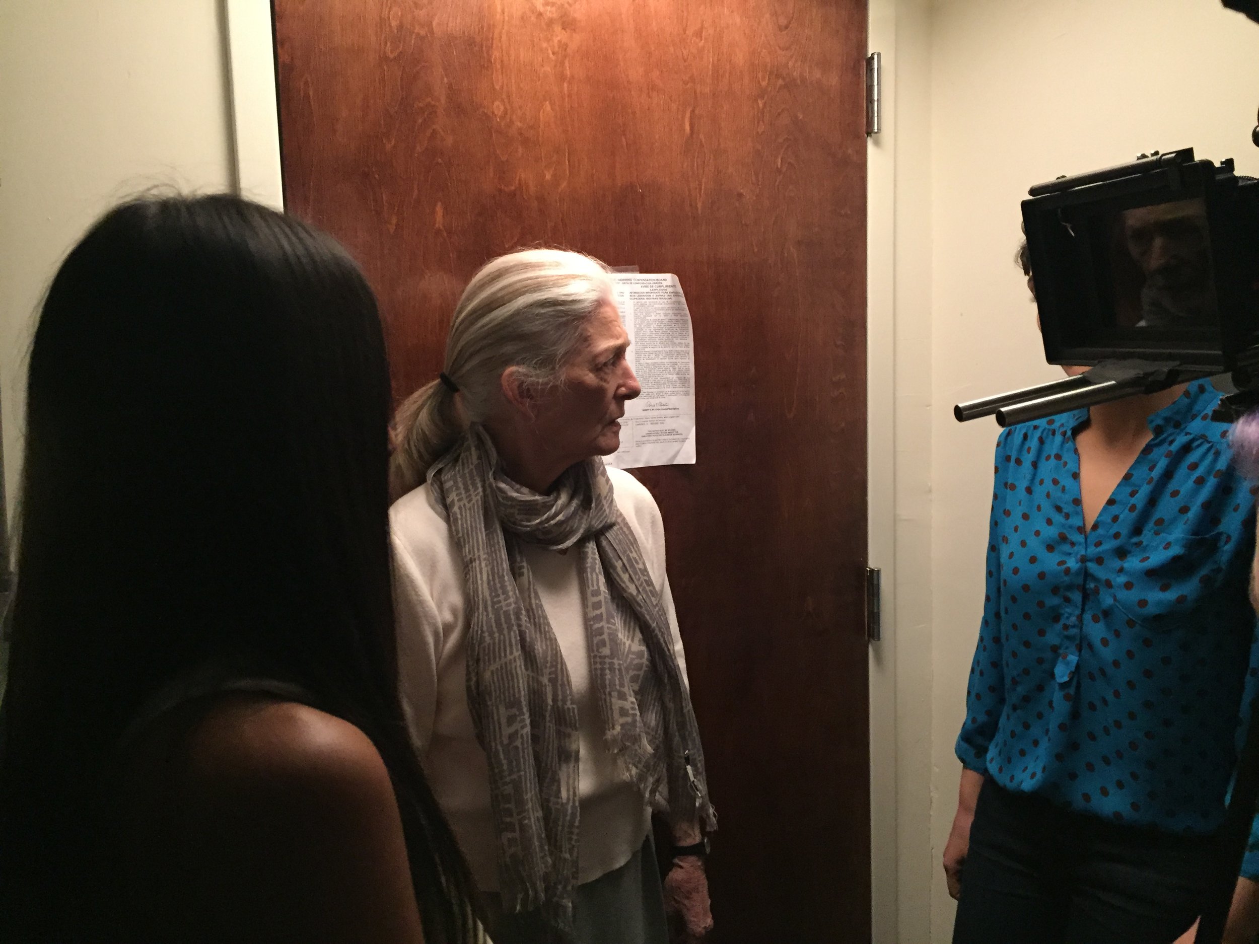
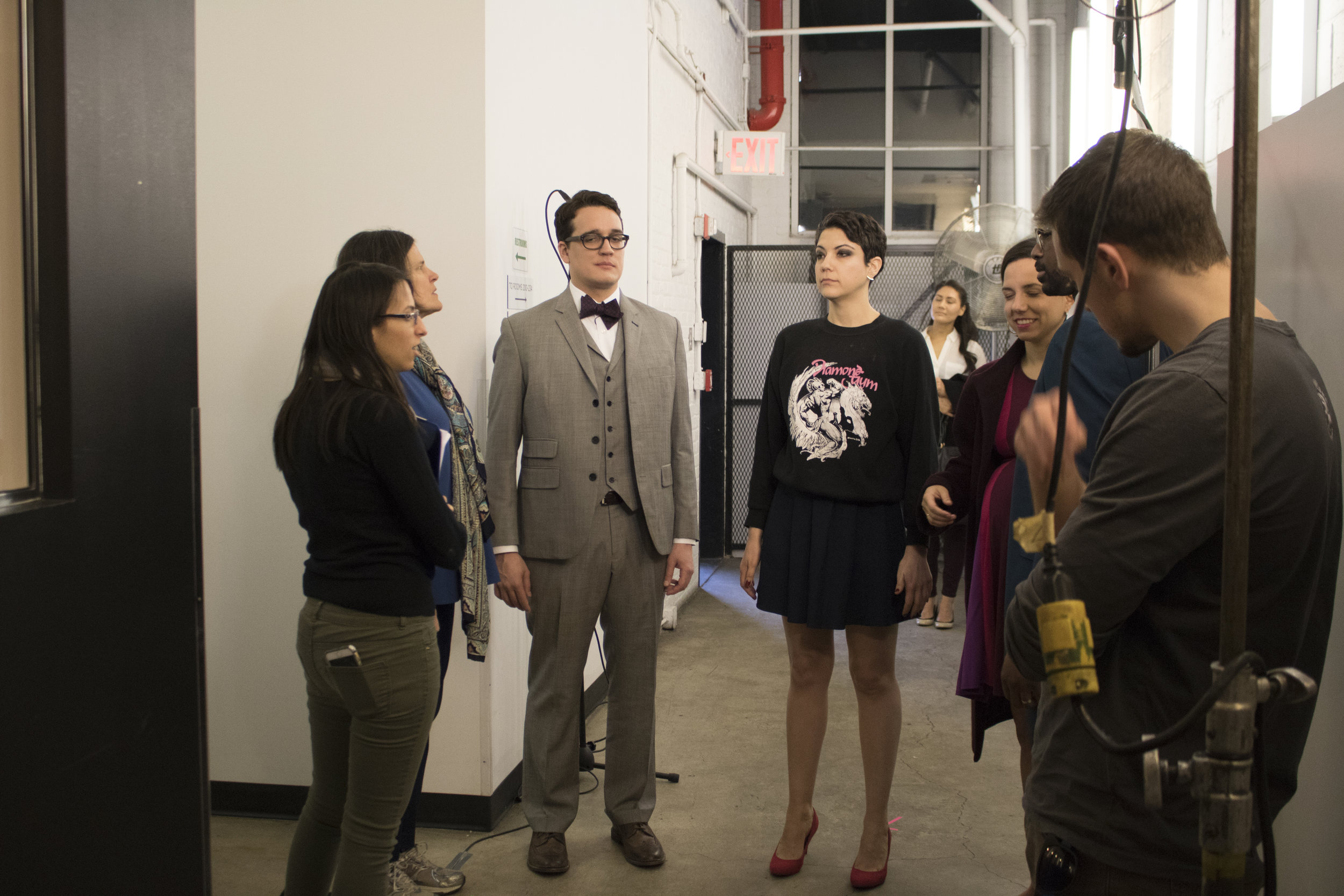
On Friday, we shot 6 pages only, but a scene that features 6 actors. So we had quite a bit of coverage to get. Thanks to The Local (where we hold IndieWorks) for loaning us their back hallway to convert into a hospital waiting room, we were able to work within our budget and make our day early (in 8 hours)! We got to experiment with the space and get some cool shots; and the performances were so on point (as I've come to expect from our talented cast). It was the first time we had Sarah Haruko (Cassie) on set and she was such a pleasure to work with. What comedic timing!

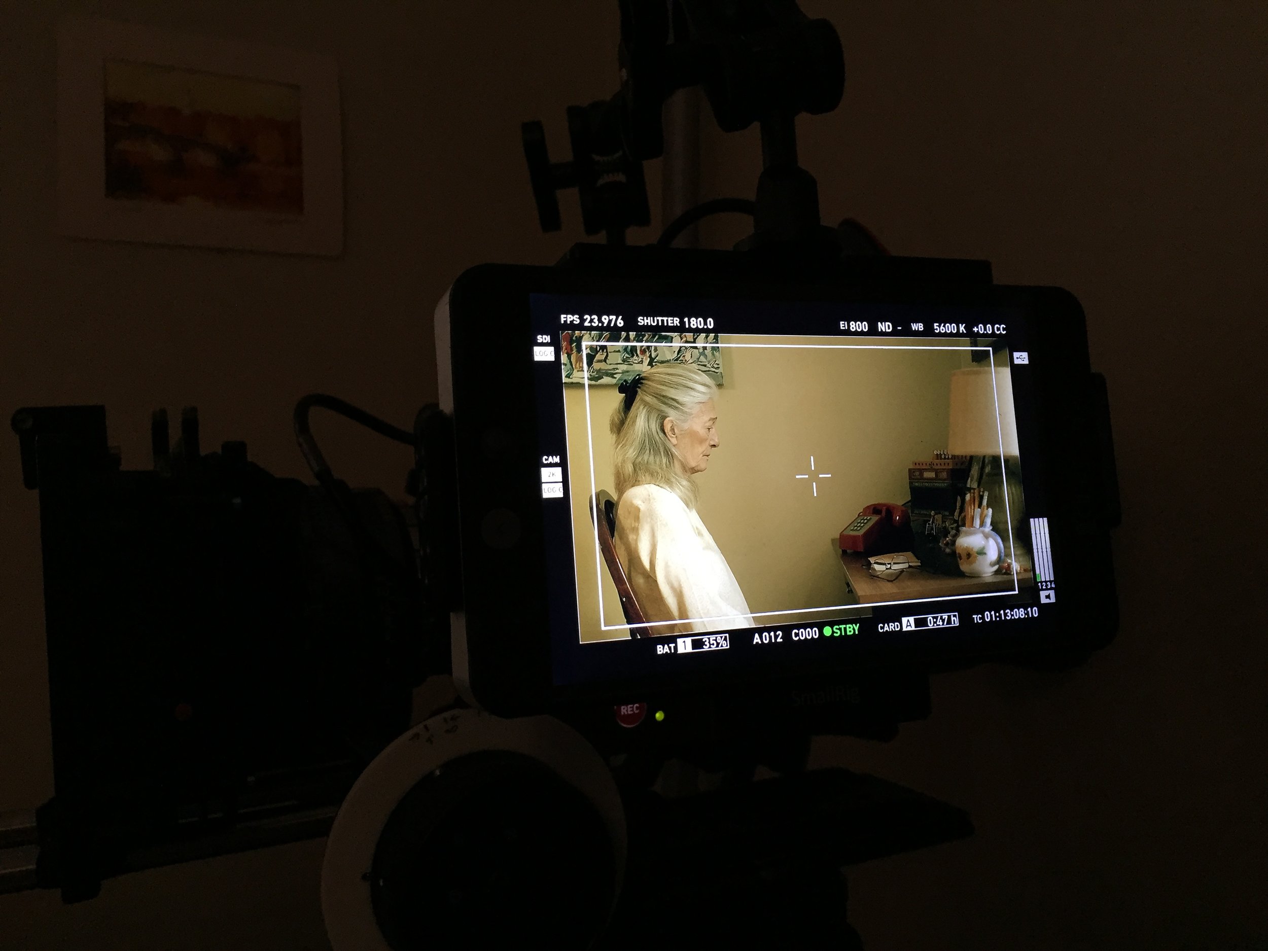
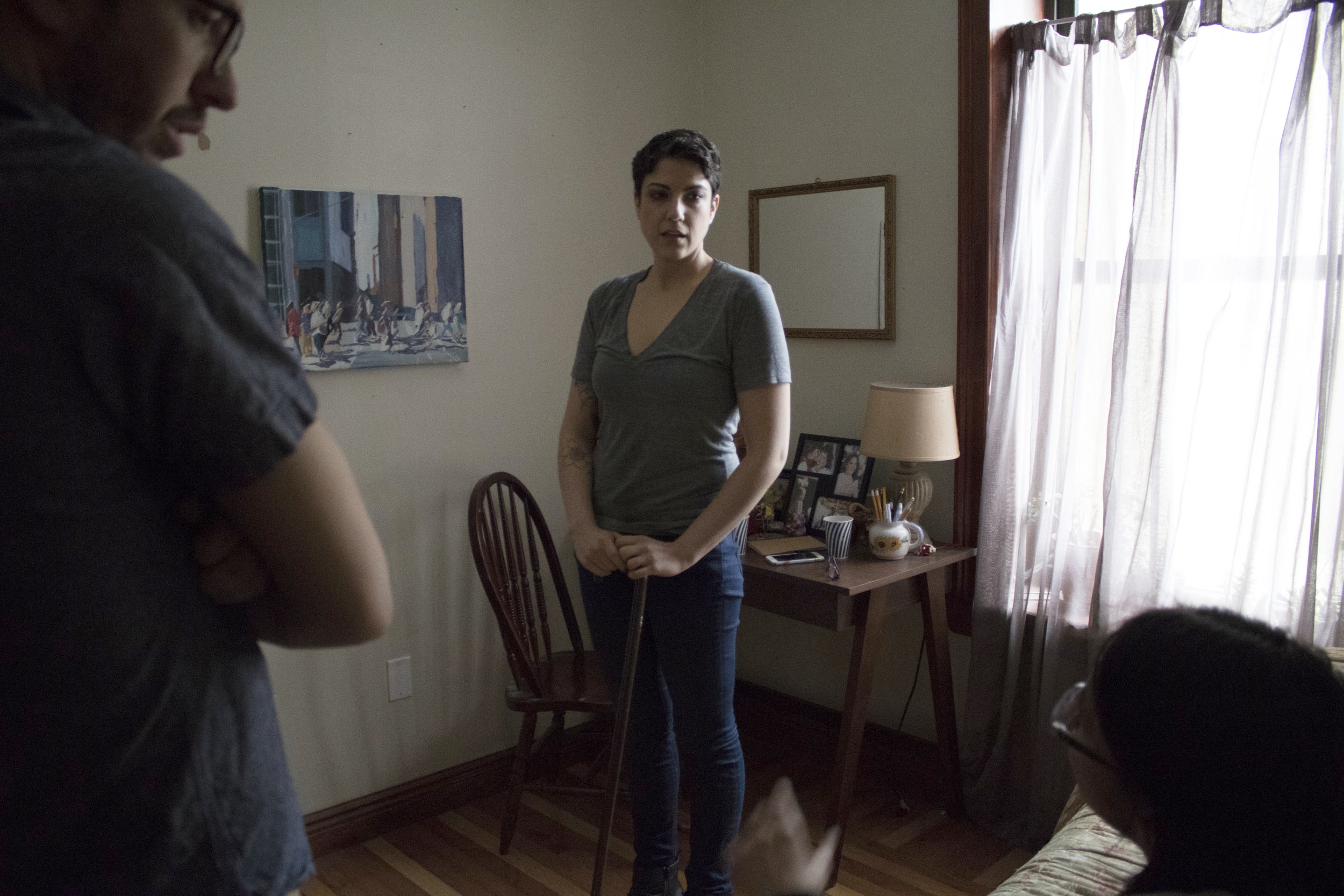
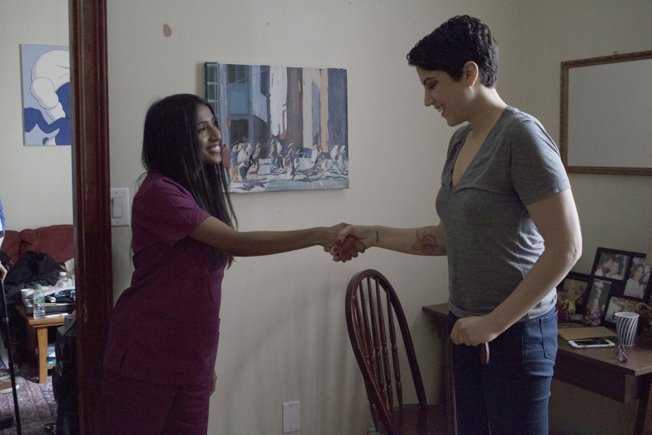
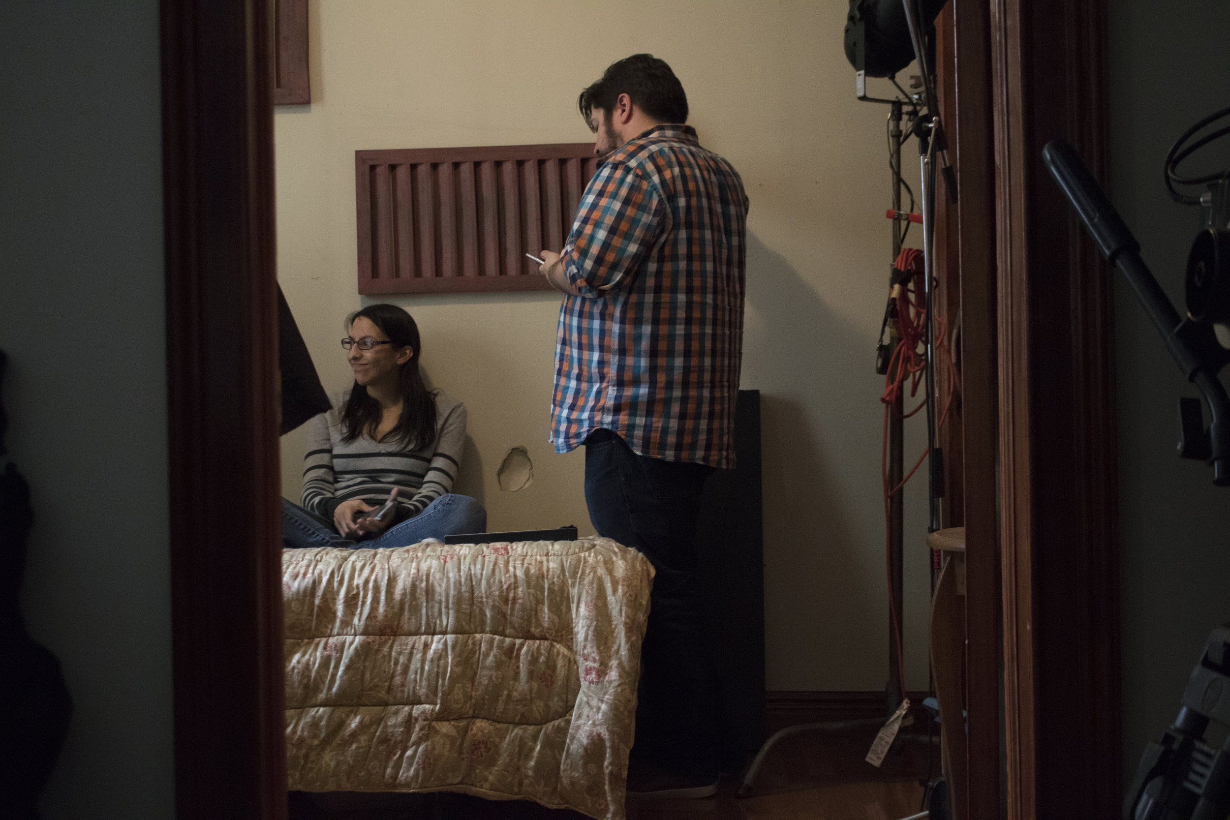
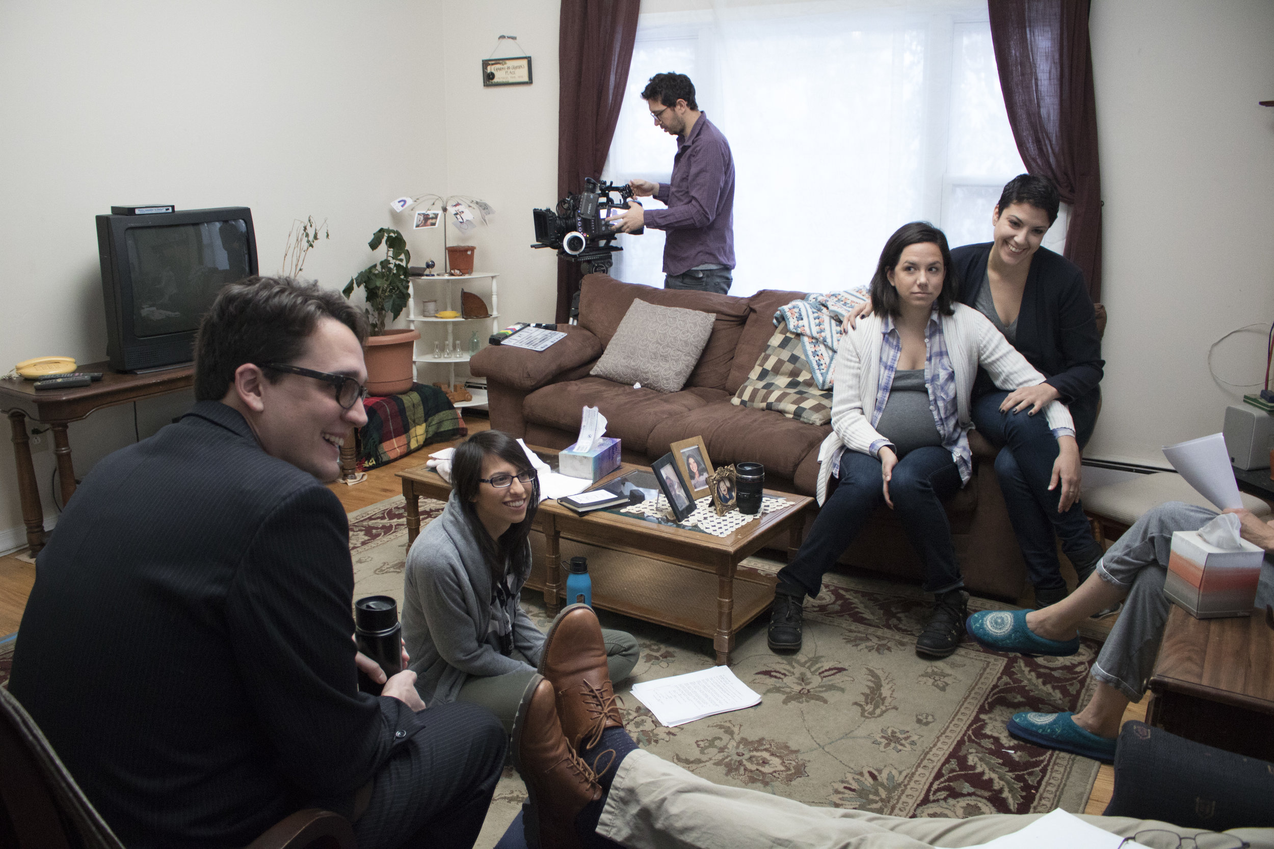
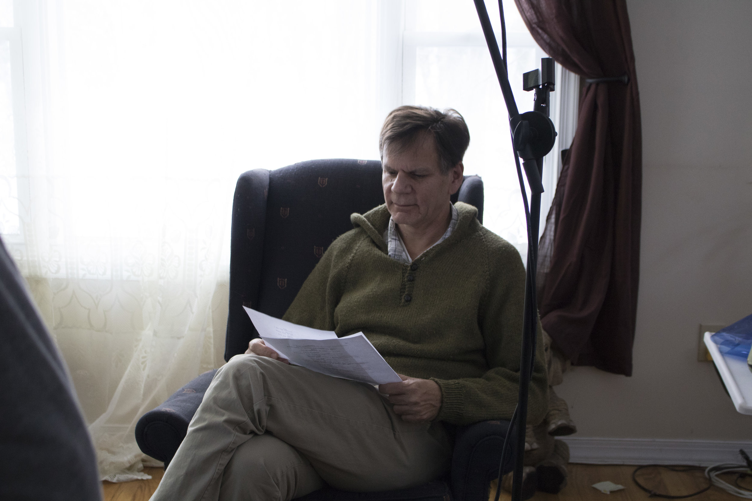
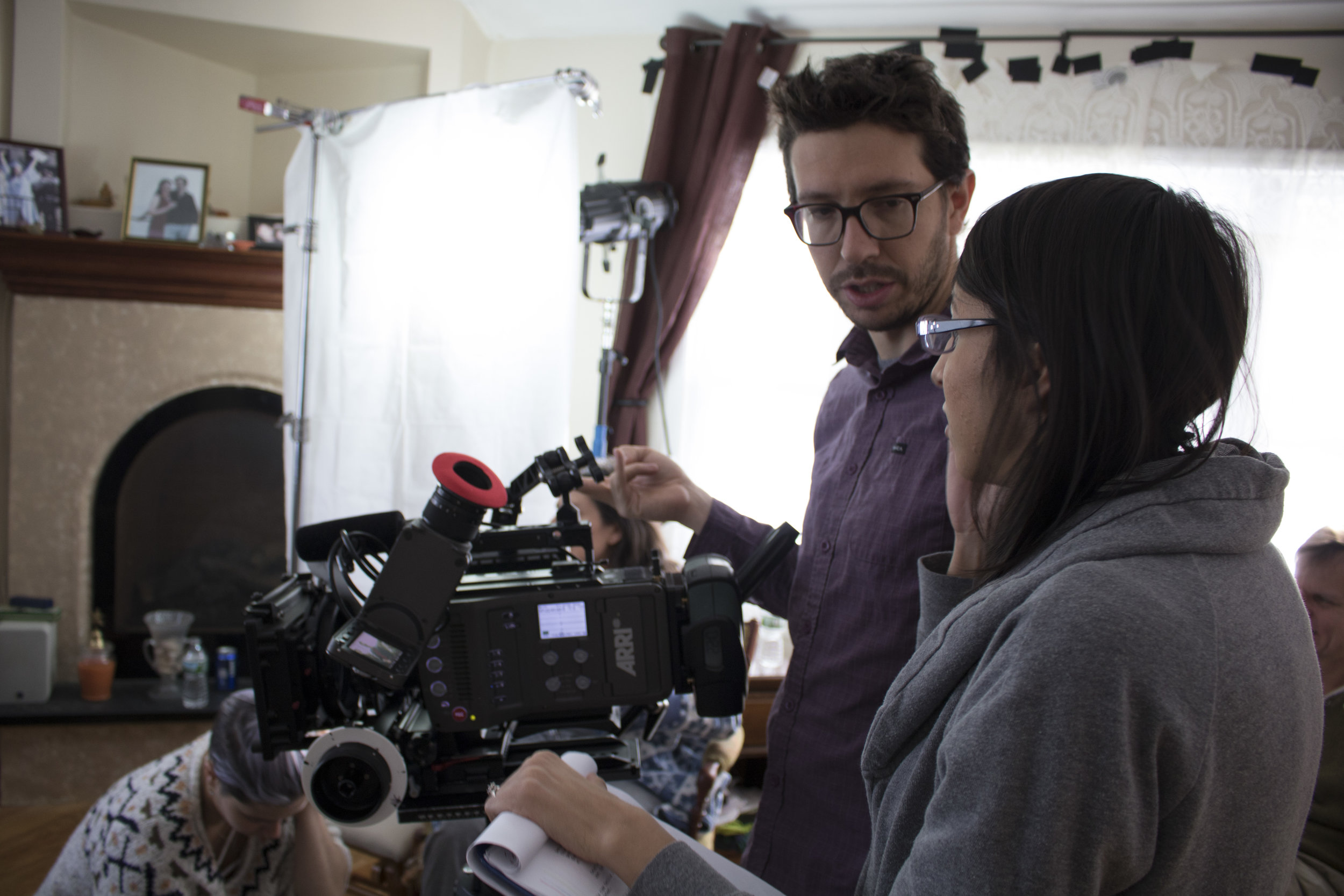
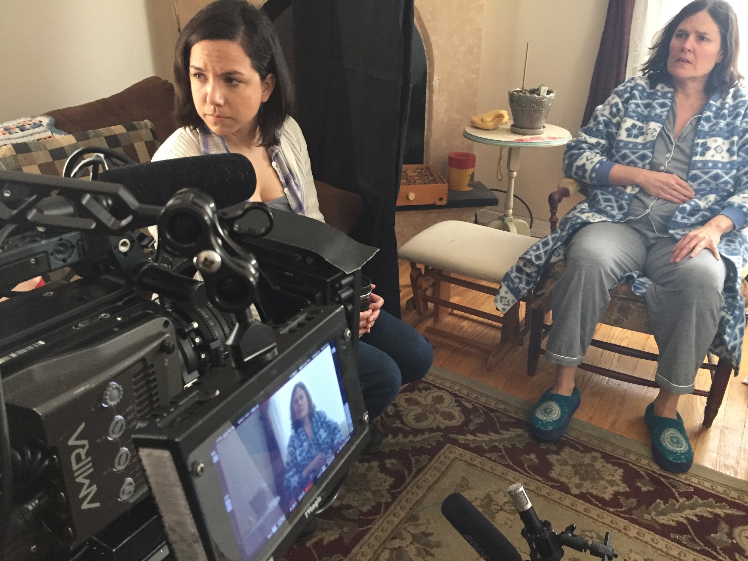
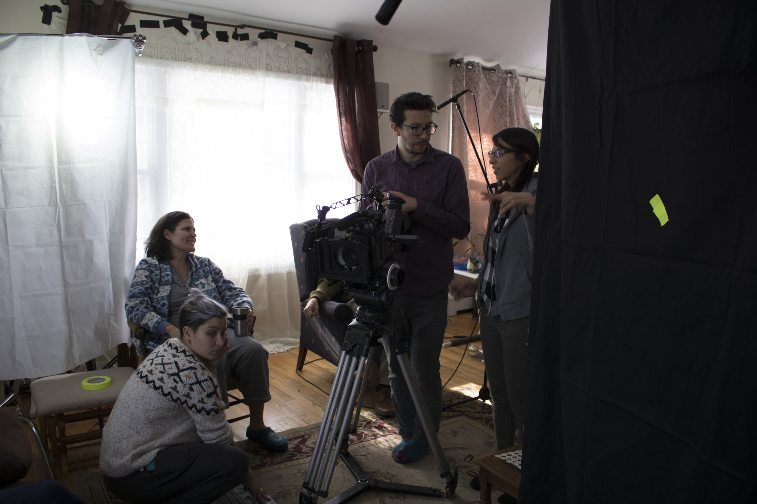
See behind the scenes of the day:

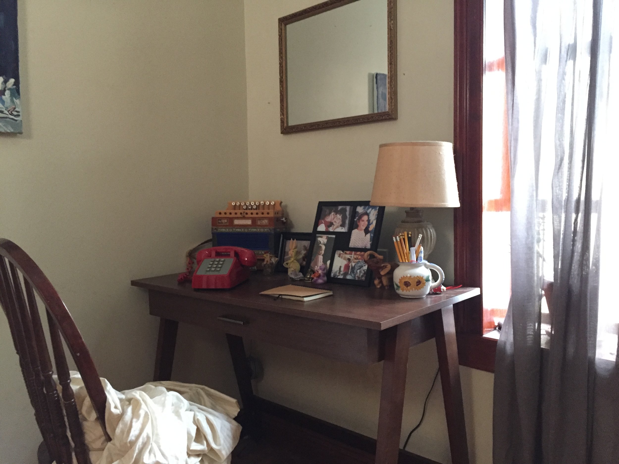
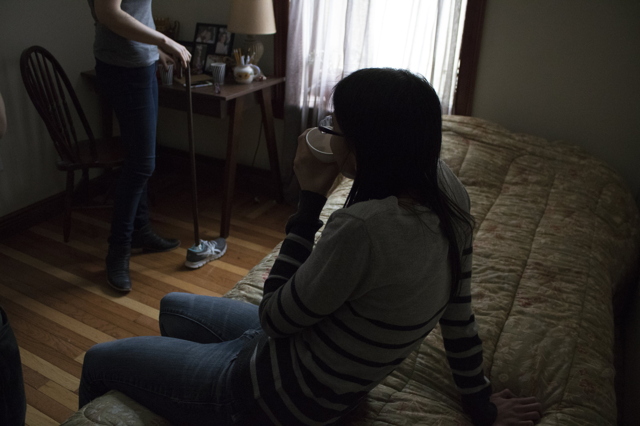
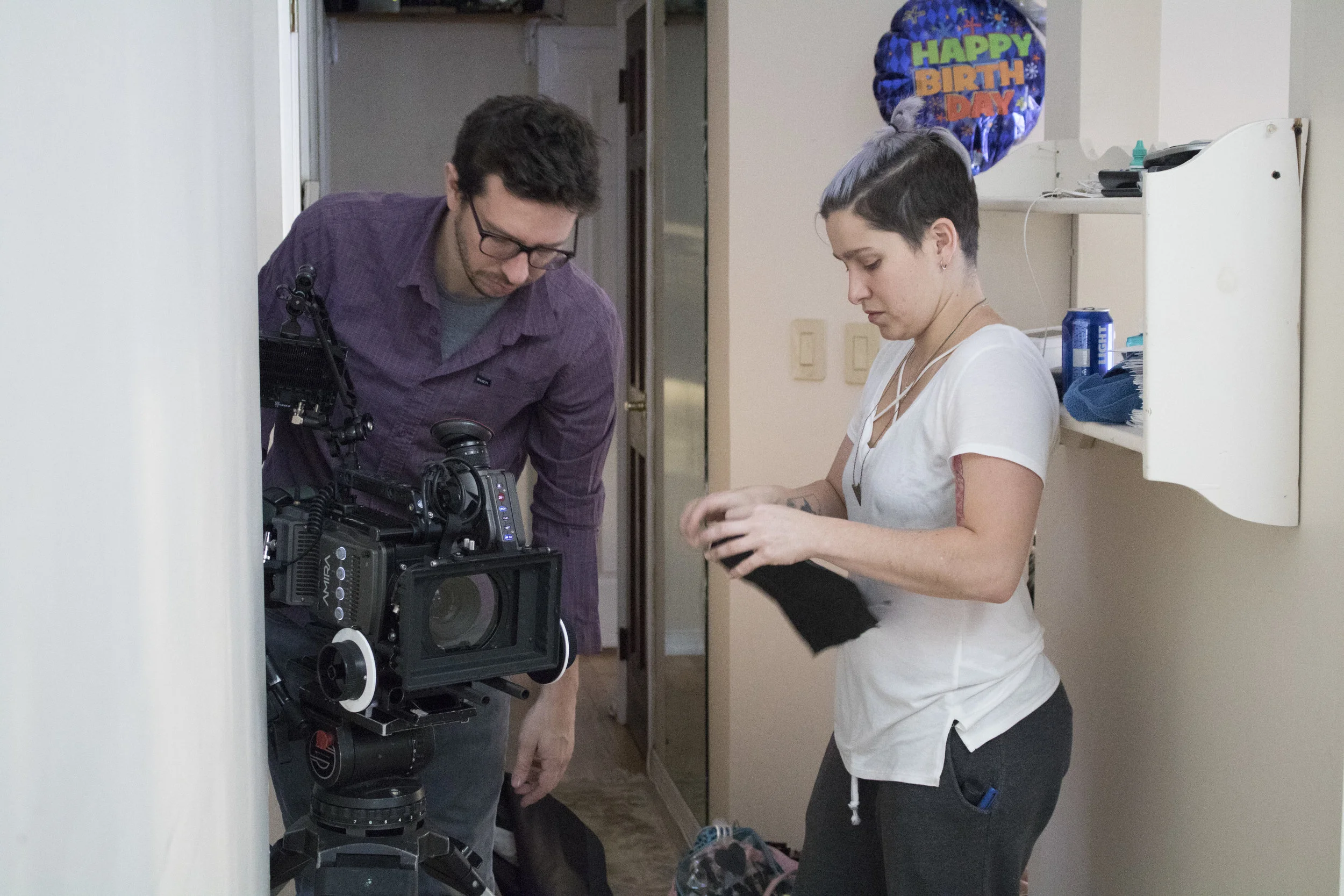
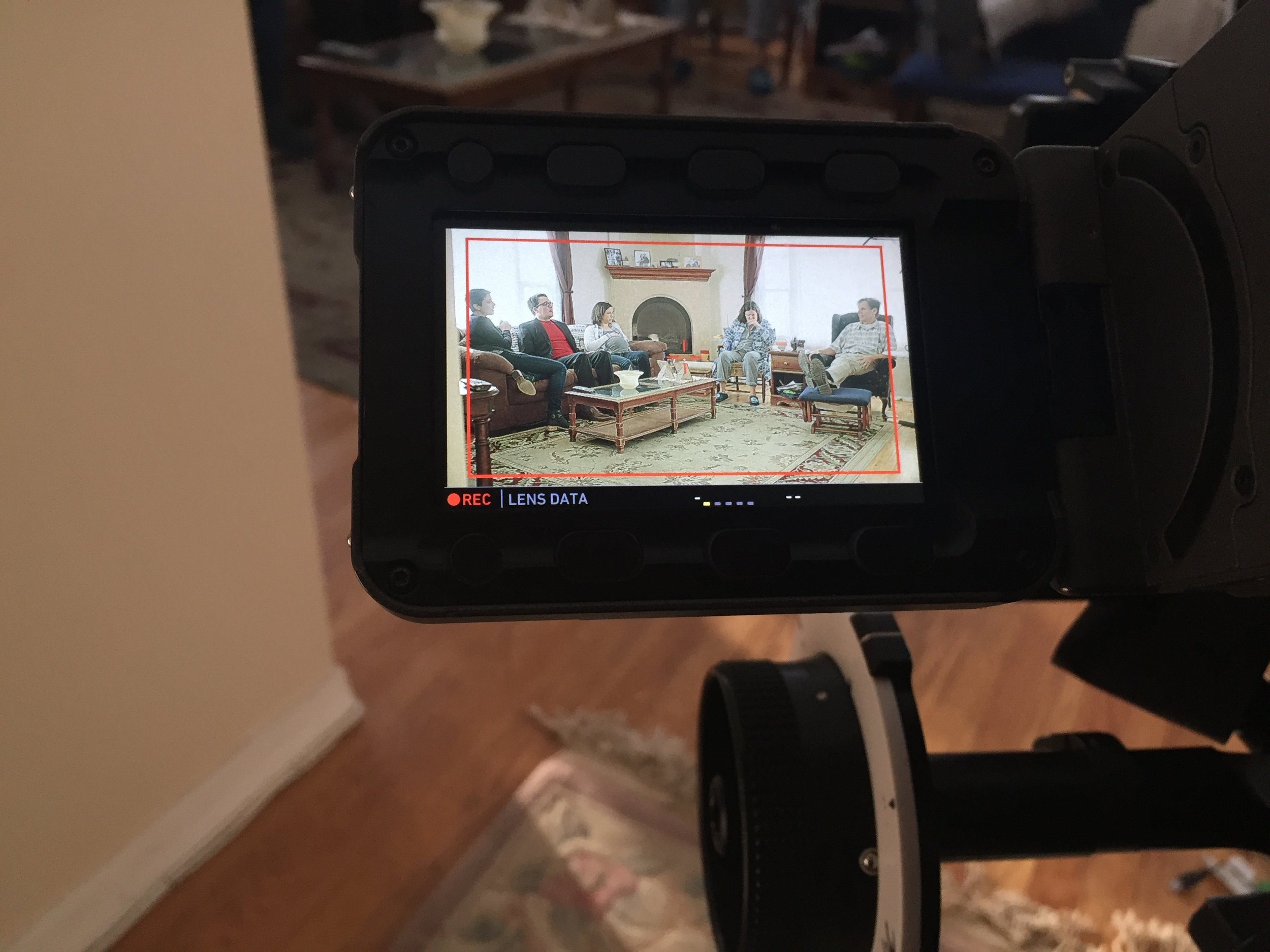
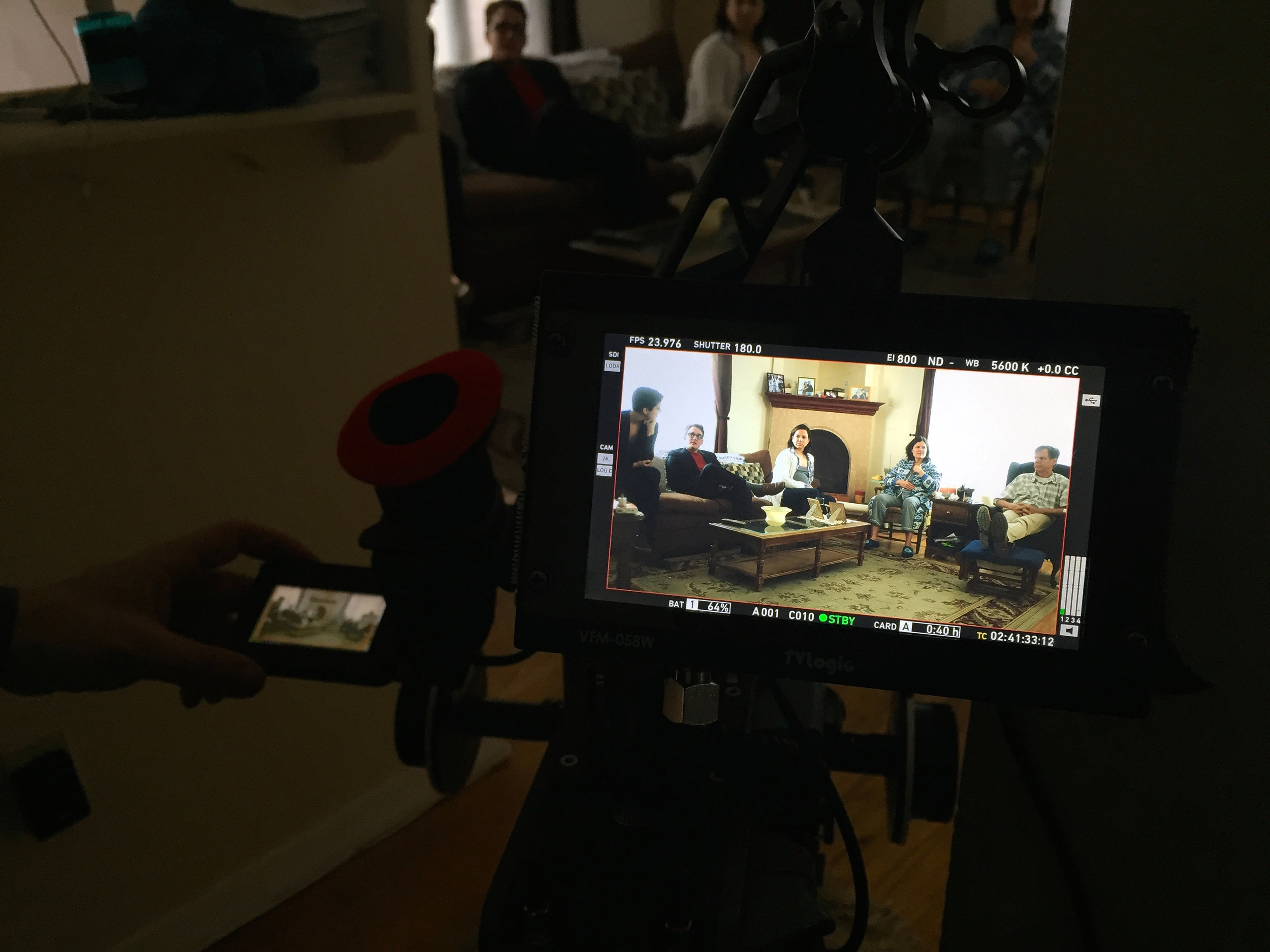
And check out these exclusive Stills from our raw footage. 

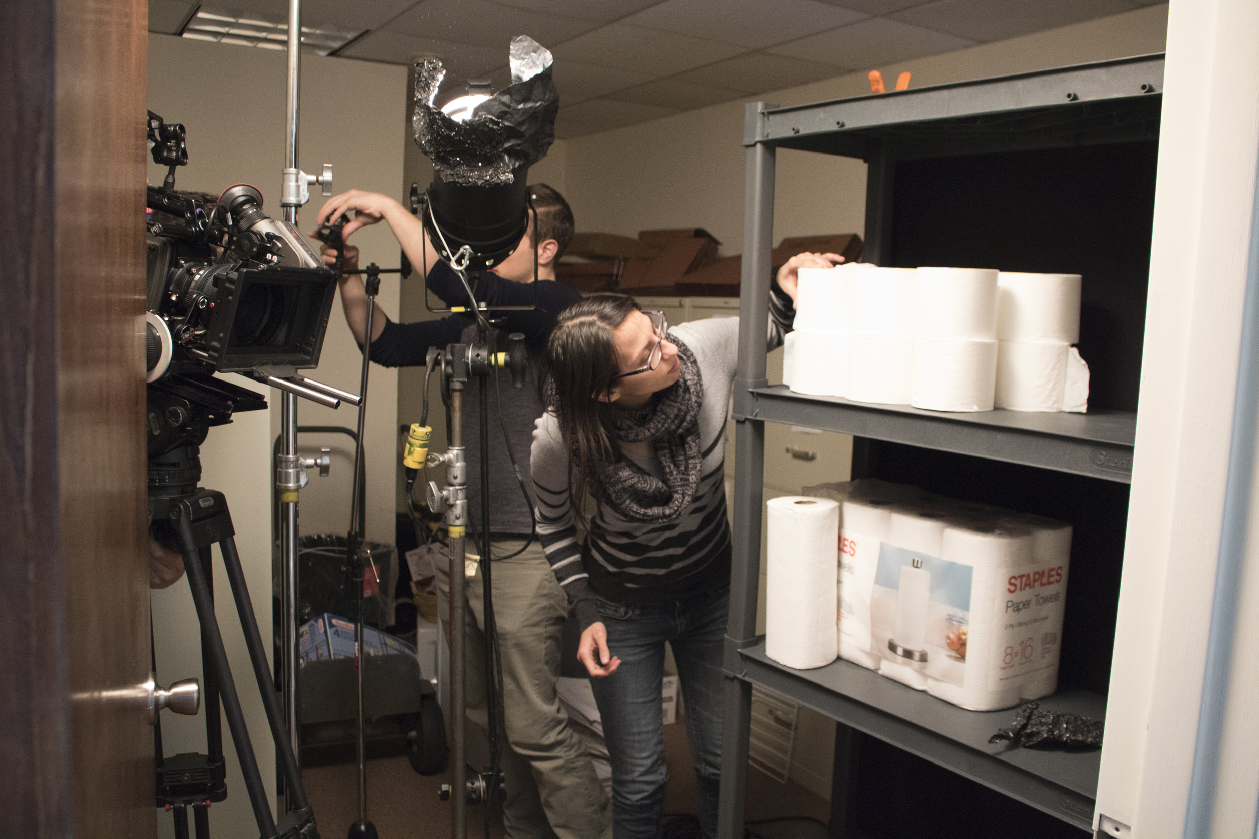
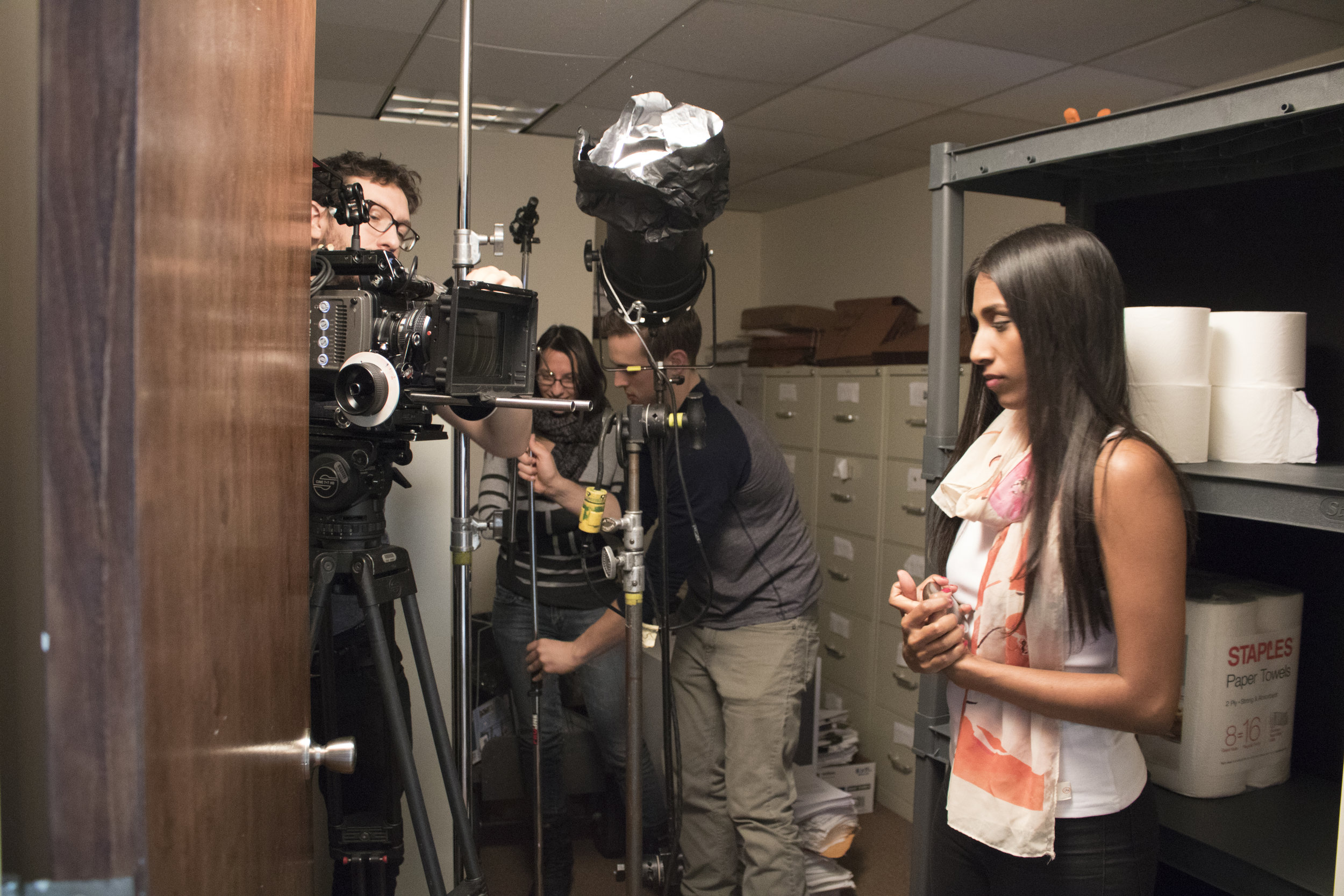
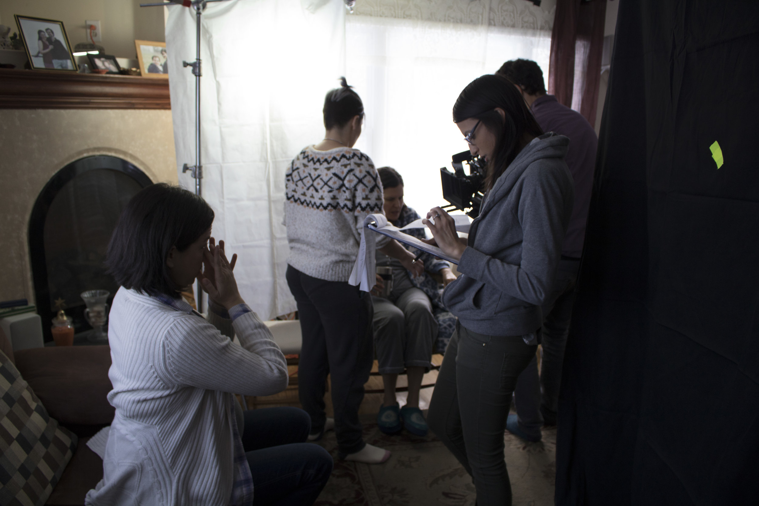
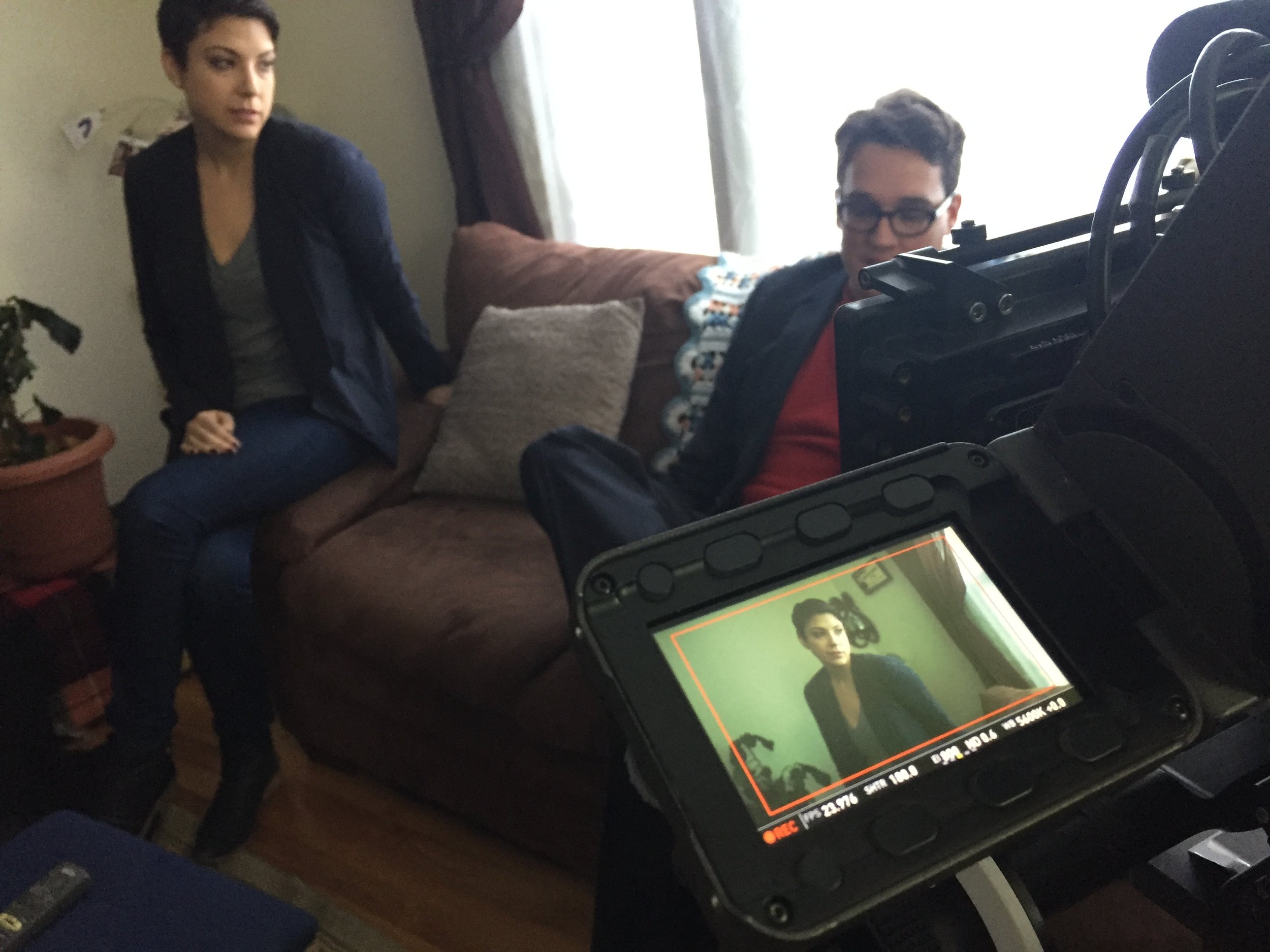
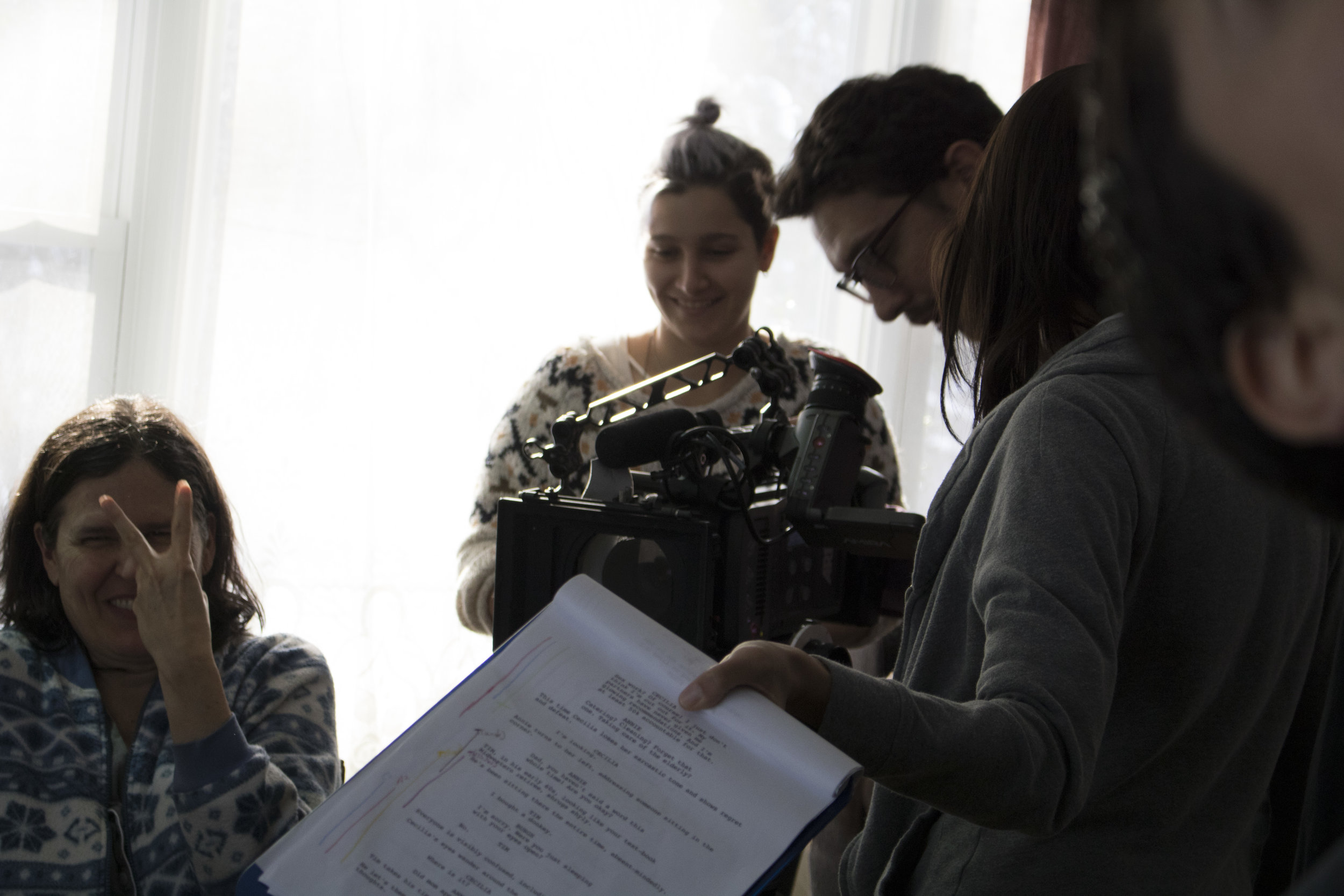
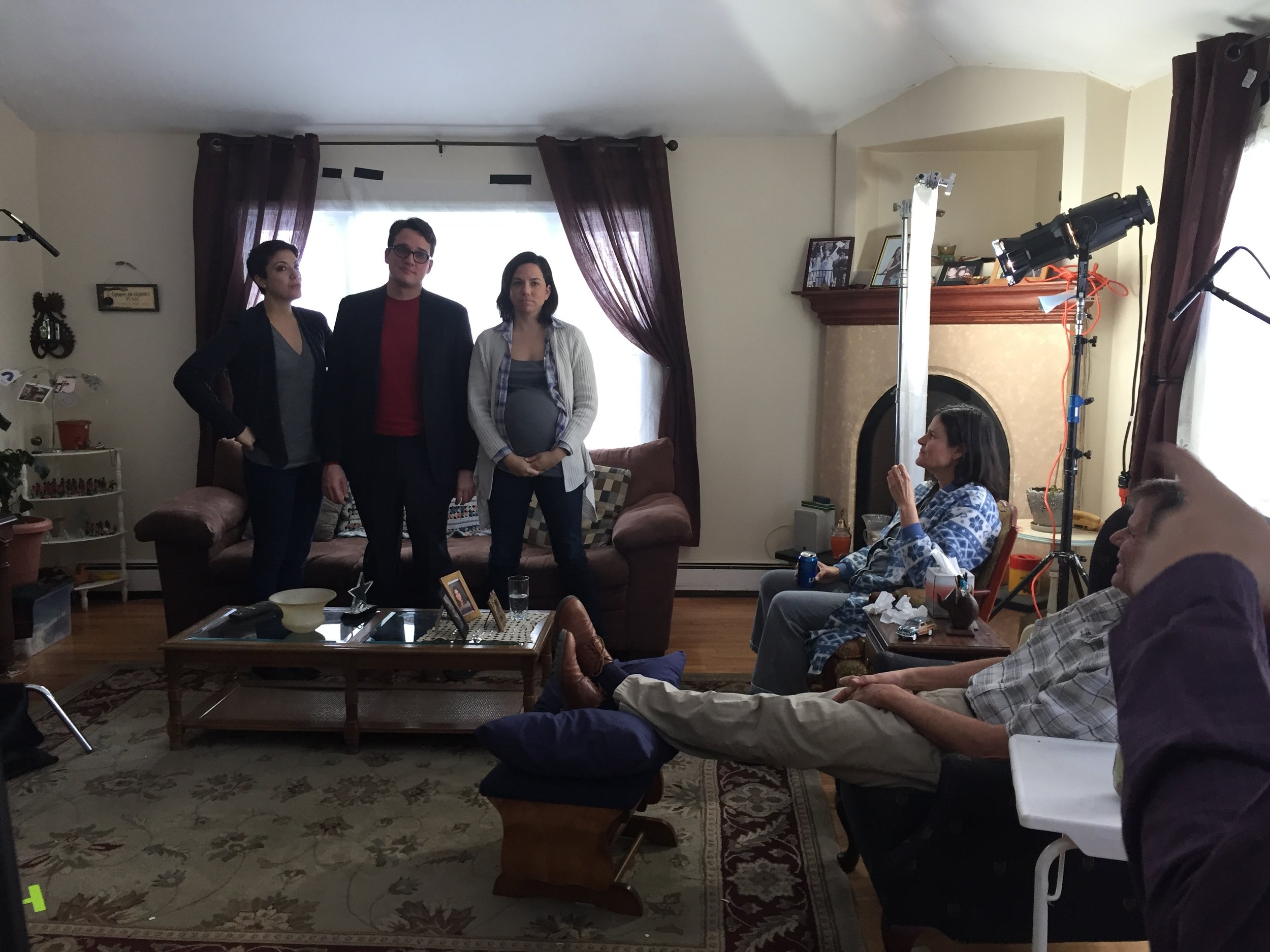
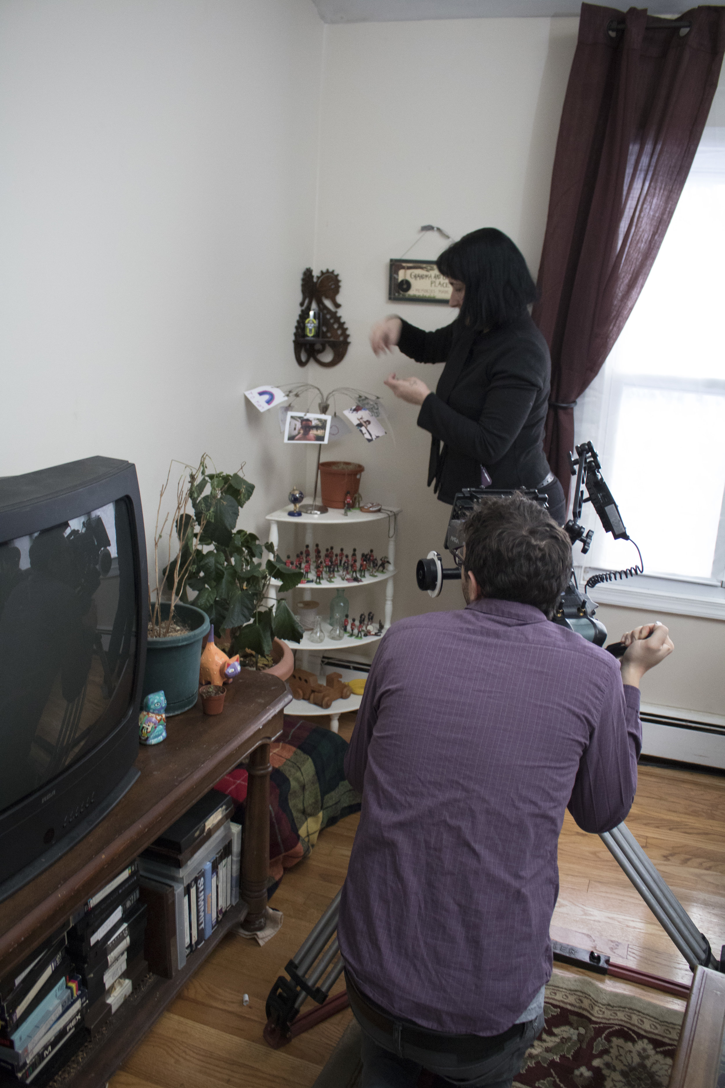
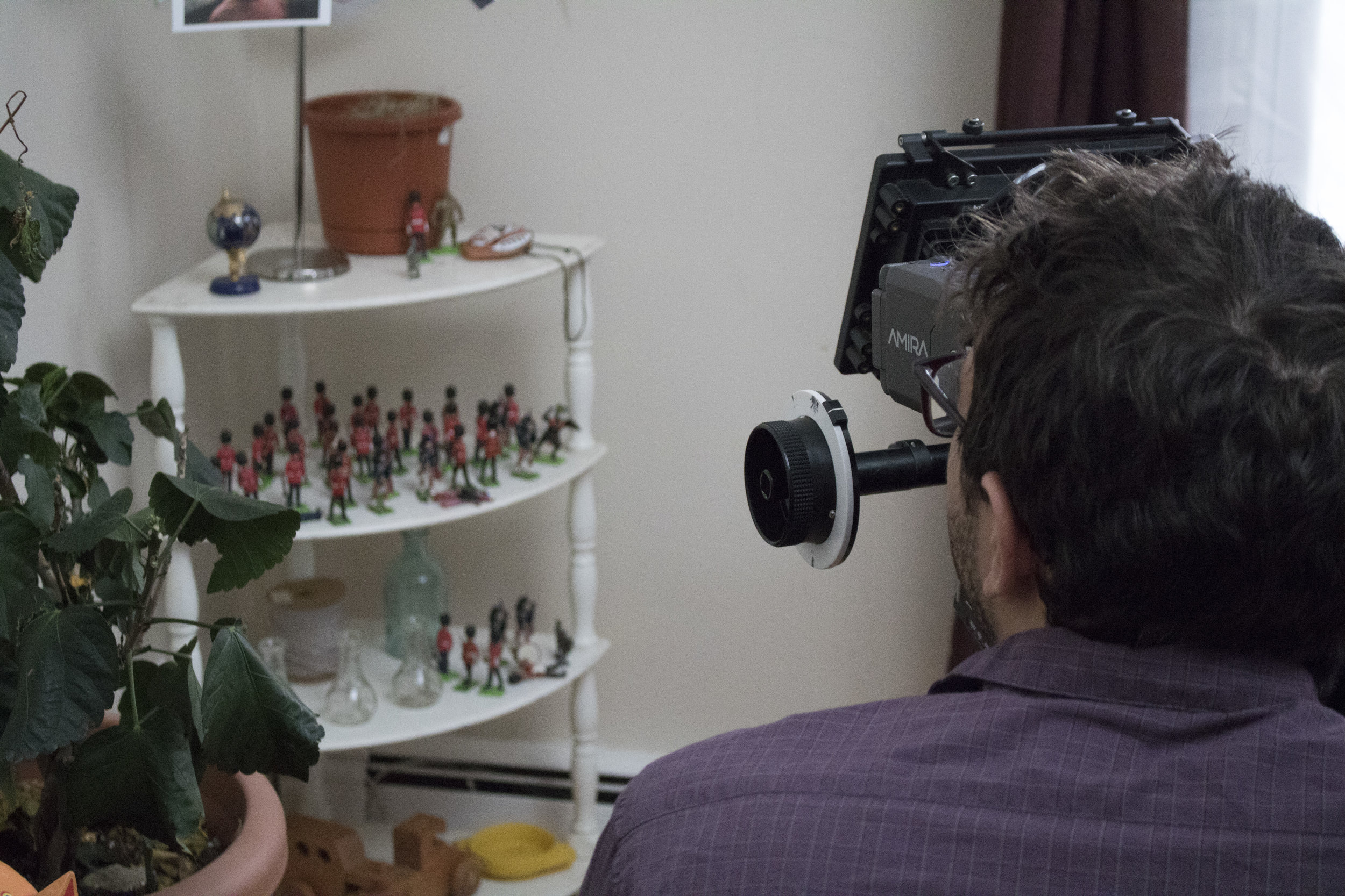
On Saturday we had a huge challenge on our hands, trying to knock out 15 pages in a day. Part of making this film work on our budget means trying to wrap specific locations in a day and minimize certain actors' time on set; as well as making creative choices as much as possible in pre-production to really shoot for the edit (which I've learned every director should do regardless of budget). It was our first time having the wonderful Ellen Graff (Grandma Farrah) and lovely Elisha Mudly (Jordan) on set and they were just brilliant. The chemistry between them and Christina Shea-Wright (Cecilia) was palpable. Despite some setbacks before the shoot, like losing an equipment loan and needing to scramble for last minute rentals, my getting a cold and losing my voice, and unexpectedly having to schedule in an hour long company move into our already jam-packed Sunday, we still managed to make our day (pushing to 13 hours but still pulling it off) and create work we can all be proud of! I'm especially excited to see what we shot on Sunday cut together because there was such energy on screen. (Shout-out to AD Matt Gershowitz for loaning his apartment and my family friends Joan & Larry Berger for loaning us their office closet and hallway!)

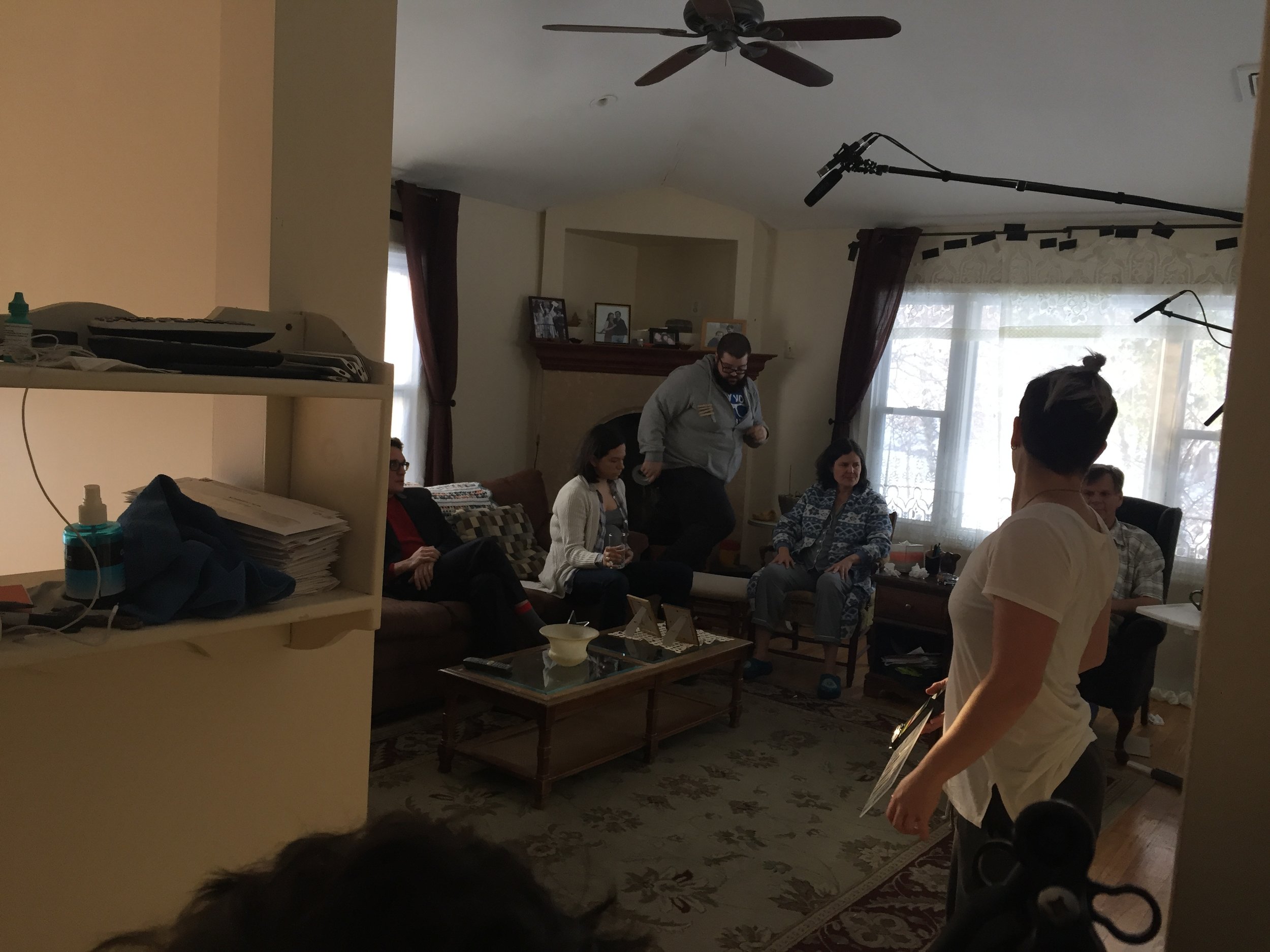
See behind the scenes below:


And check out these exclusive stills. 

Our crew overall is amazing, but it is rotating quite a bit aside from the core creative team/producers. The three other main staples we have on set are Will Graham, our sound guy who's wonderfully attentive and thorough, Lizzie Zambrano, our makeup artist who works wonders with so many faces to keep shine-free at once, and our production designer Nicole Solomon, who I especially want to give a shout-out to because she's doing a lot of work between the production days to stretch our budget and add production value all over the place! 

We'll be back at it on Friday. We're currently halfway through production and right where we need to be. 6 days down, 6 to go. But we need the weather to cooperate moving forward because we start exteriors this weekend, and will have our donkey on set the following weekend! Hopefully now that it's officially Spring, the sunshine and rain will wash away this snow. Please cross your fingers and do a little dance for us!

-Christina 

"About a Donkey" 1st Scene Shoot Recap

Kelsey & I (Christina) spent most of 2016 in pre-production for our feature film About a Donkey; and we made it a point to keep our audience updated on all our progress, from sharing videos about why we want to make the film to introductions to the characters with each casting announcement. Last weekend that work and progress resulted in the first execution of bringing this passion project to life. 

On Saturday, the entire cast (even two via videochat) and much of the key crew met up for our first reading of the full script. It was so much fun getting to bring our new extended film family together to bond and collaborate. Hearing the whole script from such brilliant performers over 4 years after Kelsey shared the first draft of it with me was really rewarding and exciting. We cannot wait to work and create with all these wonderful people. 

We're planning to crowdfund the film from February 1st through March 3rd, then jump into production on March 10th. We decided the best way to involve our audience, show them what we're capable of and give them a taste of what this film can be would be to actually devote a day to shooting the first scene of the film (12 pages!) and release a section of it as part of our Seed&Spark pitch video. So that's what we did on Sunday. I will talk more about how that went and how we pulled it off when our campaign launches next month, but know that it was a huge success thanks to our talented and dedicated crew and cast (and my amazingly supportive family). We know now more than ever that this project is something special. We look forward to bringing you along on this journey!

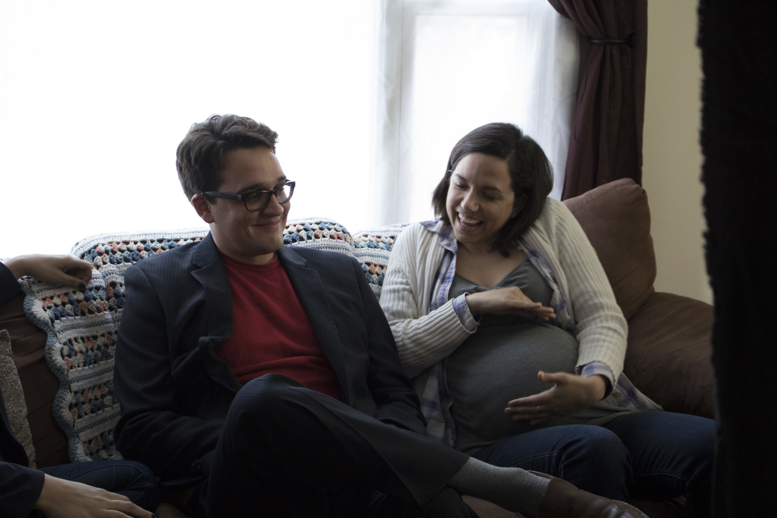
See a few raw stills from what we shot below!

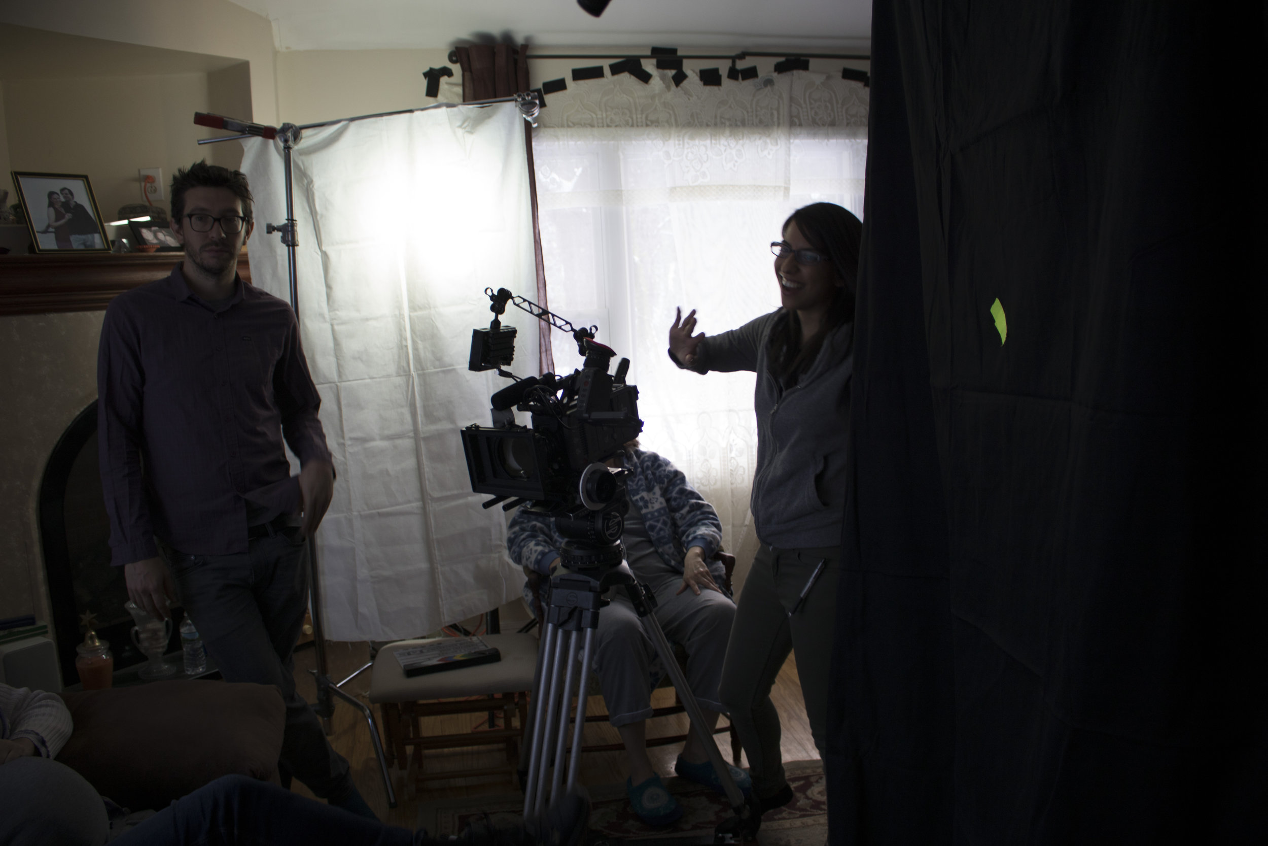
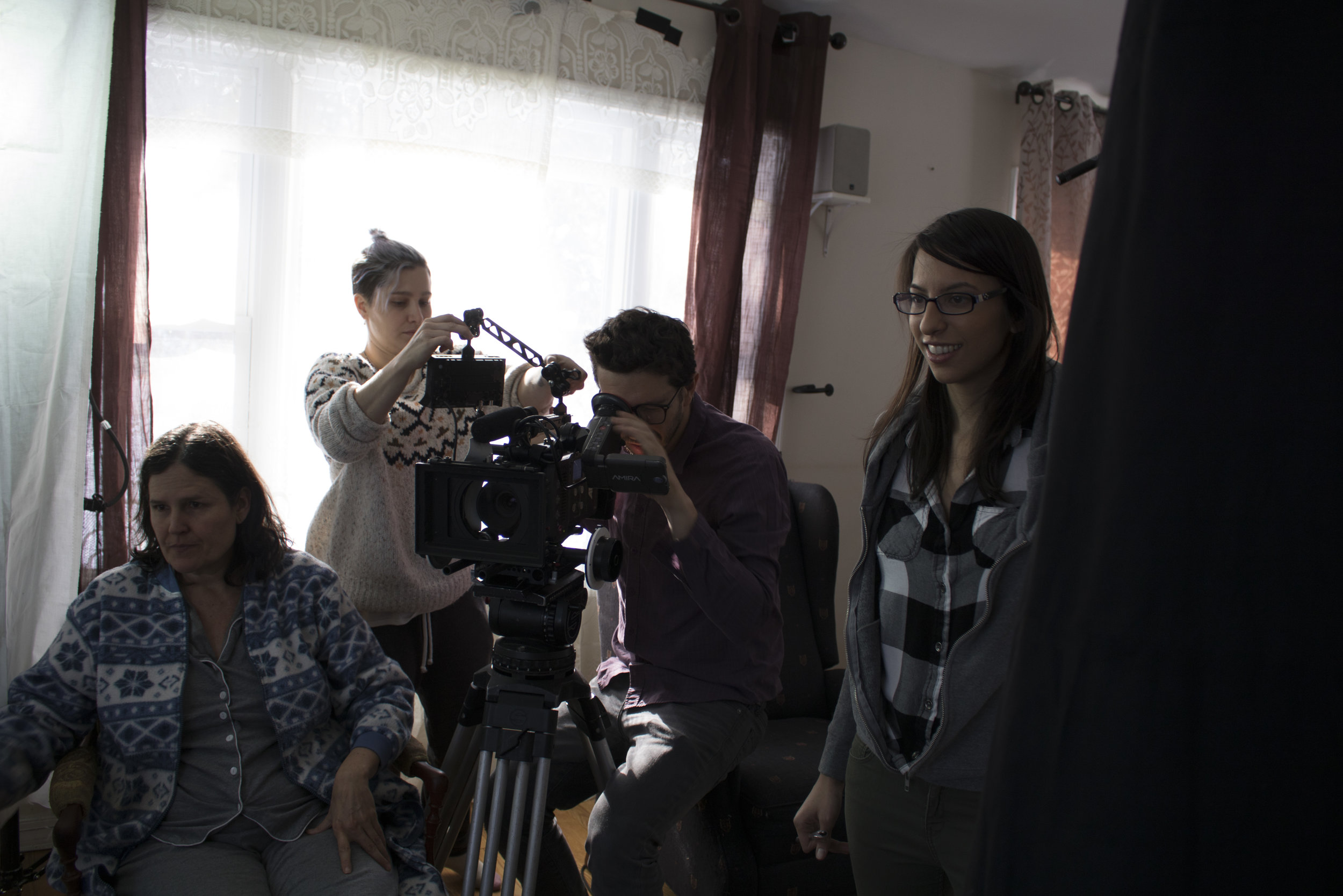
And click through behind the scenes photos from the shoot!

Be sure to mark your calendars for February 1st at 12:30pm EST. Our campaign will not only reveal the opening scene and explain why this film is so important & worth getting behind, but will also offer a sneak peek at Saturday's read-through and a variety of exclusive incentives for your contribution(s)! Bookmark this link: www.seedandspark.com/fund/about-a-donkey. It's coming soon!

WHAT IS ABOUT A DONKEY?

About a Donkey is about growing up & growing old, and finding love & laughter along the way. The film follows the Owens family: Ann & Tim, their 3 adult children, Cecilia, Burgh, and Annie (and her husband Paul), and matriarch Farrah. When Tim brings home a donkey in a mixture of wanting to rescue both it and himself, things are shaken up in each of the characters' lives.

The films quirky but relatable nature has been referred to as a little Little Miss Sunshine meets Gilmore Girls, but with a donkey and a strong focus on inclusivity (both in front of and behind the camera)! We're strong believers in being the change -- reflecting the world as we want to see it. With this film, our mission is to combat hate with humor and heart.

In our film, love is love, people's lives and desires are relevant no matter their age, and struggling with depression is acceptable and normal.

Directing 'Kelsey' - Episodes 5 & 6

Episode 5 (A Best Friend's Birthday) is probably my favorite episode of the series. It’s the episode that I think translated to screen most closely to how Kelsey Rauber & I planned/envisioned; and I just find both sides of the story incredibly enjoyable. I think it’s where we were most successful in making something under 10 minutes feel like a complete episode, as if you were tuning in on network TV. 

This episode is the first time we have Kelsey with all her friends in one environment, and, more importantly, the first time we allow the supporting characters to interact without Kelsey at all.

This, being the halfway mark for the season, was where we felt we could make a big shift in terms of the focus of the show and how the audience relates to Kelsey and the people around her. As I said in earlier posts, we where initially introducing you to Kelsey & her world through her experiences and emotions. But the goal was to take the series into a more ensemble direction and have her friends and lovers feel fully fleshed out, not just in relation to her. What would bring this on most, would be Kelsey lightening up on her self-centeredness. This is obviously not the case in this episode, as Kelsey is maybe at her worst on this date; but the shift is coming (which I’ll talk about in episode 6). However, to go along with that coming shift, we used this episode to really signal that coming change toward tighter frames and lenses (as discussed in depth in my first post). You’ll notice that the party scenes are fairly wide.

We did this to establish the space more than had been done in previous episodes, and, of course, to make it feel more like a party. (We were always stretching for extras on our no-budget; so you’ll spot quite a few crew members throughout the scenes.) But as the scenes went on and became more intimate, we definitely got tighter in our framing. 


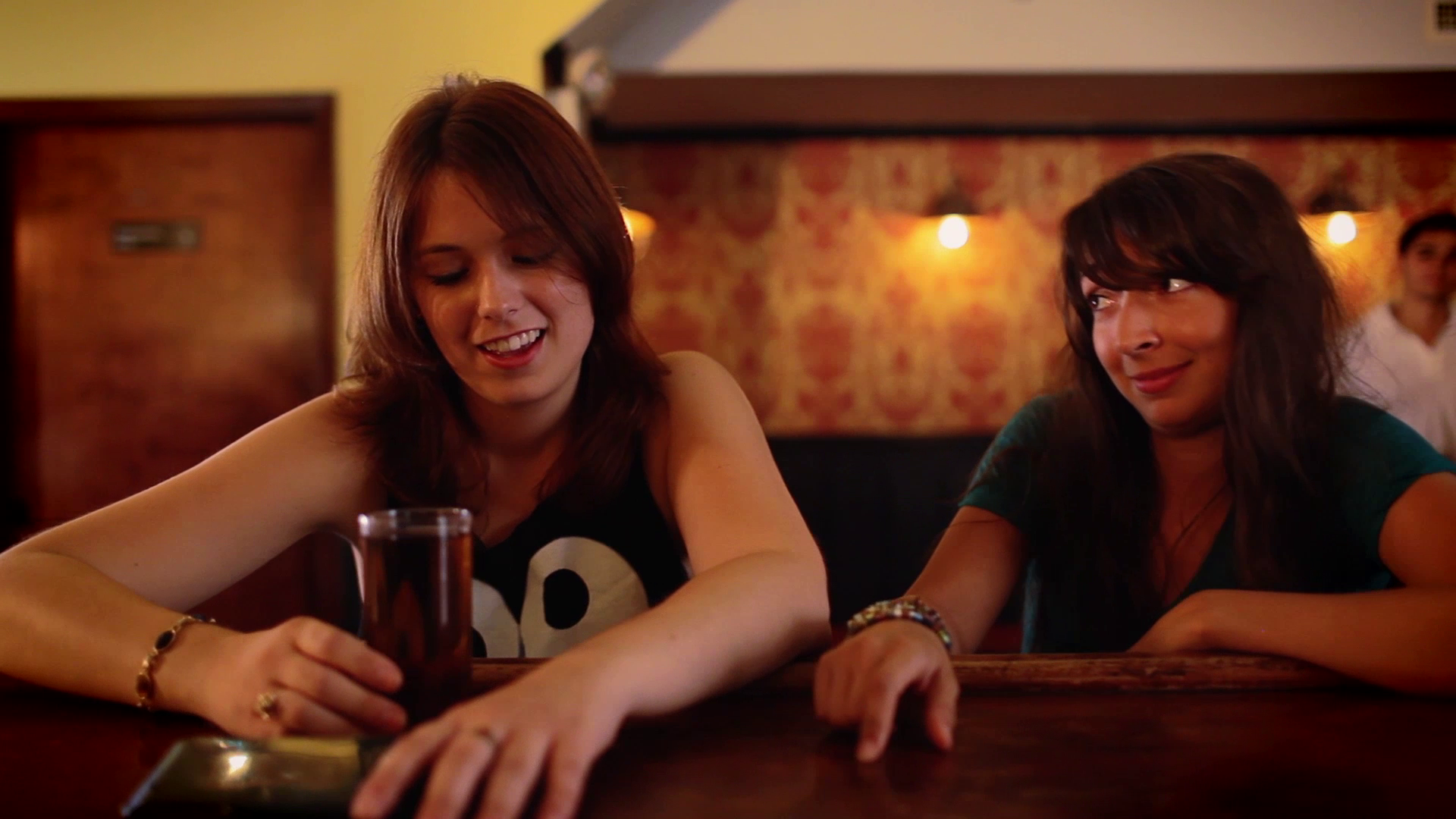
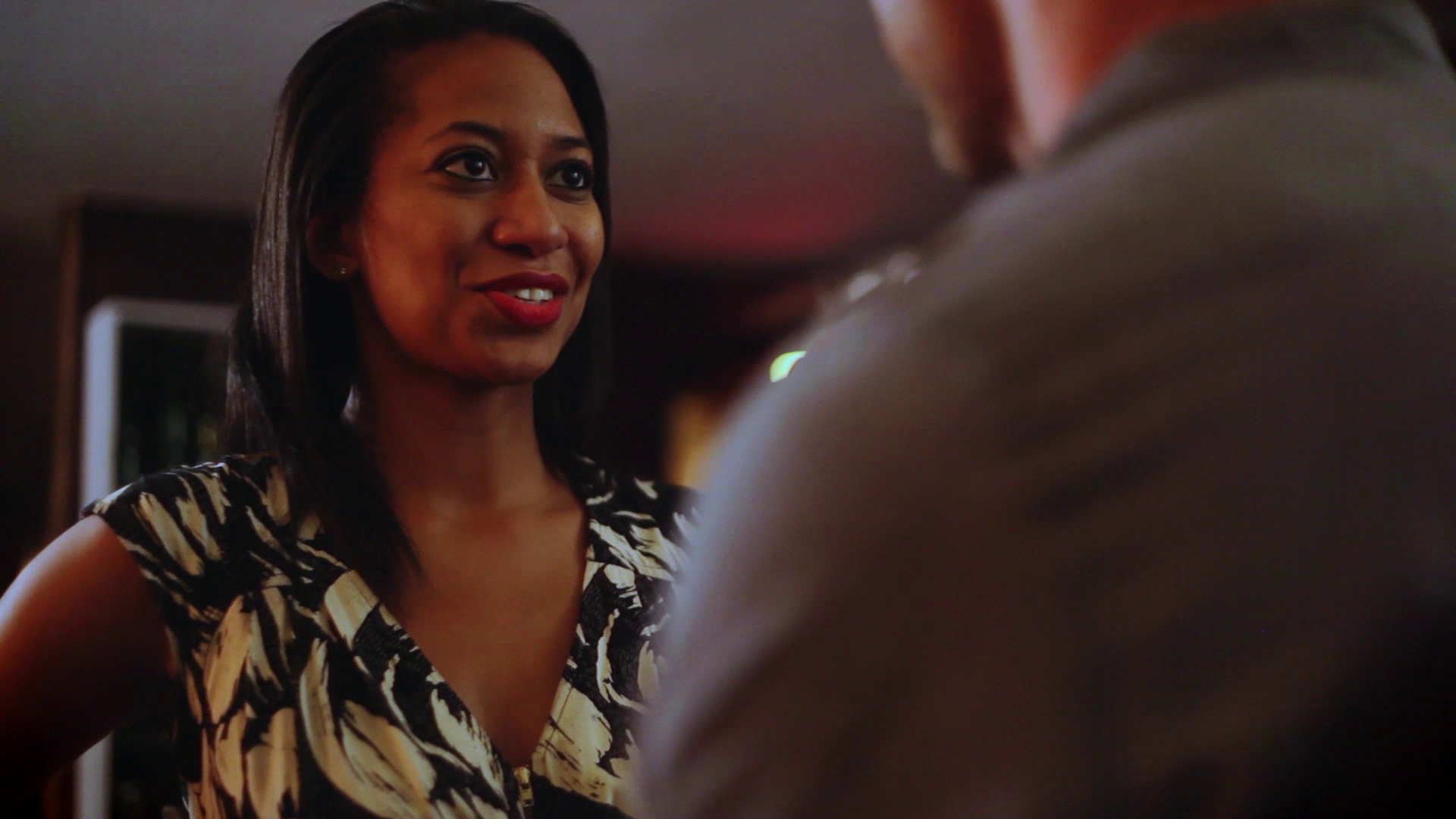
The date, being the present timeline, is where we were most tight. These scenes were also a lot of fun to play with visually in terms of subtext. When this episode was first scripted, the very first thing I said to Peter was that I wanted Kelsey to be shot in Singles and Amanda to be shot over Kelsey's shoulder with Kelsey kind of stealing her frame. I was open to pretty much anything in terms of framing and shot construction as long as that motif was maintained; it just made so much sense in my head. Kelsey was talking non-stop, in her own world, not really making an effort to get to know Amanda, who was understandably feeling overshadowed and underwhelmed by Kelsey's story. Peter came up with the idea to take it even further and have Kelsey physically inch closer to Amanda with each scene we'd cut back to them. I loved the idea. It's so subtle, I doubt anyone notices. But she is literally invading Amanda's space, stepping on her toes in a way, and consuming her frame.

vlcsnap-2014-01-12-13h19m25s147.png
vlcsnap-2014-01-12-13h20m10s101.png
vlcsnap-2014-01-12-13h22m22s147.png
vlcsnap-2014-01-12-13h22m47s138.png

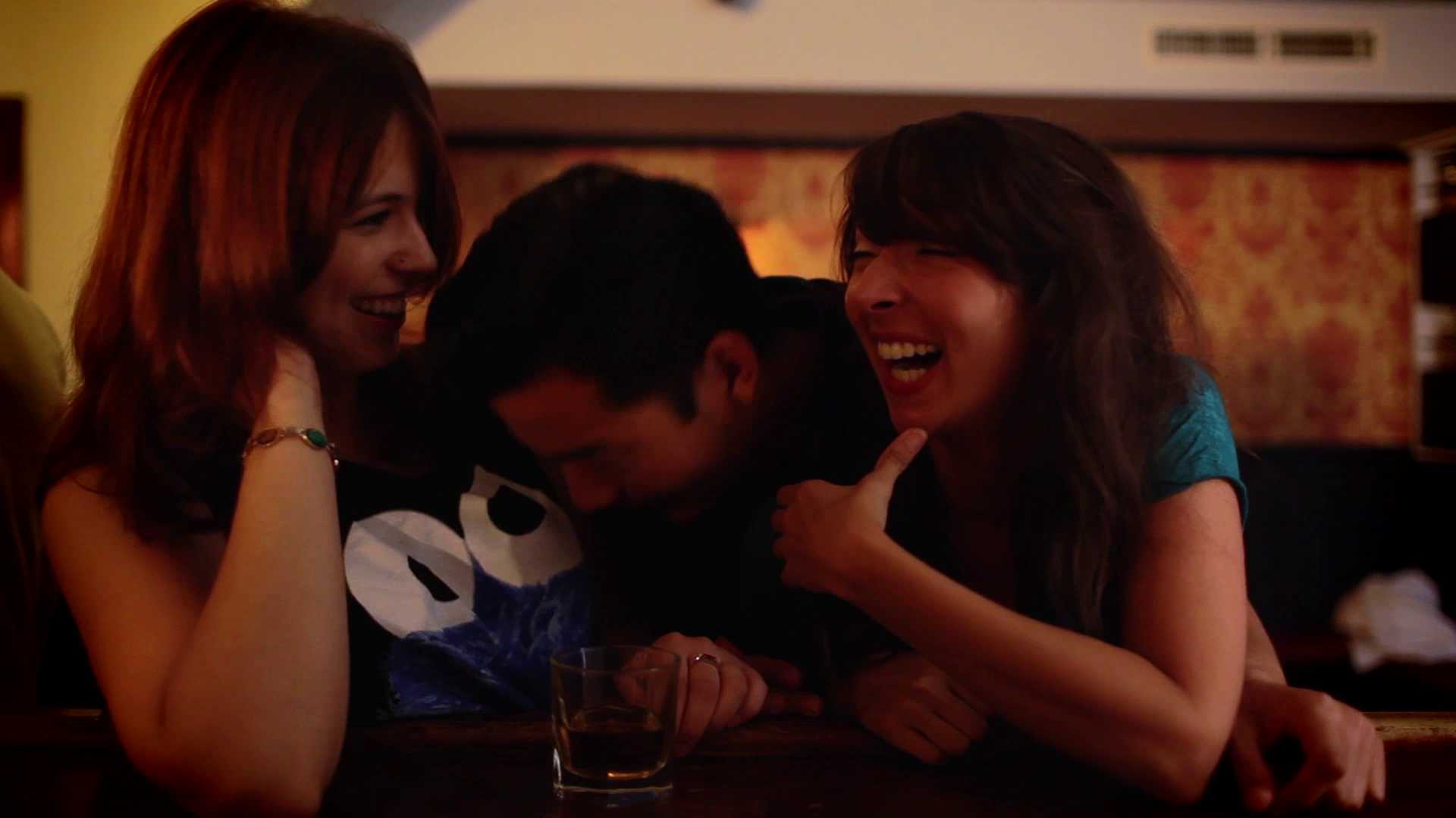
This idea of Peter's was actually an on the spot innovation. I try to avoid talking too much about the production experience because then these posts would be way too long (which I'm sure they already are), but I like to give credit where credit is due. So just to briefly explain, the date with Amanda was our last scene to shoot of production and we had a skeleton crew (because it was a Monday & we had previously shot only on weekends), literally just me, Peter, Sean Mannion (our sound guy) and Erin Clayton (our AC). Additionally, something you may not have realized, the People Lounge (the wonderful place we host IndieWorks) was turned into 5 separate locations on the series. The downstairs is the local bar, the upstairs is the lesbian bar, and all 3 restaurants are various corners of either floor that I felt we could disguise enough to pass for different spaces. This particular corner was literally a tiny corner that we had not yet seen in the back of the upstairs space; and we had nothing to work with but two benches, a small table and a couple plants. Thankfully, we were in episode 5, so keeping it tight was doable. However, it really just looked like a corner with two benches, a small table and a couple plants. I was running around getting some stuff done and Sean had volunteered to help with set dressing. So I left him with that corner & the idea that it could be like a hole in the wall Japanese restaurant, but gave no practical suggestions on how to execute that. When I came back a few moments later, he had found some Christmas lights, wrapped them around the plants, set the tables and made it all look perfectly believable. I was very impressed & very grateful. So to make a long story short, "too late" (anyone get that reference? Here's a Clue...), since we only had benches to work with, this not only allowed me to retain my Overs versus Singles motif with Kelsey & Amanda, but also caused Peter's inching closer idea to emerge. Additionally, with the Christmas lights, I was suddenly given the option to choose which color would hit each of them. And out of that was born a lighting motif, where the red was hitting Kelsey, signaling heat and attraction, essentially her thinking that the date's going well; and blue was hitting Amanda, signaling cold, reflecting her dwindling interest in Kelsey and the date.

A happy accident that I think made the scenes all the more effective; also, in my opinion, a great representation of team work and how collaborative of an art film truly is. 

Getting back to the party, in terms of the scenes with Kelsey & Joanne: as I discussed in my last post, only Kelsey Rauber's music plays when Kelsey is alone at the bar with Joanne., and the camera is, again, not facing the bar. Lastly, maybe you noticed that Kelsey has Singles with everyone else during the party but has OTS’s (Overs) with Joanne?

vlcsnap-2014-01-12-13h20m35s107.png

This was very much intentional, something we do again in episode 7, and meant to signal that there’s maybe more than friendship brewing there. It's also meant to overtly contrast the shots with Amanda, to signify a mutual attraction between Kelsey & Joanne as opposed to the unbalanced dynamic with Amanda.


I also chose to use Overs with Sam & Rowan at the bar to hint at what's to come. 


The use of Overs versus Singles in these posts are an example of how some motifs are across the whole season and some are isolated to specific episodes. If you've been reading all my posts, hopefully you've been catching the patterns. 

When Tyrone comes over to break up the intimacy, we stay in a medium shot, and Kelsey Rauber’s music is no longer playing.

By the way, the motorboat was improvised by Daniel and Lauren was great at staying in character when that suddenly happened. Just wanted to note that because I was impressed. 


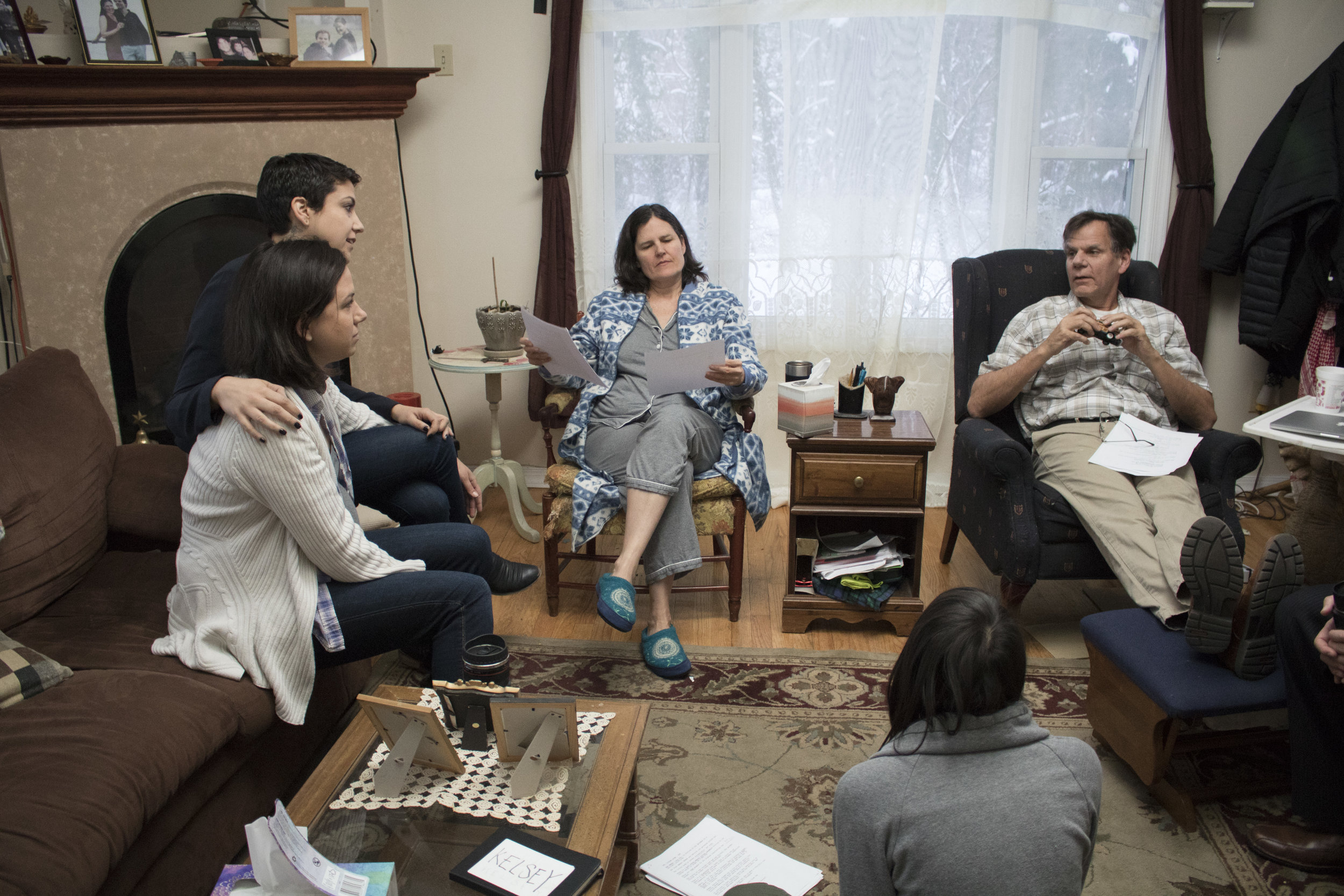
As mentioned earlier, Sam & Rowan interact with each other, for the first time, without Kelsey, as well as without Kelsey as the context of their discussions. In reality, their scenes simply hint at their complicated dynamic (discussed in my second post) and the fact that there is actually a friendship there; and when their defense mechanisms aren’t up, they actually do enjoy each other’s company.
vlcsnap-2014-01-12-13h22m09s18.png

But Kelsey would of course make their scenes all about her and their exclusion of her.

vlcsnap-2014-03-18-13h00m57s182.png
vlcsnap-2014-01-12-13h21m08s173.png

Kelsey Rauber & I thought it’d be fun to have Kelsey come to a false conclusion and have her accusation be almost like a self-fulfilling prophecy. So we planted the seed for that storyline with this episode, which is the final beat of the episode.  Jordan, my editor, and I debated the ending shot quite a bit in post. At first, there was no cut to Kelsey for her acknowledgment of Amanda's "Sam & Rowan are totally fucking line." But I felt that was necessary and thought maybe we should have Amanda cross frame and let the camera stay on Kelsey to the end. But it was Jordan's feeling that it worked better staying on Amanda's shot even after she leaves and leaving it on Kelsey out of focus in the foreground, left to stew as she slumps her shoulders. After the discussion, I agreed with him because it worked very well with our intentions with the rest of the season, to push Kelsey into reflecting a little more on her one-sidedness as well as neediness in relationships. So I had Jordan cut to Kelsey for her reaction about Sam & Rowan but not cut back to her for that final moment. I think it works exceptionally well, especially because we got another happy accident with the lighting. Kelsey's in red at first but shifts to blue once Amanda crosses frame, ending there. 

vlcsnap-2014-03-18-13h19m59s52.png
vlcsnap-2014-03-18-13h20m07s162.png


I will try to keep episode 6 (UHaul-er) short. This episode frustrates me a little because I'm not positive it translates quite what I set out to translate. Kelsey Rauber and I wanted this episode to be a big step forward for Kelsey in terms of how she really feels about the breakup and ultimately how she feels about herself. In the end, it felt a little less significant than we both originally expected and planned. I've examined it and have come to my own conclusions that I'll share at the end of this post. But I do think most things translated quite well.  

For one thing, this episode was about conveying Kelsey toned down from how the audience had previously seen her, both in her demeanor as well as neediness. We wanted to show that she's more than just this goofball who always puts her foot in her mouth. We tried to make her three dimensional in a lot of little ways early on, like showing her at work and in occasional contexts not related to her love life. But this episode was a great opportunity to show other, maybe more subtle, sides to Kelsey. 

Also, regarding toning down things, we definitely toned down the drinking compared to previous episodes, which is something Kelsey Rauber and I felt would be a good signifier of Kelsey's emotional state shifting as she gains her confidence and self-worth back. Not that she doesn't still drink by the end of the series, but she's not getting drunk. That's the distinction I thought would be important to make. 

To get to the visuals, the biggest visual motif of episode 6 is the same motif we used during the date in episode 5, but to the opposite effect. Instead of Kelsey stealing her date's frames, Joyce steals hers, as well as everyone else's.

vlcsnap-2014-01-12-13h30m14s254.png

Kelsey and Tyrone have Singles when they're alone (or for the opening before the reveal of Joyce).

vlcsnap-2014-01-12-13h27m19s38.png
vlcsnap-2014-03-18-14h57m46s132.png

But once Joyce is in the picture, they never get their own Singles as long as she's in the room. 

vlcsnap-2014-01-12-13h27m24s84.png
vlcsnap-2014-01-12-13h30m45s51.png

She overshadows Kelsey's presence pretty much throughout the whole episode. Peter and I thought this would be a perfect way to give Kelsey a taste of her own medicine. This episode is a wake up call for her of her own overbearing and somewhat selfish behavior, so the shot construction was used to emphasize the emotional conclusions Kelsey makes after this episode, even if she doesn't verbalize them. 

A behind the scenes fun fact: like the date in episode 5, this was the last day of production (shot in the morning) and we had a skeleton crew.

Screen shot 2014-03-18 at 3.12.48 PM.png

I had been looking for a restaurant to be our brunch place for a while but it was impossible with our lack of budget. So I decided that if we pulled all the curtains off the windows in the front of the People Lounge and put some tables and chairs up on the stage, the audience wouldn't notice that the area used as the brunch place was the area they had seen in the distance behind Kelsey all season long sitting at the local bar. So we did just that and Sean, again (or rather for the first time), worked his magic with set dressing, and it all worked out!

Another fun fact, the car parked outside the window behind Tyrone is the car he later buys, seen in episode 9. We tried putting a 'For Sale' sign on it but it wasn't readable.


vlcsnap-2014-01-12-13h29m26s31.png

A final fun fact: it's the real Kelsey, series Writer Kelsey Rauber, at the lesbian bar with "Suckface" Jen. When Kelsey wrote the appearance of Jen's latest bruised concubine into the script, I thought it was absolutely hilarious. We kicked around the idea of me playing the part because people had been mentioning how Nichole & I had a somewhat similar look and it could allude to Jen having a type. But I thought it would be a much funnier easter egg to have it be the real Kelsey, especially since she's the one "Suckface" really happened to.

Additionally, Kelsey Rauber did her own lip bruise makeup! 

Another interesting aspect of the episode is Joyce's look. I made it a point to have Kelsey spot her first, even though Joyce is the one who makes the first move.

vlcsnap-2014-01-12-13h28m16s82.png
vlcsnap-2014-01-12-13h28m42s64.png

She shares a stylistic resemblance to Shane, and, although I didn't want to imply that a person's look signifies who you are or how you'll behave, I wanted it to be representative of Kelsey's type, and maybe her attraction to emotionally unavailable or manipulative women. Kelsey eyeing the one woman in there who's similar to Shane is not so much a literal statement about their styles but just a visual way of showing Kelsey's bad habit, and a way to show a sharp contrast to Joanne. If we're talking literally and not symbolically, Joyce is only known to be a bad fit later on because Kelsey barely gets to know her and takes her home with the assumption that everything will be perfect the next day; whereas Joanne starts out as her friend and gets to know her, quirks and all (since Kelsey's not putting on a show for her), and wants to date her because of who she is, not in spite of it. That's the context for why Joanne is better for Kelsey than Joyce (aside from their chemistry and attraction to each other). But I wanted to have a visual connection between Joyce & Shane to allude to Joyce being wrong for her early on. I realize that I'm being kind of rambly about this, but I don't want it to feel like Kelsey Rauber & I were making assumptions about femininity and masculinity or implying that an edgier look automatically means you're the heart breaking "bad girl" type; it was merely a combination of casting, a desire for stylistic diversity within the lesbians portrayed on the series and a need to symbolically show Joyce as a contrast to Joanne as well as a similarity to Shane (who pops up in episode 8).

vlcsnap-2014-03-18-14h57m56s234.png

It also made for visual fun when Joyce swapped out her night-before attire for Kelsey's two favorite shirts previously seen on the series; a very different look for Joyce to accompany her very different behavior in the light of day.

There's not too much else to discuss in episode 6 because, as I said, the main motif was Joyce stealing Kelsey's "spotlight" in framing.

vlcsnap-2014-01-12-13h32m57s79.png

Also, we began the shift to tighter lenses & frames. We weren't quite at 85's yet but we weren't touching anything wider than 50mm for sure. 

This positioning was all Peter. -->


The lighting in the bedroom lowered our quality a little, which wasn't ideal, but we really wanted to use natural light and have it all feel a little drab.

vlcsnap-2014-01-12-13h30m28s143.png
vlcsnap-2014-01-12-13h31m49s162.png

This camera angle is possibly the least romantic angle I could possibly imagine. Peter and I wanted it to feel almost voyeuristic so that it'd be as awkward and uncomfortable as Kelsey felt at this point. It also signals that Joyce is about to be out the door because we were shooting from the stairs out of Kelsey's bedroom.

I mentioned at the beginning of this post that I don't know if the episode fully translates what I set out to. What I regret about the episode is not having a more transitional ending. Kelsey Rauber is, of course, the writer but she and I collaborated on the storylines and seasonal arc; and this episode in particular, I was pushing for it to have a transitional feel for Kelsey as a character.

Kelsey Rauber ended it on a punchline, which totally works. But I neglected to see at the time that it didn't work quite in the way we wanted in terms of the series as a whole and getting Kelsey from A to Z. That said, it still worked out in the end because this episode feels like a standalone, which is always nice to have (some people have even said it's their favorite because of that). And it does still function in terms of showing development for Kelsey. She actually rejects someone, which is a huge change for her. She realizes that this woman is not right for her and that she doesn't have to settle just because Joyce is there and interested. Also, important, she did it without the aid of any of her friends. This shift, we hoped, would make it clear that Kelsey is ready for Joanne, for a real connection, not just one that comes out of proximity and horniness mixed with loneliness. I think the episode as a whole did work in terms of setting that up in episode 7. I just wish I had carried it through to the end with a little more than just the punchline. Regardless, it did lead in to what is probably my second favorite episode of the series: episode 7.

The view count is now at 153,224! We passed 150,000. I don't know how quickly the numbers will move without some big press or outreach to new fans. But I'm going to cross my fingers that we can hit 200,000 by the time I finish this 'Directing Kelsey' series in 2 weeks. We will see! 

As always, thank you for watching, reading and sharing! I'm so grateful for the support. See you in a week with episodes 7 & 8

-Christina

P.S. I spent today replacing all the episodes' video files with slightly higher resolution versions that have the audio cleaned up a bit as well. So if you’re itching for a rewatch, that’s a perfect excuse to spend 72 minutes with Kelsey & her friends.

Directing 'Kelsey' - Episodes 3 & 4

Christina here, continuing my Directing Kelsey series. I took a break last week to share our blooper reel but I'm back to talk about episode 3 (WWWdating?) and episode 4 (Shopping in Groups). I hope you've enjoyed my past 2 posts and getting to know a little about how each episode came to look and feel the way it did. 

Starting with episode 3: This episode was in some ways about making Kelsey seem small in the frame (which wasn't tough considering Nichole's height compared to everyone else on the show) in order to reflect how small she felt finding out about Shane having a new girlfriend and the fact that all her friends have stayed somewhat in touch with her ex. 

vlcsnap-2014-01-12-13h01m19s225.png
vlcsnap-2014-01-12-13h01m28s138.png
vlcsnap-2014-01-12-13h03m00s27.png
vlcsnap-2014-03-03-12h02m30s79.png

However, despite this small motif, for the most part this episode was visually about working towards a sense of normalcy compared to episode 2 because Kelsey was actually in a good mood at the start of the episode and, despite her excessive drinking and hangover, seems to be moving toward a better place by the end of it as she accepts the reality of her situation.

As I discussed in my first post, this episode was still pretty wide in terms of framing and lenses compared to where 'the look' would end up by the end of the series. But we definitely started working our way into over-the-shoulder's and medium shots more, and less use of full or wide shots (compare).

vlcsnap-2014-03-03-12h03m06s181.png


vlcsnap-2014-03-03-12h53m17s61.png

One of the things I'm most proud of in this episode is pulling off the slide behind the computer screen. Peter initially wanted to do reverse shots on them and the screen, since it was scripted that we'd see Shane & her new girlfriend. But I preferred leaving Shane and, especially, her new girlfriend (later learned to be named Suzie) a mystery because I felt like the audience should be isolated to identifying with how Kelsey felt about her and how seeing the new girlfriend made Kelsey feel rather than be able to form their own opinions. Also, it seemed pointless to cast someone we'd never see on the show (Suzie). Additionally, I wanted it to remain ambiguous whether or not Shane would make an appearance on the show. So the less we showed of her, the more it seemed like we just got a model for the Pilot photo and didn't cast an actual actress. And lastly, a more practical reason, I didn't want the hassle of having to create a Facebook profile for Shane nor deal with the potential repercussions of showing Facebook without proper permissions. 
So anyway, Peter was totally on board for keeping the camera on them the whole time, and sliding behind the computer. He felt that it would be a tight squeeze but thankfully found a way to make it work precisely the way I wanted. 

vlcsnap-2014-03-03-12h19m40s105.png


What's wonderful is that a lot of people relate to episode 3. Staying Facebook friends with your exes and/or your friends staying friends with them is such a reality for our generation. Your ex can randomly pop up in your face at any given moment with the refresh of your newsfeed. When this episode was scripted, I felt it was so timely and relevant but also timeless in a way because finding out your recent ex has moved on before you is something anyone, regardless of how they find out, can relate to. I was excited about bringing the whole episode together because it'd be a fun way to explore each of her friends' take on the situation and introduce the next episode's plot of online dating.

However, things didn't quite work out that way when we got down to the last few days of production and had to cut out one production date because Kelsey Rauber and I were about to go over budget & out of money. The exterior day that we planned to shoot episode 4 at Ikea got rained out early on in production, so we lost a date that it took almost all summer to try to coordinate and get back. Because of this, we had to sacrifice an alternate exterior date which was supposed to have scenes between Kelsey & Rowan in episode 3, and Rowan, Sam and Shane in episode 10 (will talk about that later).  So two scenes out of episode 3 had to be cut. Here's a preview of the pages:

Screen shot 2014-03-03 at 12.22.20 PM.png

I felt that the episode could still work without the scenes, so found a way from a producing & directing standpoint to pull the episode off without making the loss evident to the audience. I ultimately do feel that the loss of the two scenes hurt the episode a little because it did not have as much cutting around as we originally envisioned since the entire episode is the past and only three scenes at the bodega are the present, which gave it less of the punchy feel that we like. However, because we had notice, we were able to make some adjustments to keep the momentum bouncy. We had already shot the office and bodega scene but not the bar scenes by the time we realized a day needed to be sacrificed. So we reworked the tone of those scenes a little to compensate for what was meant to go between them, and managed to bring it all together pretty tightly. Kelsey Rauber and I still feel what's lacking. But it seems that audiences enjoyed it regardless.

As you may have noticed from the preview above though, Joanne was meant to be in the episode. It was just supposed to be that appearance in the background so that we could further establish that she lives in the neighborhood and has met Rowan. Rowan would mention that he was double dating and, because Kelsey would spot her with the woman Rowan was presumably double dating with, this would add to Kelsey’s assumption that Joanne is straight in episode 4. We were, however, able to compensate for this loss in episode 4 because, luckily, we had not shot the Kelsey & Joanne scenes of the episode until after we realized the exterior shooting day would need to be cut. 

Speaking of episode 4: This episode is one of my favorites for multiple reasons. It's where we first get to see Kelsey interact with Joanne, Kelsey is finally at a point where her world doesn't revolve around Shane, we establish Tyrone as more than just Kelsey's co-worker and actually part of the group of friends, and where I think Kelsey Rauber's dialogue writing really stands out. I loved the contrast of the rapid banter of the Ikea scenes versus Kelsey's oblivious rambling to Sam versus the more conversational (but still somewhat oblivious) moments with Joanne. I had a ton of fun taking Kelsey Rauber's excellent script and finding subtle ways to bring it to life and really hit the beats in this episode.
I'm not going to pick the episode apart too much. But I will say that I treated each of the locations' corresponding segments as almost little films of their own, where each had a slightly different look while still working as one cohesive episode. I did this because I felt that, although they each play off each other narratively, the three locations' scenes worked almost as episodes on their own, independent of the context of the story Kelsey was telling.


vlcsnap-2014-03-03-15h17m45s232.png

For the scenes with Sam, I chose to have kelsey sit on the counter, not just because it made framing easier, but also to show that she has gotten some of her confidence back (in spite of her playful self-deprecation throughout the episode and especially these scenes). It was to show a stark contrast to the last episode in terms of her self-esteem level. Also, their bodies get a little closer together in two-shots and the overs are a little tighter, at least in terms of depth between Kelsey & Sam, to create a sense of closeness now that the friendship is more established. 

The scenes at the bar were very important because there was a lot of subtext going on and I wanted to emphasis both the chemistry as well as the tension between Kelsey and Joanne as much possible. 

vlcsnap-2014-01-12-13h03m15s178.png
vlcsnap-2014-03-03-15h17m24s39.png

You probably didn't notice this but there's a very big difference between these scenes with Kelsey and Joanne versus the ones from episodes 1 & 3 with Kelsey & Sam at the bar. I wanted there to be a visual difference for when Kelsey would be at the bar with Joanne compared to her with Sam, in order to allude to there being more than friendship brewing between the former. Peter suggested we shoot Kelsey & Sam facing one way and Kelsey & Joanne the other way, with the bar as the dividing line. I loved this idea and we both agreed that not showing the bar or bartender, and narrowing our Overs so that there wasn't too much depth behind Kelsey & Joanne felt more intimate and, in a sense, romantic compared to facing the bar and seeing more of the space (as is the case with Kelsey & Sam). So this became a pattern we stuck to throughout the series. 
 

vlcsnap-2014-03-03-16h54m42s34.png

Also, just to refer to what I spoke about in episode 3 regarding the absence of Rowan & Joanne. The bit about Joanne saying she knew Kelsey's name from Rowan, and then the awkwardness of Kelsey assuming Rowan had mentioned her and trying to hide that she was too self-involved to remember, and then Joanne appeasing her by explaining that she only knows him because he went home with her friend Sarah, was meant to compensate for the missed beats in episode 3, as well as set up the ongoing plot of Kelsey being completely oblivious to not only Joanne being a lesbian but also being attracted to Kelsey. It was also a way to quickly establish Rowan is definitely straight because Kelsey Rauber & I had feared the audience would assume he wasn't and be completely thrown by Kelsey's accusations later in the series. Episode 3 was meant to confirm this, so I added the throwaway line about "Sarah" to make up for what we lost. 
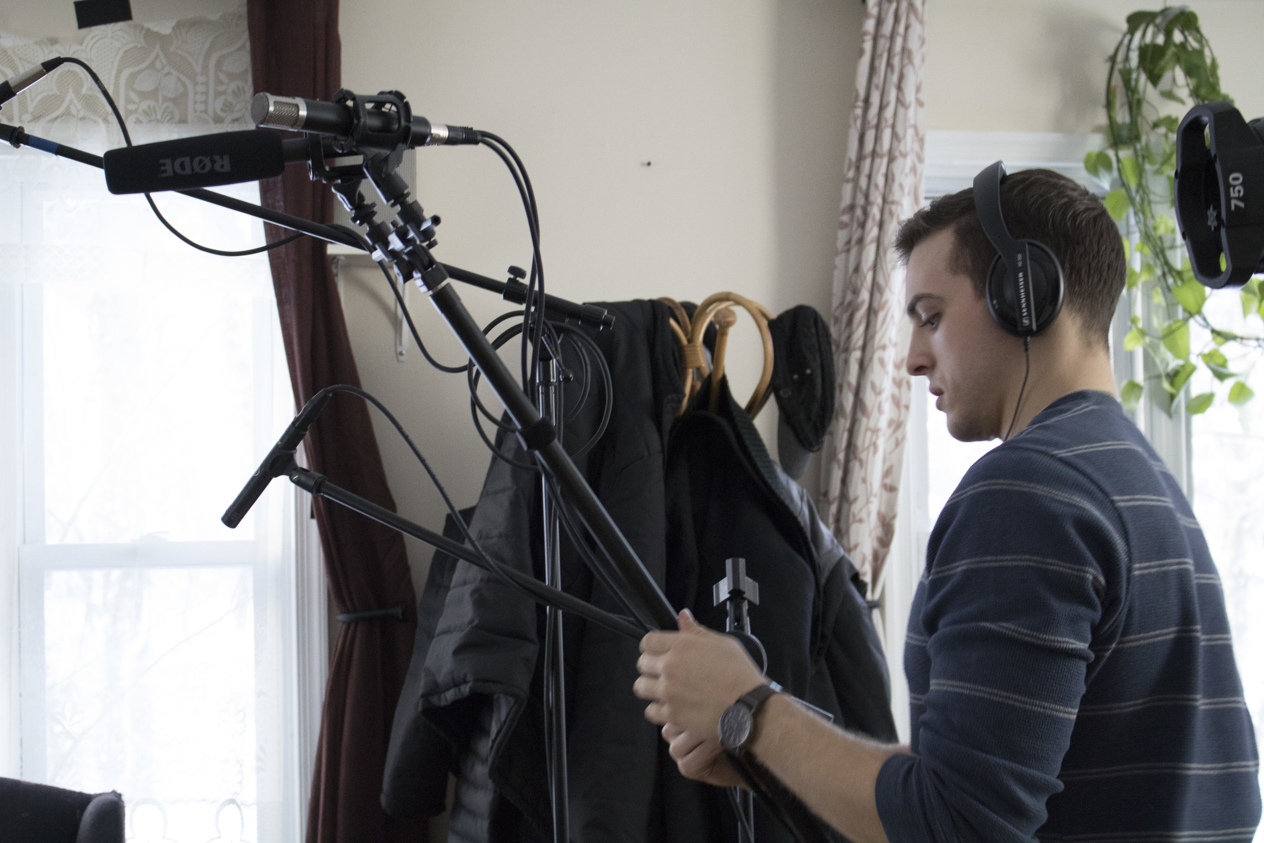
Last thing I want to mention about these scenes is the use of music. I know, this isn't referring to the look, but definitely the feel. It's the first time music is heard at the bar. I tried to avoid using a score or any non-diegetic sound for the whole series in order to add to the realism, and highlight the acting & pacing. So anytime music is heard, it's coming from a source within the reality of the show. I made it a point to not have music playing at the bar except for, conveniently, when Kelsey is with Joanne. I felt that it would set the mood a little and allude to their future together. Additionally, I thought it'd be fun to use Kelsey Rauber's own music on the show (she of course was not a huge fan of this decision), so you will also notice that every time Kelsey & Joanne are at the bar alone, the music playing is in fact by the real Kelsey. That's the only time her music is heard on the show. Any other time, for instance in episode 5, it's other tracks by local musicians who were wonderful enough to allow us use of their work.

In terms of the Ikea scenes: When we were shooting, it was an incredibly sunny day out, and Peter did an excellent job bouncing the light and using what shade we could find. But there was too much of a glare on the monitors to tell whether or not we were catching crew member reflections in the actors' sunglasses. Peter assured me that he didn't think we were but once we got into post, we realized we had. I found it very distracting once the cut was put together and really pushed to find a solution. Peter eventually came up with the idea in color grading to lower the saturation and give more of a bleach bypass look, which significantly darkened the reflections in their glasses. It unfortunately led to less of a sun-kissed look for the cast but definitely hid the recognizability of the figures reflected in the lenses.

Untitled_5.jpg
Screen shot 2014-03-03 at 3.27.22 PM.png

I opted for the alternate look, despite it not being as flattering, because it didn't immediately pull me out of the scene the way seeing actual faces in their lenses did with the first color pass. Overall, the day just ended up looking a little more cloudy than it actual was, and everyone slightly less tan than they actual were. But I'm happy with it how it turned out in the end. 

In this episode, we tried to be on Kelsey's eye-level at all times to, as stated in episode 3, get to the point of normalcy, allowing her (and in effect the audience) to feel grounded visually because she was finally at a space of feeling ready to move on and more comfortable with the idea of not being part of a couple anymore. 


vlcsnap-2014-01-12-13h03m27s33.png

These scenes are also where I most used my director trademark of sorts, building up to close-ups, something I spoke about in the first post. I chose to start wide but abruptly isolate the three of them in singles, rather than overs, to emphasize them being in conflict rather than actually working together.

And of course the singles get progressively tighter as the tension builds between them. 

vlcsnap-2014-01-12-13h05m27s219.png
Luckily, the bleached look didn't remove some of our planned reflections, like Rowan taking off & putting on his glasses seen in Tyrone's lenses.

Luckily, the bleached look didn't remove some of our planned reflections, like Rowan taking off & putting on his glasses seen in Tyrone's lenses.

As tension subsided and the situation resolved itself, we pulled back out. 

vlcsnap-2014-01-12-13h35m51s15.png
vlcsnap-2014-03-03-16h23m02s225.png

And ended the scene on the skyline shot that Peter & I were very excited about. (See the reverse of it here.) I wanted to show that the series is true indie, on-location production and, although that comes with a million headaches, it has the perks of having the realness you can't get in a studio. 

Also, regarding true indie production, as a fun fact to share, the shots facing the actors and the shots facing Ikea are actually on completely opposite sides of the building. We had to run & gun the shots in the front of Ikea to avoid getting caught, and then we were able to take our time with a little more ease at the back of the parking lot for the majority of the shots, which were facing the characters. Just a little low-budget movie magic. 

That's it for episode 4. Hopefully my ramblings are interesting and give you some useful insight into the episodes upon rewatch. If you ever have questions or want to chat with me about the series, always feel free to tweet at me. And I hope you’ll be back next week for episodes 5 & 6. The view count is now at 144,395. So close to 150,000! Thanks for watching & reading.

-Christina