Hello to all our wonderful "Kelsey" fans,
Christina here. Some of the more cinephile-type fans of the series have asked questions about the look of the show over the past couple months. So I thought it’d be fun to write a blog series about some of the artistic choices behind "Kelsey". This is the first of what will be 5-10 posts discussing each episode; I may combine a couple episodes depending on how much I decide to say. This one will be the longest, though, because I'm setting up the series as a whole before diving into a specific episode. So here it goes, starting with episode 1 (Palette Cleaner).
If you don’t know the story of how “Kelsey” came to be, read it in Kelsey Rauber’s words HERE. It was back in July of 2012 that we had that dinner and the idea to turn her hilariously bizarre but incredibly relatable story into a web series first occurred to me. I told her that what I found so compelling about her story was the way in which she told it to me. Her hindsight commentary was a big part of what made the story so entertaining. When she said that she would start writing immediately, I told her that she should try to retain her comedic storytelling style as a character in the writing of the series itself. So, we initially came up with the idea that Kelsey, the character, could be retelling the story of this event in the form of a video blog and part of it would be portrayed through flashbacks, while the other part her commentary. However, talking to the camera has become such common practice in comedy now that I’m so glad that that idea was eventually nixed. Kelsey wrote her first draft and it was funny but not nearly as funny as it later became when the new non-linear motif was tested in her second draft in February of 2013. Kelsey had come up with the idea that the character of Kelsey would be telling the same story to her friends separately and the audience would be able to follow it partially through flashbacks and partially through the non-linear moments of interaction with her friends throughout the episodes. I thought this was absolutely brilliant and unlike anything currently happening in comedy right now.
So we decided to roll with this structure and, after we brainstormed on where we wanted the series to go as a whole, Kelsey began writing future episodes and I brought on our DP Peter Westervelt; then we began casting. This is where I’m going to stop telling background to how the show came together. I just wanted to set up the narrative structure of the series as a way to get into the aesthetic choices behind it.
The prospect of the series including flashbacks and a general non-linear structure made the series more exciting for me from a directing standpoint and allowed me to have some interesting brainstorming sessions with Peter (as mentioned, the series Cinematographer) on how we could create a visual distinction between past and present. I initially proposed the idea that we commit to shooting the flashbacks on a specific lens, which we would never use in the present, in order to create a subtle but intentionally different look between the two time periods of each episode. This is something I had seen done in Blue Valentine, one of my favorite films. But Peter, rightfully, brought up the fact that that would be very limiting for the visual storytelling, especially with tight locations to contend with. Peter then suggested that we have some sort of camera movement for every time we introduce the past in an episode. I loved this idea, so we decided that the main way we'd differentiate the past from the present would be to slide into the past and cut out to the present. This is a rule, I’m proud to say, we maintained throughout the whole series. This is a part of why I think it’s so necessary to plan and ideally shoot a season of your web series as one whole entity because, even if you are thinking of each episode as standalone, you can make artistic choices that go a long way. (From a producing standpoint, as well, it’s just incredibly naïve not to shoot your whole season together before launching your pilot in regards to time efficiency, cost effectiveness and consistent distribution. But I’m not talking producing here. This is the director side of me writing this post.)
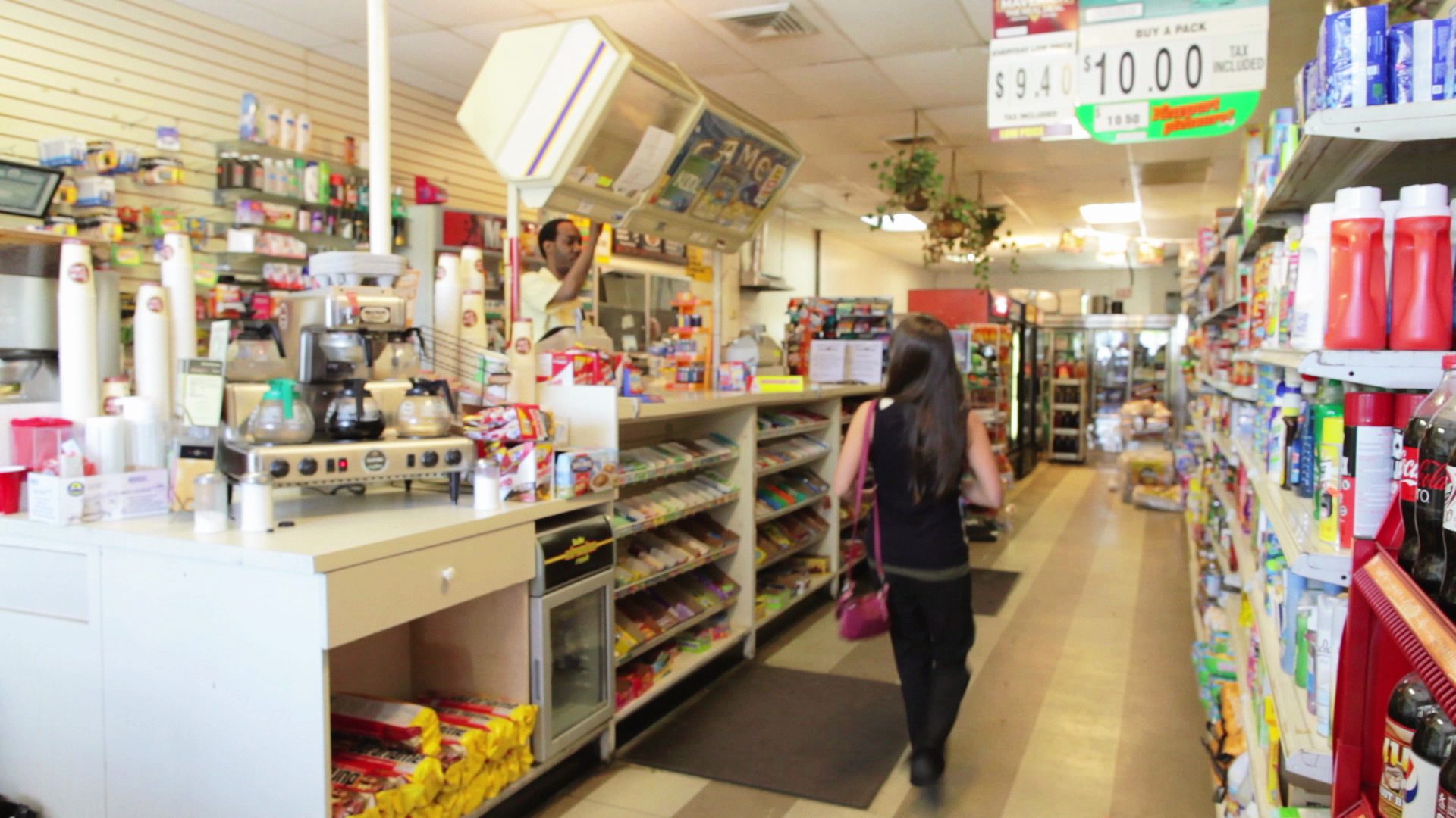
Another motif for the series that I wanted to convey was the idea of building up to close-ups. This is something I generally incorporate into all my work, especially if tension building is a big aspect for the film as a whole, even in comedies ("S.K.A."). It was definitely an integral aspect of the cinematography for my feature film Summit, and I was actually producing "Kelsey" right off the heels of shooting Summit. I suppose I wanted to find a way to use that motif very specifically again because it worked so well in the film. The way I worked it into "Kelsey" was by using wides early on as a way to introduce you to Kelsey’s world in relation to her.
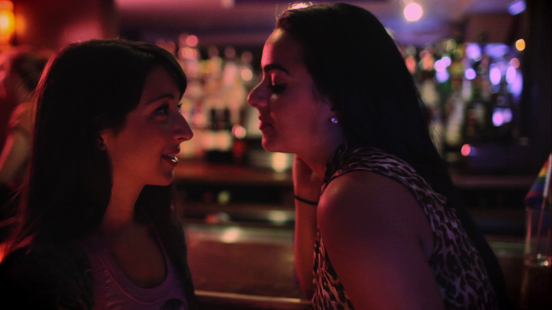
But as the relationships became closer and they became more of a tight-knit group of friends, and as Kelsey became less self-centered, our shots got tighter and dirtier over the season. I’ll elaborate on this further for each episode from a tone/feeling standpoint. But here's an example compared to above:
I wont touch on lenses and that kind of stuff; it’s Peter’s realm. But for you real tech fans, we generally never went above a 50mm lens for the first 3 episodes, and never went below it for the last 3.
It was Peter’s idea to open the series coming into focus on Kelsey. I thought that was really cool because I had made it a point with the pilot to just kind of drop you into her life, and the focus shift felt, to me, like it was you coming into Kelsey’s world.
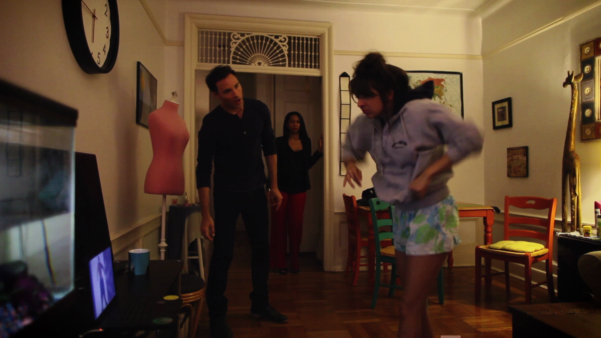
The kitchen was an incredibly tight space to work with. We basically just tried to be as wide as possible while getting as much coverage as possible. Peter was really amazing at utilizing the limited shooting area, and our editor, Jordan Roberts, did an excellent job of taking all the shots and making the scene feel cohesive and smooth.
We toyed with making the photo of Kelsey & Shane on the fridge more in your face with a very intentional close-up. But I felt that was kind of tacky, and decided to just put it in the foreground a few times and let the audience find it upon rewatch after Samantha references "her stuff" or Kelsey pulls it off at the end of the episode.
I’m generally not a fan of inserts as a way to draw the audience’s attention to something and tell them it’s important. I rather be subtle about it and let the scene play out more realistically, as if you're in that space with them. You’ll probably notice that there are few, if any, inserts during the series.
But for the fans who’d like to see that photo more closely, here's a shot we never used:
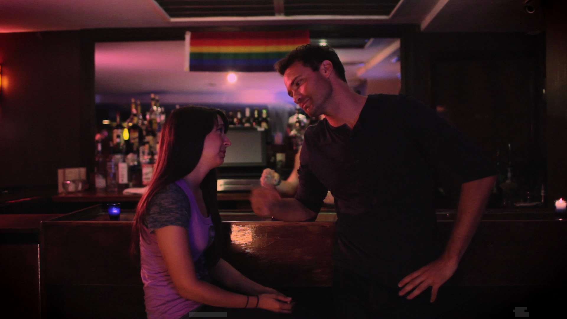
You'll notice wider frames and lenses are generally all over the place. It's in both bars (something that was always a bit of a challenge to pull off with our limited budget & lack of extras). The look of the lesbian bar was made different from the local bar mostly through Peter's idea to put colored gels on all the lights. It added to the rainbow theme of the space.
There’s a lot of fun we had with art direction in Kelsey & Tyrone’s office. We established Tyrone’s infatuation with Ryan Gosling (which would play into episode 2) and Kelsey’s love for Kermit (true story, Kelsey Rauber really does love Kermit).
Okay, I’m not going to pick apart each scene or shot in the episode, don’t worry. I just wanted to touch on a bit of what makes each episode different while also talking about the general look of the whole series. I'll stop doing that now.
Moving on, a stand out aspect of this episode is the use of close-ups on somewhat wide lenses as character's POVs. A choice mostly used to be slightly jarring and add to the comedy, but also to pull you into the story like you're the one being spoken to, like you're one of Kelsey's friends now.
This is not something we do in any other episode. I normally think it's a bad idea to do something in the first episode of a series because the audience may come to expect it from the whole show. But I also felt that, since it's a pilot, we could get away with it as long as we didn't repeat it at all in episode two, and that, since the pilot is so standalone as is, it'd be an okay choice to make. This is the episode where we flashback more than any other; it's also the most story-oriented, where little happens in the present and the story she's telling dominates the episode. I felt that having character POVs would be a great way to show how intently the other characters were listening to Kelsey but also how they were reacting to her and her story in a different way from how she perceived it (which would go on to be a running theme). Again, like starting the series out mostly wide, it was a way to introduce you to the supporting characters specifically in relation to Kelsey and her world.
Peter was totally on board for this isolated episode motif and pulled it off very well. We made it a point to shoot Kelsey's interactions with each character on the same lens and from the same angle and distance as much as was possible for each part of the story she was in while talking to them. We figured that, not only would it feel more polished to do so, it'd help audiences subconsciously place themselves chronologically in the non-linear story.
It was completely Peter's creative idea to shoot the shot where Kelsey & Jen do all the shots in one take.
I liked it a lot, especially the slight awkwardness of it happening in real time rather than convenient jump cuts. Getting drunk and hooking up with some random at a bar is inherently awkward, and I generally like to make you feel a little awkward visually if the characters feel that way (more on this in episode 2).
I specifically wanted to jump the line for the kiss in order to signify that what was about to happen was what this whole episode had been building up to and that it'd be slightly jarring the way jumping the 180 line is jarring.
The final scene of the episode is one of my favorites of the whole series. First of all, the color tone of the end product is actually quite different from the original. In Post-Production, Peter gave me a choice and I chose the colder look because it was much more in line with the tone of the scene. Just a taste of the beauty of color correction and Peter's overall skill.
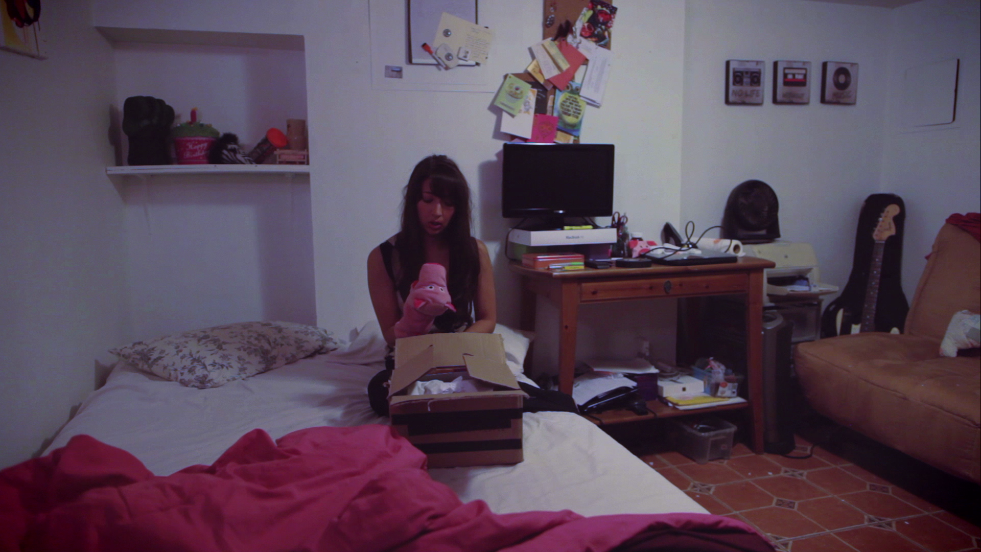
We only had one version of the poster on the wall so Nichole had one take to nail crumbling it up. I was also deadset on it being all in one wide shot, no cuts to close-up. I liked the idea of conveying the intimacy of that scene by not being intimate with the camera, but actually making you, the audience, feel somewhat like a voyeur as you watched her in this incredibly vulnerable moment. So Nichole had quite the challenge on her hands, as did the whole production team because nothing could go wrong in this take.
The part with the pig puppet was not scripted; it was originally scripted that Kelsey takes down Shane-related stuff off her wall and puts it, along with the photo that was on the fridge, in a box and tucks it away under her bed feeling slightly hesitant but ready to move on. I found the pig puppet in Kelsey Rauber's bedroom and thought it was cute so told Nichole to pretend that it was a gift from Shane and that she had to say goodbye to it as she packed it and the rest of Shane's stuff away. I also wanted to take a slightly more somber approach to the ending in conveying that the realization that she was actually ready to move on was maybe the saddest and scariest part for her. Nichole totally rolled with that and didn't want to rehearse what she would say to the pig; she just wanted to let it come naturally. So I was banking on liking whatever she chose to improvise, as well as everything on a technical level going well because, again, we literally had one take to pull this off. Her choice to actually have the puppet speak to her was brilliant, humor in such a sad moment; and the way she kissed it goodbye and put it in the box was heartbreaking. I loved it. She nailed the scene in one take.
For the final moment, I chose to just let it linger on her, lying in bed after she finally decided to put the box of Shane’s stuff away. I wanted to make it clear that, although the show was a comedy, we’d be touching on some real stuff in it. When Kelsey Rauber saw the footage, she was on the same page. I was proud to have captured what she had emotionally put on paper.
I think we truly nailed it with those final moments because it's one of the most referenced scenes in interviews, including what led to a discussion, in one of my favorite interviews that Kelsey Rauber & I were invited to do, with Fetch & Femme about Kelsey(the character)'s uncomfortableness with being alone and how the show is really meant to be the journey of Kelsey getting to the point where she's okay with who she is regardless of who she's with.
That's it for episode one. If you enjoyed reading this, go ahead and rewatch the episode to see what I was talking about. And definitely check back in a week for the exploration of episode 2. I promise it wont be as long as this post. Also, as of right now, the series has a total of 136,667 views! Thanks for watching (and reading)!
Christina

